Why is it that we blog? Why not just write in a journal? The specific answers may vary, but in the end it all comes down to the audience – the readers.
Maybe you want to make people laugh, maybe you want to offer people help, maybe you want to share stories, maybe you want to draw traffic to make money. It’s all variations on a theme: finding readers. Because if we didn’t want readers, we would just write in in a private journal. So when people land on your site, if they are your target readership, you want them to stick around, get to know you and get hooked! What should be at the top of the page? What should be in the sidebar? Today’s post is 7 blog layout tips to keep people on your site, and to encourage them to interact with you – largely by subscribing and commenting. You know it’s what you want! 🙂
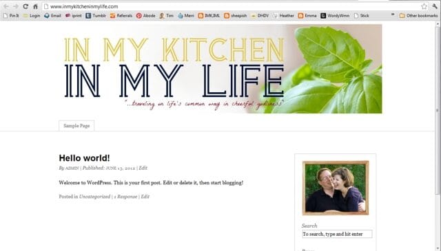
And as in all the previous posts in this blog redesign series, my friend Lori’s blog, “In My Kitchen, In My Life” will serve as the example where I’ll be making these changes. So here we go!

Comments are like candy for a blogger. I LOVE comments. It lets me know people are reading – and it lets me know what they are thinking about what I’m writing. Comments give you great feedback on what people want more of, what people find especially helpful, and plus, they’re just fun! Here are some hints to encourage commenting:
‣‣‣ Make sure your readers know you WANT comments! Don’t be bashful. At the end of your post, put a clear “call to action” asking people to leave their thoughts and letting them know you enjoy hearing from them.
‣‣‣ You can take it a step further and instead of asking for comments in general, pose a particular question that you would like comments on, and include that in the “call to action”.
‣‣‣ Make it EASY for them to comment. Avoid using CAPTCHA like the plague, and if possible, just provide a place for name/email/website rather than making them sign in to comment.
‣‣‣ Have a blog design that allows threaded comments so people can respond to each other.
‣‣‣ Once someone leaves a comment – reply to it! Especially on your most recent posts.
‣‣‣ Realize people comment about your blog elsewhere than your comment section. Provide social sharing buttons at the end of the post to make it easy for people to share and comment on your blog on sites like Facebook, Twitter, Pinterest, etc. (Helpful tip: if you’re curious what people are pinning and saying about your site on Pinterest, just go to pinterest.com/source/YOURDOMAINHERE.com … just put your domain name where it says “your domain here”. For instance, mine would be pinterest.com/source/theflourishingabode.com. See what people are pinning and commenting there, too!)
‣‣‣ Consider some WordPress plug-ins that make commenting even more friendly for your readers! For example, Lori wants “Comment Luv” on her blog. That’s the handy little feature that includes a link to your readers’ most recent blog post along with their comment. You can find this, and other commenting-friendly features, in the plug-ins section of your WordPress dashboard. Just click “add new”, search for the plug in, and when you find it click “install now”. Then once it has installed, click activate! Easy-peasy – now CommentLuv is installed on her site! Some plug-ins have options, and you can edit those under the “Settings” section of your WordPress dashboard.
So there are some ideas on encouraging comments. But before you can get comments, first you need readers to stick around and feel engaged enough to WANT to comment. (By the way, I’m totally hoping to hear from you in the comments of this post!) Plus, you’re hoping they’ll subscribe so they’ll be back for future posts. The rest of the tips address those issues.

If you’re not familiar with the term “above the fold”, it just refers to the amount of a webpage that you can see before you scroll down. If you have to scroll down to see it, it is “below the fold”. First impressions really do make a big difference – if someone lands on your blog and they don’t like what they see above the fold, chances are they’re not going to take the time to scroll down and investigate further.
Bear in mind “liking what they see” isn’t just style, but also whether it looks easy to use and navigate. It might have lots of pretty elements, but if there are a gazillion different things going on, and they can’t tell where to go or what to do – people generally aren’t going to stick around. So usability and navigation is a HUGE part of it. There is also the style side, of course – but bear in mind, like we talked about before, you’re not trying to appeal to everyone, you’re trying to appeal to your target audience. One big part of the style showing above the fold is your banner, like we talked about last week.
Whatever it is you’re going for on you blog, the area above the fold should “hook” your target audience. The style should speak to them, the navigation should be easy, and it should be clear what they can expect. In deciding your layout, remember that above the fold is the most valuable space on your website, and you should make sure it is high impact. But *how* to do that? On to the next tips…

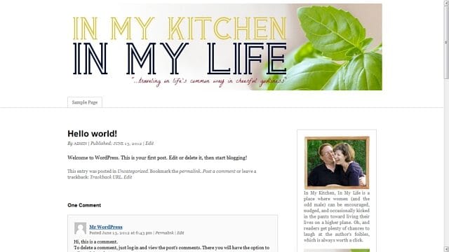
In this online world of computers and information, one of the reasons we are drawn to individuals’ blogs, or small handmade businesses and so forth on the internet is because of the PEOPLE behind them. When we meet someone, we can see their face, and their personality in their appearance. In your content, you should also be conveying who you are and your personality … but in general it’s still a lot easier to “connect” if you can actually see the person. A nice well-lit photo that conveys your personality near the top of the page is a GREAT way engage your visitors – let them see you! Lori has this *fabulous* photo of her and her husband – I just love all the personality and joy in this photo. Plus, it starts cluing you in to the fact that her blog is about home and family right away:

I think it deserves to be above the fold. It’s welcoming, important and creates a connection. So I put it at the top of her sidebar (and check it out – her branding colors are even incorporated in her photo! Just like my colors are in my photo. Ka-pow!):

Ok, pull back out your branding printable from week 1. (I told it would come in handy!) One of the questions on that first page was, “Someone has just landed on your blog and wants to know what it is about: Describe your blog in 50 words or less.” If you answered this question (and kept in mind that you’re explaining your blog to someone who just landed on your site), then you now have a great little blurb to use on your site! Here is Lori’s blurb: “In My Kitchen, In My Life is a place where women (and the odd male) can be encouraged, nudged, and occasionally kicked in the pants toward living their lives on a higher plane. Oh, and readers get plenty of chances to laugh at the author’s foibles, which is always worth a click.” Have to say, I love her style. 🙂
I’d recommend having either a little description of yourself or of your blog right below your photo. On my blog, I have a description of myself there, and I have my blurb a little farther down the page under the heading “so … what’s this place all about?”. Here is Lori’s blog with the blurb put right below her photo:

So, let’s say someone has landed on your site. Your banner speaks to them about what your site is about, they see your photo and feel a connection to you, the writer, and then they read your blurb and think to themselves, “Wow, this is right up my alley!” The content they came to read is helpful, and they’re liking what they see. They are your target reader. Maybe they leave a comment, maybe they browse around some more. They think, “Oh, I like this blog!” And then they leave to go do something else and you never see or hear from them again.
What was missing? Subscribing. But if you really want people to subscribe, you NEED to make it easy and obvious – don’t make them hunt for it. I’ve heard this as good rule of thumb – ask a friend to look at your blog and if it takes them more than 5 seconds to find where to subscribe, you need to change it. Ideally, it should be above the fold or JUST below the fold.
I also think it’s a good idea to have additional places to subscribe at places on your blog where a reader has reached a point of “commitment”. For instance, if they read a blog post and make it to the end, or if the decide to leave a comment, or if they make it to the bottom of your website, there can be an option there to subscribe. If they’ve made it that far in, give them another opportunity to keep in touch.
But what kind of subscription should I offer? RSS? Email subscription? A weekly newsletter? Or what? This will vary somewhat depending on what type of blog/site/business you have and your personal preferences. You have to weigh the pros and cons. For me, email subscription to my blog itself has been by far the most popular way to subscribe, though I do offer RSS as well, and I also tried a newsletter. Just to illustrate – I officially launched this blog in January, and I now have 524 blog subscribers by email, but just 106 subscribers by RSS/readers. I had tried a newsletter in the past, but personally, I found a newsletter to be extra work and less effective because I had more to share than I could reasonably put in a weekly newsletter. I definitely prefer just offering blog subscription, and putting anything I would put in a newsletter into a blog post. *shrugs* But that’s my personal preference.
We’ll be getting more into exactly HOW to set up email subscription, etc. to your blog in a week or two when I move Lori’s blog over to WordPress and get all that stuff set up more fully. But for now, I’ll just set up a place for it high on the sidebar with a button that incorporates her branding and design choices, like we’ve talked about before:


People who land on your blog won’t automatically know everything you have to offer .. and they probably don’t want to scroll back through pages and pages of posts hunting. You want to make navigating around your blog as easy as possible. Here are a few suggestions to help with navigation
‣ ALWAYS make sure you have a search bar for your blog on your page.
‣ Put blog posts in “categories” so the people can click on those categories and see what else you’ve written on the topic
‣ Consider including a category drop-down menu in the sidebar do people can browse and discover more content
‣ Consider having buttons in your sidebar that link to an especially good series/topic
‣ Consider building stand-alone pages/menus that give helpful lists of posts or give maps of your content (we’ll be talking about this more next week)
‣ Consider making a gallery of posts (like I have on my Tips & Tutorials page)
‣ Make sure your contact info is easy to find from every page

The sidebar on a blog is some pretty powerful real estate. For one thing, the sidebar is visible on pretty much every page of your blog. Different people will have different priorities for the sidebar. If you make money by ads on your blog, ad space is going to be important in your sidebar. But firstly, your sidebar IS your own! Make sure you’re using it for the things you need to use it for to make your blog user-friendly and easy to navigate. And if you don’t have ads, don’t feel the need to fill up your sidebar with just a lot of “stuff” – think about what will have the most impact and engage your readers. Your sidebar is valuable real estate, and that is what to remember in deciding what should go there. Here is what I’m recommending on Lori’s sidebar, and which I think are just good to have in general, most of which we’ve already talked about:
‣ at the top: a photo of her, a blurb about her blog and a subscription form (as we’ve already talked about)
‣ Branded buttons linking to series/features (to help with navigation to some of her best content)
‣ Branded buttons linking to her Twitter and Facebook page (to encourage connections on social media)
‣ A search bar (to help with navigation)
‣ A category drop down menu (to help with navigation)
‣ A “grabbable” blog button (handy tutorial for that here)
It’s too much to fit in a screen shot, so instead you can just go check it out and see the work in process on her blog here: In My Kitchen, In My Life. and within just a few weeks it will be time to transfer her blog over from Blogger to WordPress!
I hope these tips have been helpful … and I’ve also laid my secrets out on the table: I want to interact with YOU! I’m always thrilled to get a notification of a new comment. Let me know what you’ve found helpful, or even just say hi – it really does make my day. 🙂 Leave your thoughts and comments below!
If you’ve missed the other posts in this series on DIY blog redesign, here they are:
Part 1: Discover your branding with “The Drawing Board” Printable
Part 2: WordPress vs. Blogger
Part 3: Design Tips + Design Worksheet
Part 4: Themes, Coding and Stylesheets
Part 5: Making your own graphics
Part 6: 7 Blog Layout Tips to Engage your Reader (This is this post!)
Part 7: Blog Page: The Must-haves and the Panache
Part 8: 25 Tips for using WordPress
Part 9: The Big Reveal
Part 10: 7 Ways to Promote and Market Your Blog
