Ok, so we had a lot of groundwork to set before we got to this point – but at last we’re able to start designing our graphics! WooT! 😀
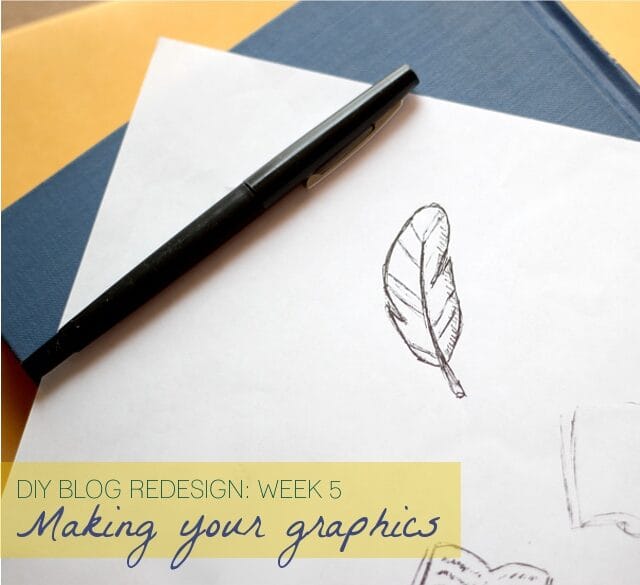
If you’re new to this series, it’s a 10 part event that happens each Friday – so if you haven’t seen the previous posts, I’d recommend you go back and check them out to be able to get the most out of this post.
Part 1: Discover your branding with “The Drawing Board” Printable
Part 2: WordPress vs. Blogger
Part 3: Design Tips + Design Worksheet
Part 4: Themes, Coding and Stylesheets
And now, today, part 5 – we actually get to start making graphics! Several people expressed an interest in learning how I turned my hand drawn illustrations into graphics for my site – so I’ll be explaining that, plus talking about using photography for graphics (which is the medium I am using for the graphics I’m making for Lori’s site) as well as tips that I hope you’ll find helpful for whatever medium you are using. Let’s jump in! 🙂

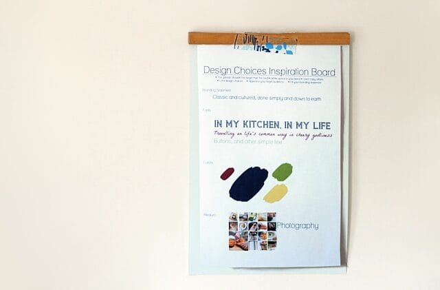
Alright – first step, pull out your branding printable from part 1 and review your target readership and branding statement; keep it in mind in every step of designing your graphics. And look back at your design worksheet from part 3 – remind yourself of your design choice limits (like your medium, colors, etc.) as well as the design tips I included on that sheet. Make sure you stay true to your design choices as you start making your graphics.
So, as I’ve mentioned before, my friend Lori from In My Kitchen, In My Life has kindly let me use her blog as the demonstration for doing this redesign and move to WordPress. The branding statement we came up with from her branding printable was “Classic and cultured, done simply and down to earth”. On her design sheet I chose colors, fonts and the medium of photography. I consider these choices to be the “paints” I have filled my design palette with – whenever I need to design something for her site, these will be the “paints” I will use.
Today we’re going to work on designing a header. After the importance of not having a background that overwhelms your content, I would say what you put in the header is probably the single most important graphic on your site. First impressions really do make a big difference – and the header is right at the top. The header is actually the whole area right there at the top of your page … and often people have a banner there, which is what I’m going to be putting on Lori’s site. As I mentioned above, I’m using photography as the medium for her design.
A few pointers to bear in mind while making your banner:
– make sure your blog name is large enough and easy to read
– consider including your tagline on your banner to help people know what your site it about right away, but if it doesn’t work on your banner, it is not a requirement
– don’t forget the previous pointers on the effectual use of white space – sometimes less is more
– make sure the main colors in your banner are colors from your design choices
– ask yourself “does this banner fit my branding statement?”
– look back at your branding printable and look at what you wrote that you wanted to be people’s first reaction to your site — and realize that the banner is probably the first thing they will see and react to on your site

So, the next step is to just start playing around. Admission: I am a graphic designer … but that doesn’t mean the very first draft of a design comes out fabulous. Don’t expect the first try to be perfect. Don’t worry about messing up. Just have fun and play around with your ideas! If your medium is painting, try some different techniques, maybe some that are messier, and some that are neater. If your medium is pen and ink, cover your papers with assorted drawings – you can always just crop out the ones you don’t want! If your medium is photography, like I am doing for Lori’s blog, try a variety of shots – different angles, different distances, different photography subjects. And just to show you kind of how it goes, here are an assortment of photos I took just to try out some different ideas for Lori’s banner.
Some rough draft photos:
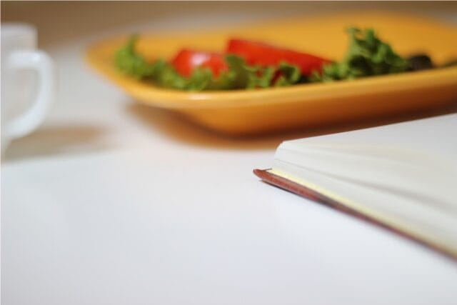

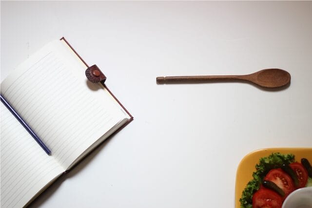
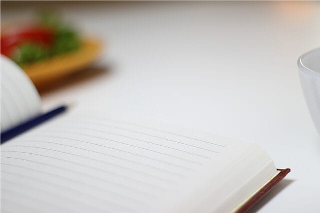
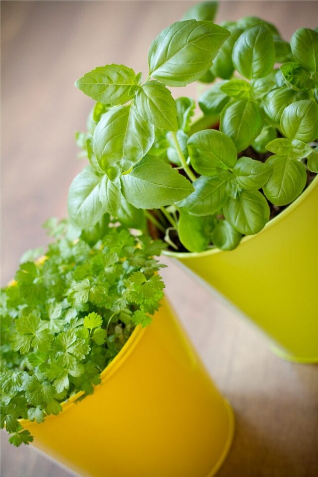
I wanted to take a photo of some basil and try that out, but I didn’t have any basil. Here is a tip if photography is your medium – try checking out some public domain photo sites. PLEASE bear in mind that just because a photo is on the internet, that does NOT mean it is public domain – even photos on the internet are protected by copyright and you can be sued for taking copyrighted photos. However, there are some sites where photographers choose to make their photos available in the public domain, which means they are no longer under copyright, and you can use them for both commercial and personal use. Just *make sure* the site states they are in the public domain – assume they are copyrighted unless the site specifically says otherwise. A good example is publicdomainpictures.net where they state that you can use their photos for person and commercial use for free – and I found a photo of some herbs there:
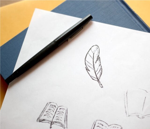
And, as I mentioned, I’ll also be showing how turn your hand-drawn illustrations into graphics … here is a sheet where I was sketching some images for graphics for my site:

So now we have a whole bunch of rough drafts – the sampling above is just a few of the many photos I took for Lori’s site and illustrations I drew for my site.The next step is to take those and enhance them into actual graphics in your image editing software. If you have Photoshop – great! If not … well, neither do I. It’s simply not affordable on my budget. However, there is a program called GIMP that is a completely free download from GIMP.org which I highly recommend. I’ll say up-front, it’s not the easiest program to learn. BUT, really, you don’t need to know how to do everything. I’ll give you a few pointers on some of the features … and even if you never learned anything beyond this, I think you would still find the program tremendously helpful. But chances are once you started using it, you’d learn more as you go.
First off, here is the explanation of how I take my hand-drawn illustrations and turn them into graphics. This assumes you’ve already drawn your art (like my feather you saw I drew, above) and have it in the scanner and the instructions are meant for that – but many of the steps and tools are useful for any type of image editing:
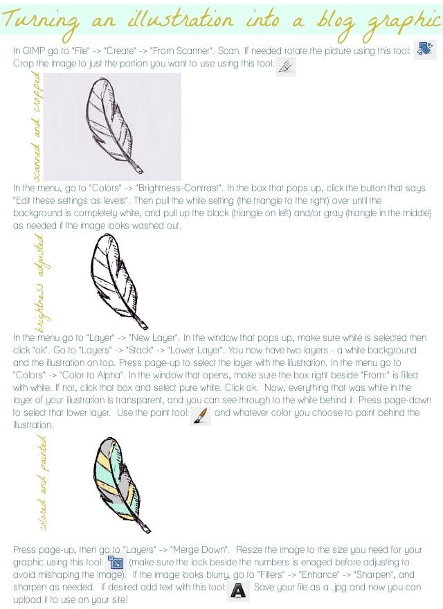
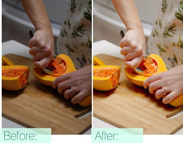
For photography, which is the medium I’m using for Lori’s blog, many of these tools are what I’m using as well. Be sure that in editing brightness/contrast that you click the “edit these settings as levels” button before adjusting anything, especially in photography. You probably won’t want to alter the levels quite as harshly in a photo as you would in a black and white line drawing, either. A couple other helpful tools for editing photography are on the “Color” menu: Color Balance and Hue/Saturation. As long as I’ve taken the photos in shaded natural lighting (for instance, taking a photo inside right by a window), these three (brightness/contrast, color balance, and hue/saturation) are usually all I need. See the difference these few can make? This is a lovely photo Lori had on her blog that I may be incorporating into her design that I touched up with these tools:
Plus, of course in a banner, you’ll use text overlay. Like I mentioned before – play around and have fun with it! Here are a couple banners I made to try out on Lori’s blog:
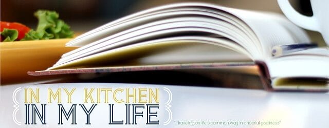

But in the end, I decided they weren’t quite working. So I started using the herb photo from the public domain site. This is a good example of where cropping can be effective. I really only used a small portion of that photo – and even then, I blurred out a significant portion of it to white so that the words would really pop. In the end, I felt this one best spoke to her blog and branding, and also represented her colors best. Here’s the final result:
Though, of course, that is just a smaller version there – you can see how it looks full size on Lori’s site by clicking here: In My Kitchen, In My Life.
Also, if you’re using WordPress and the theme which I recommended last week, you can click here for simple instructions on the code you need to put in to give your site a banner.
I hope you’ve found these tips and pointers helpful – and that you’ll have fun working on your new graphics!
What medium are you using for your blog graphics? Share your thoughts below, I love to hear from you!
To check out the next posts in this series, you can see them here:
Part 6: 7 Blog Layout Tips to Engage your Reader
Part 7: Blog Page: The Must-haves and the Panache
Part 8: 25 Tips for using WordPress

