Skip to content

Challenge

Photos & Descriptions: Your product in its best light

Well, we are on to week 4 in the Creative Biz challenge! This week we are going to be looking at a couple of topics that came up a LOT in the post where you all posted your creative biz questions: photography and descriptions. A few things have to be in place before really honing those two, though – you have to have a great product, know who your target market is, and be pricing to actually make a profit. Those points are what we have talked about in previous weeks, so now we’re moving on to product photos and product descriptions.

In both of these two topics remember this: you’re trying to use this medium to convey the essence of your brand in a way that is effective to your target market.

First off, let’s jump into photography. Here are 7 tips (and if you followed my blog design series, you’ll recognize a certain amount of overlap)

1: Excellent lighting makes more of a difference than an excellent camera
Your product photography isn’t going to be printed and hung on walls as art. Its primary purpose will be fulfilled in a relatively small online image. You don’t need a fancy camera with a huge number of megapixels. I took my product photos with an old point and click for a long time. Excellent lighting, though, makes a HUGE difference. Avoid using a flash at all costs. Use natural light – but not direct sunlight. Great places to find diffused natural light are near a window, or outside in the shade.

2: The garnish should not be larger than the food
Props/backgrounds/settings can really set the stage for your photos. But just like a beautiful plate of food, the garnish can help make it more appealing but shouldn’t overwhelm or distract from the main dish. Remember, props and backgrounds should be enhancing the visual appeal of your product, not distracting away from your product.

3: White space is your friend
This doesn’t mean you necessarily have to have a completely white background, but leaving some white or simple areas for the eye to “rest” can help your items really pop – as opposed to everywhere being busy or cluttered. You can also get the same effect by having the product in focus, and the background out of focus.

4: Do your own thing
Your shop photography is an excellent opportunity to convey your own signature branding and shop aesthetic. Don’t just base your photos on someone else’s photos; think about how you can portray your own unique style in your photos. This doesn’t mean you have to reinvent the wheel, though. For instance, there are plenty of shops modelling vintage clothing against a white background, and you can do that too .. but if your model is always wearing a bowler hat, that’s going to be unique and identifiable.

5: Limit your photography choices
It’s a good idea to not have a completely different background/style/setting in each and every setting. For instance, if you’re selling earrings, if one photo is of them hanging on a tea cup, one photo on a chalkboard background, one photo on red fabric, one photo on a model, one photo on sand, one photo on wood, etc., etc. – it’s going to be distracting and make your shop less cohesive. Not every background has to be the same, of course, but if you limit to just a few that convey the same style and use them repeatedly in your shop, it will help to convey your branding and style. This also really helps to keep cohesion when you have different types of products in your shop.

6: You aren’t trying to appeal to everyone
Focus on appealing to your target market with your photography. If your target market is stay-at-home mothers, don’t worry whether urban hip-hop teens are going to love your product photos. If you target market is 20-something guys who are into geekery, don’t worry if your product photos aren’t appealing to 40-something fashionistas. As a small handmade business your goal is appeal to a niche market, not to appeal to absolutely everyone.

7: Your photography should always reflect your branding statement
I recommend having a “branding statement” – a short phrase the encapsulates the style and message you want to convey through your shop. I made a free printable to help develop a branding statement – it was originally meant for blog branding, but much of it applies to shops as well: www.theflourishingabode.com/2012/07/diy-blog-design.html All aspects of your shop should convey your branding – your listings, your photos, your packaging, etc. I find this is easiest when you can actually state your branding in a single statement.

Now let’s talk a little about descriptions…

Writing descriptions can be a challenge, because there are a few different goals you want to accomplish with a description and they don’t necessarily always want to play nicely together. Such as…
– appealing to your target market
– including all the necessary details to compensate for the fact the viewer can’t examine it in person
– using keywords to boost your SEO
– conveying the unique value of your product
– communicating that you have other related items if this one if not quite what the viewer is wanting
– being succinct and easy to read

Online attention span is generally fairly short. Because there is so much information to convey in your description, I used to write reeeeeeeally long wordy paragraphs in mine. But when someone scrolled down from the photo to find huge chunks of text, it actually had the opposite effect of what I was wanting: if it felt like too much to read, the easiest response was to just leave the page.

I have since found the best friend of description writing: bulleted lists.

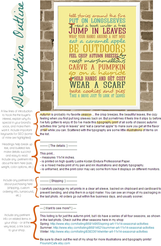
Of course, there a number of ways you can do an effective product description, but here’s a general outline that I use on my listings (such as the one below) and I hope you will find helpful:

For some more tips on writing item descriptions, you can check out this helpful article on Etsy’s Seller Handbook Blog.

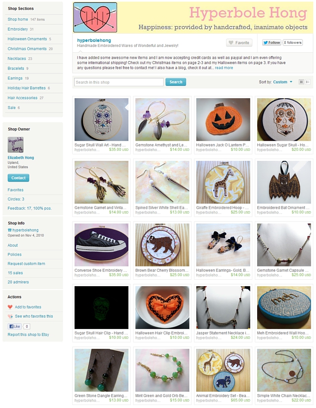
The critique this week is for Elizabeth Hong, owner of Hyperbole Hong. Here is what she posted in the critique request thread about today’s topic:

How can I make my items (through descriptions, photos, etc.) appealing to more people without losing my personality in the mix, or is sterilization a good thing

Thanks for the question!! Let’s take a look at her shop:

First of all, let’s take a look at some things she is doing well…

– Profile and About page: People like to learn about the person behind a handmade business, and Etsy recently gave a unique opportunity to provide this with the “About” page, where you can put up behind the scenes pictures of your process, information about you as an artist and more. Elizabeth has both her her profile and her about page filled out nicely, with interesting info and photos to give people a look into her creative process.

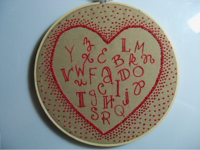
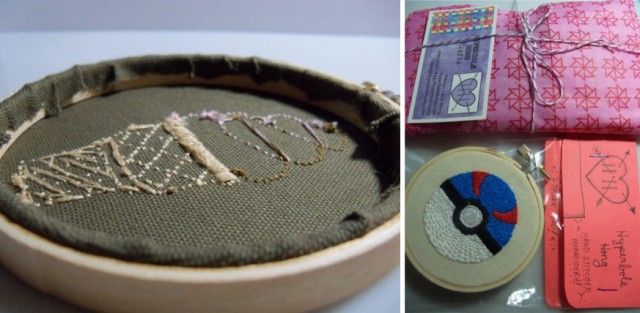
– Craftmanship: her items are look to be very well made. The embroidery in particular jumps out at me .. I’ve tried embroidery and mine never looks so good! :) Her eye for detail is clear in her work, such as the piece below.

– Secondary photographs: she is doing a great job of giving great visual information in the additional photo spots. Etsy lets you put up a total of 5 photos, so it is in your best interest to use all 5, and let each photo give new information. Since the viewers can’t pick up and turn over the item in their hands, use the photo spots to show them as much about the product visually as possible. For instance, she shows the backs of her embroidery, how she packages her items, and other great info in her additional photos.
Now we’ll move on to some things to improve:

– Finding the common thread: I know she mentioned “appealing to more people”, but really the goal isn’t to appeal to a wider audience, but rather to appeal more strongly to a narrow market. I love the eclectic-ness of her shop – from earrings with bows, to geekery inspired decor, to an embroidery piece based on a dress from Singing in the Rain. However, finding a common thread to the shop would be good, and how it ties together in appealing to her target market. She mentioned sterilization, and that is certainly not what I’m talking about – in fact it is the opposite, because the goal is to appeal just to her target market, not to absolutely everyone. I think it would be good to come up with some kind of phrase as far as what the shop is ABOUT and WHO it is that would be shopping there. For instance, the target market for the more formal looking necklaces is probably quite different to the target market for the Pokemon embroidery. (And side note here for Elizabeth – perhaps you have taken care of licencing and such for trademark names and such that you are using, but I wanted to throw this word of caution in here in case you haven’t … things like “X-box”, “pokemon”, “Nintendo”, etc. need to really be looked into as far as the legal side of things and whether you can use them. I know I get lots of requests for custom pieces in my shop that incorporate modern quotes that I simply can’t use due to copyright issues. So that is just a word of caution for you to be careful about the legal side of things.) But coming up with what the unifying theme of the shop is would be helpful in terms of branding and marketing it most effectively. The branding printable from my blog series might be helpful – it was intentionally designed for branding a blog, but could also be helpful in terms of a shop. You may find that you decide to focus on some items instead of others as a result of your theme.

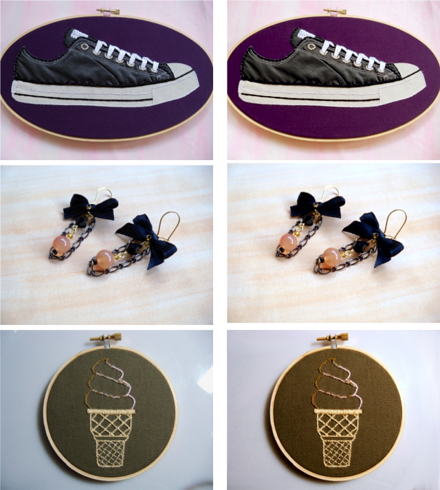
– Unifying your photography style: Once you’ve established the connecting theme of your shop, I’d recommend choosing one photography style to shoot all the different items. When you do have a variety of items, I think photography is a great way to tie them together. Think about your branding theme, and then I’d recommend choosing one or two backgrounds/settings that reflect that without distracting from the items, and use that to shoot them all. And the photography doesn’t have to be “sterilized” – you can put your personality into it! But I’d just recommend limiting the styles. Currently, I see some items in cups, some items on wood, some items on white, some items on a tree, some items on a jewelry form, etc., etc. Narrowing that down will help your shop feel more cohesive. As far as what background to choose … personally, since your items themselves have so much personality, you don’t want to distract TOO much with a competing background. If you use a white background though, you might think about brightening or touching up the color just a little in an image editing program. Here are a few that I think are successful in having a non competing background, and then I’m also showing the result of just a subtle adjustment in a photo editor:

I think these kinds of backgrounds really allow your items to pop – and ever though there is variety in those three items, they flow better with the similar backgrounds. I especially like that on the last two, we can see the entire item, even in thumbnail.

I think backgrounds you might want to avoid are the really bright/deep colored backgrounds (they are fun, but to the point of overwhelming the item itself especially in the thumbnail size image that people see in search results, and the item itself is what you want people to notice and remember) or the hair clips in cups (props should help reflect something about the item – since they were in cups, it looks like they are some kind of tea cozy or herbal sachet or something, to me, and it wasn’t until I started reading that I realized they were hair clips).

– Descriptions: I really like that you are conveying personality in your descriptions, and I think that is an excellent thing to continue. I especially like that you talk in the first person (“I was inspired to make this when..”), as that helps to drive home that these are handmade goods. A couple pointers, though, that might help you to be able to take your descriptions to the next level:
– Be concise but high impact: Keep words and sentences that pack a punch, put them higher in the description, cut out fluffier parts
– Put details in list form
– Have a description format that you use on all listings.

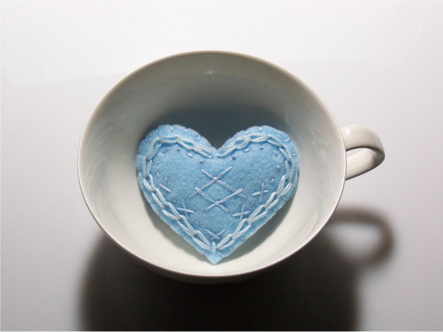
For instance, on this hair clip:

The description you have …

I love cute and unique hair accessories but it’s always so difficult to find something I can get excited about and something that can actually support some hair. That’s why I created this hair clip! I was in a creative rut when I designed these but I had a goal to come up with a hair accessory I could make for myself that would show off some embroidery but not look completely outrageous (well, maybe not completely), and I finally made this. I loved it so much I have made it in every color I have, so if this color isn’t to your liking please check my other listings.
This is a cute and frivolous hand cut light blue felt heart hand embroidered with matching and contrasting embroidery floss then filled with new poly fiber fill and blanket stitched closed. I then hot glue the slightly puffy heart to a metal hair barrette which is then stitched together for an added level of security.

I only use these metal barrettes because I feel they are the only option out there than can securely hold hair without slipping. If you are interested in a set please contact me.
Each item I make is handmade and because of this each one is slightly unique. This item is ready to ship and I usually ship in two days or less.
My embroidered heart hair ornament is approximately 3” x 2” at its widest part.

Everything I make is hand stitched, hand cut and hand assembled by me from my own sketches.

… could become (and I pretty much used words you already wrote, just rearranged)…..

This is a cute and frivolous hand cut light blue felt heart hand embroidered with matching and contrasting embroidery floss. I love hair accessories but it can be difficult to find something cute and unique that that can actually support some hair. That’s why I created this hair clip! The slightly puffy heart is filled with new poly fiber fill and blanket stitched closed, then both glued and stitched to a metal hair barrette for an added level of security.

More details on this sweet heart:
– it measures approximately 3” x 2” at its widest part.
– I use these metal barrettes for the back because they are so effective at actually holding hair.
– This item is ready to ship and I usually ship in two days or less.
– Everything I make is hand stitched, hand cut and hand assembled by me from my own sketches.

Want something a little different?
I love this style of hair clip so much, I made them in a wide variety of colors. Check out the hair clip section of my shop to see the other options: http://www.etsy.com/shop/hyperbolehong?section_id=10455263

That way it makes it easy for a potential customer to take in all the necessary info at a glance, but still conveys your personality – just condensed to the more powerful parts!

I hope this has been helpful for Elizabeth, and others as well! (By the way, Elizabeth, I am totally digging those earrings with black bows!)

Are photos and descriptions something you struggle with? Leave your thoughts and comments below! :)

One of the hardest parts of creative biz: Pricing

My apologies that this post is a day late! I usually stay up really late on Thursday nights (or stay up late into Friday morning would be more like it) to put up my Friday post. I must admit that sleep won over this week. Life has been crazy lately. (Although, is life ever NOT crazy and busy? I guess not.)

Anyway! On to this week’s topic for the creative biz challenge, which I think is one of the stickiest:

Pricing. It is hard to figure out how much to charge, especially on handmade items. Pricing feels strange because it is a reflection of how valuable an item is that we have made – and that can feel uncomfortable. I know when I first opened, I felt embarrassed to charge anything more than just the cost of the materials. But it’s even harder for one person to tell another person what they should be charging for their handmade items. Only the artisan know just how much time and effort went into each piece, how much they are relying on the income of the business, as well as other factors. But in the end, you ARE running a business, so you need to get your prices in alignment, or your business won’t be able to stay afloat.

Before moving forward, here is an important question for you: is your shop a hobby or a business? I’ll tell you something I haven’t told you before – at this current time, my online sales and business are our family’s only source of income. It is a short term situation, but even so, it means that my prices HAVE to be profitable. If your shop is just a hobby, and you’re not actually trying to make money from it, you’re going to approach things very differently. I want to make it clear at this point – I’m not saying that money is the most important thing *at all*. If you want to just keep it laid back and only pay yourself back for the supplies you use, you have every right to do that. My advice in this post, though, is for those who are looking to run a more profitable business and have it as a source of income.

I will say this – in general, handmade businesses (such as many of the ones on Etsy) charge prices that are far too LOW. If you are trying to price in competition to the prices you see in stores, like at a department store, you are pricing too low. You (most likely) do not have employees, machines, or the ability to mass produce. Don’t try to price in competition with a company that has those things. They can afford to make a small amount of profit per sale, and rely on the fact that they are having a huge number of sales. Your strategy should not be the same as them. If you are a one of kind, uniquely crafted, artisan brand, then price accordingly!!

Here is one litmus test that I feel can help you gauge whether your prices are high enough: businesses expect that when they place a wholesale order, that they will be paying only 50% of retail price. Suppose a company contacted you with interest in placing a wholesale order. Look at the items in your shop – if you charged wholesale price (half off) for a large order from your shop, would you still be making a good profit? If not, your prices are too low.

Also, realize that people expect the value of the item to be reflected in the price. When I first opened my first shop selling jewelry, I had people flat out say they wouldn’t buy from me because my prices were so low they just assumed I had a low quality product. That may sound harsh, but it is good to know! I put a ton of work into each piece, handcrafting even the beads themselves, but the price did not reflect that. So people assumed that it wasn’t a quality product. Think about it – if you went in to a painter’s gallery, and there was a large original oil painting for sale for $5, what would be your thought? “What wrong with it? Is it actually an original? This can’t be what I thought at first – the price is too low.” If you have a quality product, reflect that in your price. Buyers who want to buy handmade items are looking for quality, not cheap disposable items. They expect to pay that price.

And if you have buyers who are wanting to only pay cheap prices, like you might find at a discount store, you need to find a new target market. You reach out to different target markets with different pricings. Let’s face it – very few of us are selling necessities. We are selling luxury items. Right now, I am on a tight budget. I can’t buy a lot of luxury items. Right now, I am probably not your target market. And that’s fine! I’m not entitled to your products. You should be pricing for who IS your target market – people with disposable income. People who can afford luxury items. I remember one of the Etsy admin making a good point – if you want to get a good idea of your target market, it is someone like you, but who has a lot more money. Price with that in mind.

You might be afraid of sales going down by raising your prices. Interesting tidbit: when I raised my prices, my sales have gone UP, not down. But even if your sales went down – is that always a bad thing? That may sound strange, but stop and think about it. Let’s say you have 5 sales this week at $10 each – that is $50. Now let’s say you raise your price to $20 next week, and your sales drop to 3 sales that week. That is $60. It is fewer sales, but higher profit. Plus, it is less work for you to make/list/ship 3 items than 5. I know it’s easy to gauge your shop by how many sales you have, but really that is not the test. I’d rather have fewer sales at higher prices so that I can actually keep up, than to have TONS of sales, but not making much profit and working myself to the bone.

Ok, but let’s get down to some brass tacks. On what should I base my price? Here is a formula that I’ve heard before, and while this is by no means the right formula for everyone, check this out just for kicks …

((hourly wage x hours spent) + cost of supplies) x 2 = wholesale price

wholesale price x 2 = retail price in your shop

And let me not this: your hourly wage should NOT be just minimum wage.

Now this is just a loose formula, not an exact science, and you very well may decide not to go with the final result. It isn’t the formula I personally use, but it is an interesting guideline. You may judge that it doesn’t work for you because maybe you work very slowly so the hours are inflated, or you may realize the market just won’t bear the final price. BUT I hope at the very least this will give you a little sticker shock in a good way: you should probably be charging more than you are right now. At the very least, even if it is not double like in the formula, I’d suggest that you make sure your wholesale price is more than covering just your expenses (paying yourself and your supplies cost are EXPENSES, not profit) so that you could do wholesale profitably. And then your retail price (the price you charge in your shop) should be double that.

Ok, now it is time for this week’s critique. Here is the question that Olya from OboCreations posted in the opening thread:

“the topic i suggest is a challenge of a turning a hobby to a business. how do i combine it with my daily job and compete with those who are doing full time?. They can devote 8-12 hours per day to Etsy shop vs me spending this doing other things. Seems a catch 22 – to quit my job i need my business to pick up – yet how to do that if all i have is the night? one of the aspect is setting priorities and here comes the question of what they are. As a small business especially as starter you face the need to address so many different aspects – set up online shop, make description, photos, SEO, dig into forums, promote, get social media, make packaging, find bloggers etc etc etc. So remembering i only have few hours before i collapse to sleep – where should i start?”

I think a huge part of the answer to her question is today’s topic: pricing!

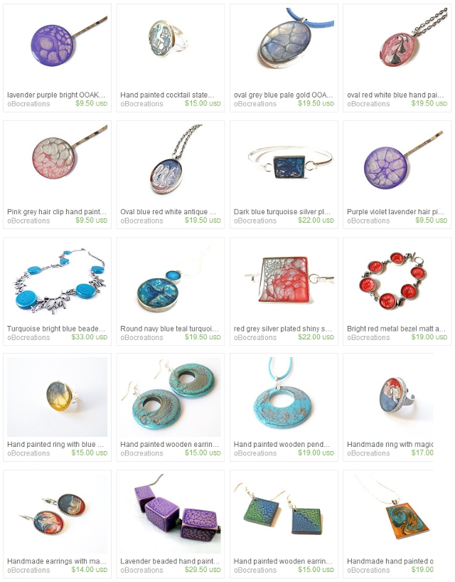
Let’s take a look at her products:

Ok, first of all let’s point out some things Olya is doing well about…

Listings: She just opened her shop this summer, and she already has 100 products listed. This is absolutely amazing!!! One huge thing to have a great shop is having enough listings to be able to be found easily in the search and to have enough variety to offer visitors to your shop enough options for them to be able to browse through and choose from. So you are far ahead of the curve on this one, Olya, nice going! In fact, if I were you, I probably wouldn’t add more listings until I started to see how sales are going to do on your product. But the fact that you’ve been photographing and listing that many products is amazing – nice going!

Policies and Profile: You have them both filled out, which is great, and I especially appreciate your very clear policies and info on what to expect since you are shipping from Switzerland. Very, very helpful, especially since most buyers on Etsy are from other countries, so that is very smart to have all that information, well done.

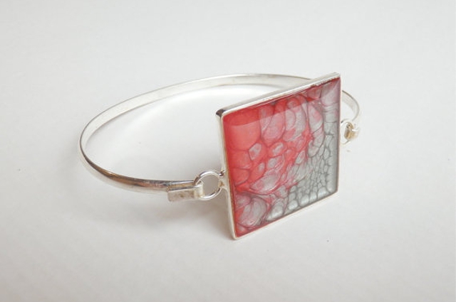
Photos: Your photos are so crisp and clean and look absolutely catalog worthy! They look really professional and clear to see the item. Being able to fully and clearly see the item is of utmost importance in product photography, and you’re doing a great job of that. On the (possible) downside, that catalog look is something people already see a good bit, especially in jewelry, and can also come across as very sterile. Since jewelry is SUCH a saturated market on Etsy with SO many jewelry sellers, it can be hard to stand out. I used to sell jewelry, and it was hard, I know! The style of photography is one thing you can use to help differentiate yourself. Maybe in the future you might think about modeling some jewelry or play around with conveying your branding in your photos? But in asking where to start, you definitely don’t need to do anything like that first because overall your photos are very impressive. I especially like when you leave them not quite so whited out in the background, like the one below. Great work on photography!!

Descriptions: I really like that in this listing on the above bracelet you drive home the handmade nature of it in the description: “This cute Silver colored shiny brass metal bracelet is hand painted using my very special technique. I have used silver grey and red color and let them interact and mix with one another to form this lovely shade and magical pattern . On top the artwork is covered by a high gloss top quality jewelry resin. It protects end enhances the image making it look almost 3d.” Knowing that kind of info is SO important. There are a huge variety of jewelry sellers, so this unique and very handmade technique is very important to emphasize. I think it is important to make that clear in all your listings. On Etsy, it is perfectly acceptable to purchase an already made pendant and use it in the jewelry you make. But since you’re going a step further and painting the pendants yourself, you want to make sure people realize that! Also, watch out for capitalization. Starting sentences off with lower case letters, or using “i” instead of “I” in your description can make it feel less professional. It is one of those things that may seem little, but really can make a difference.

And now, an area to improve:

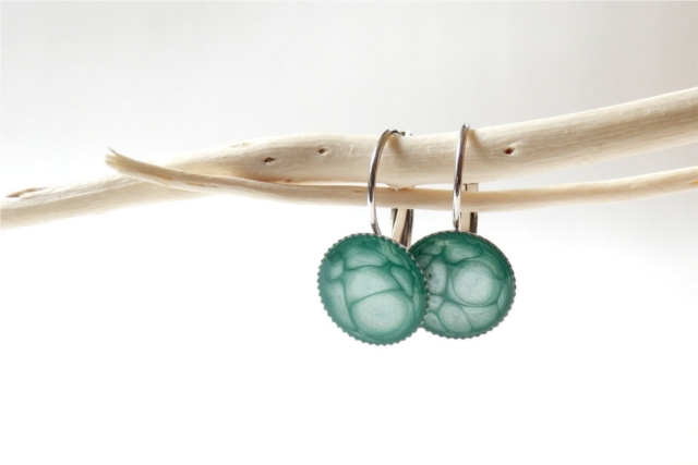
PRICES!!: Now, not being the artisan myself making the jewelry, I can’t tell you exactly where you should be pricing your items, but I DO think they are under priced. For instance, these earrings are $14:

I can go to the mall and easily find a regular pair of earrings for $14, and they are not hand painted originals from a jewelry designer in Switzerland. Your earrings are!! I think your earrings deserve a higher price tag. If I were to put your price into the formula backwards … Your retail is $14. That means your wholesale is $7. Which means $3.50 is what is there to cover paying you and your supplies. Not to mention Etsy and PayPal fees, which will add up to about another 50 cents. Basically, it doesn’t seem like you’re making much, if any, profit. So if you’re looking for advice on how to go from hobby to business, especially since your time is limited and valuable – make sure you charge for your time! Take a good look at your prices – if your shop suddenly sold out tomorrow, would you have enough money to repurchase all the supplies you would need AND pay yourself to do all the work to restock your shop – AND have also made profit? If not, then you need to start by figuring out a pricing structure that will be actually workable business-wise. If it wouldn’t be profitable for that to happen in one day, it is also not going to be profitable for that to happen over time. So once you’ve figured out what WOULD allow you to make a profit, then try out those prices in your shop for a while. Like we talked about before, make sure you drive home the value of the product in your descriptions, highlighting the handmade nature of the jewelry, and maybe tweak somethings in your shop to reflect a higher end price tag, like maybe a banner that is less cutesy, and work on marketing to your target market. But if you find the market won’t bear those prices, it might be time to look into tweaking your product, like we talked about in the first post of this series. Because if you’re trying to make the switch from hobby to business, you need to get paid for your work at a level that actually is profitable, not just covering your costs. Especially considering it doesn’t sound like you have a lot of extra time you can just pour into this!

Anyway, I hope that has been helpful, both for Olya, and for any of the rest of you who are running a creative biz. I know pricing can feel sticky and hard to figure out, but it needs to be figured out if you want to go from hobby to business.

I told you some of my early pricing woes and mistakes – do you find pricing easy?

Your target market: Who and where are they?

So let’s say you are selling crochet doilies. Should you be marketing to young urban men? Um, let’s go with NO. A hugely important part of running a successful creative business is understanding your target market.

So, we’re going to talk about who your target market is and how to find them, as well as doing a shop critique of one reader’s shop! But before we get into figuring out all of that … why is it so important to know your target market?

In the questions you asked me in the opening post, a lot of people asked “how can I increase views and sales”? What is the different between those two? Let’s say for a moment I had a guaranteed way that for $10 you could get 5,000 views tomorrow, but that ALL of the views would come from 12 year old girls who love horses, listening to whatever is the current top 40, and glitter. Some of you might find that to be a great opportunity. Others of you might be thinking, “5,000 views in one day would be nice … but I don’t think they would be into what I’m offering”. Or here is another scenario – let’s say you could get a celebrity endorsement of your product, and the options were Paula Deen, LeBron James, or One Direction. Your choices reflect the importance of knowing your target market.

You need to know who you are marketing to in order to be able to market to them effectively.

We can talk about marketing, photography, views, etc., etc. – but if you’re trying to market pearl necklaces to bikers, or photographing baby hats on adults, or getting views on your photography only from fellow photographers who prefer their own work anyway – it’s not going to do much good, because you’re appealing to the wrong crowd. Yes, you want to make your shop more appealing and draw people in … but you want to make your shop appealing to and draw in the people who actually want to BUY your items. Would you rather have 800 views where only 1% of the people buy, or 300 views where 50% of the people buy? Your target market is the people who actually want to BUY from you.

So you want these people to buy from you. How do you make that happen?

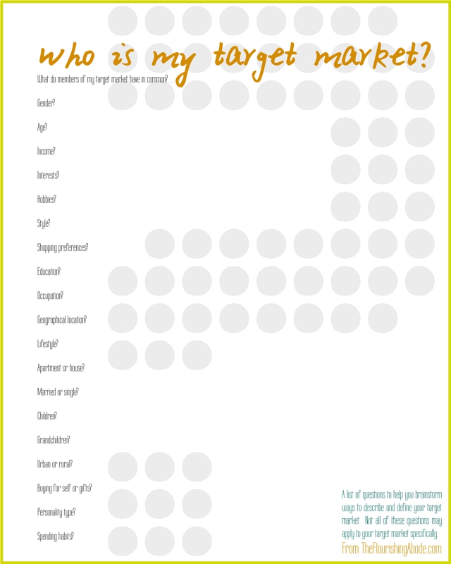
Step 1 – define and describe your target market. And no, just saying “women between the ages of 20-50” isn’t enough. That describes waaaaaaaay too broad of a group. That could cover a new grandmother, and an indie singer/songwriter, and a stay-at-home mother of 5, and a college fashionista. Those four people all will have very different buying habits. When figuring out out target market, you want to narrow down much more than that. Here is a printable list of questions – not all of these may shed light for every seller, but hopefully this will get your thoughts rolling:

Once you have a good feel for who your target market is…

Step 2 – find and appeal to your target market. There are a variety of ways to appeal to your target market: firstly through your product itself (like we talked about last week), as well as how you do your product photography, through your descriptions, through the style of your shop as a whole, and through the price of the product (and this does NOT necessarily mean a low price). Those various topics, though, are all ones which I will be devoting an entire post to in the future, so in this post we’ll be focusing more on FINDING the people in your target market.

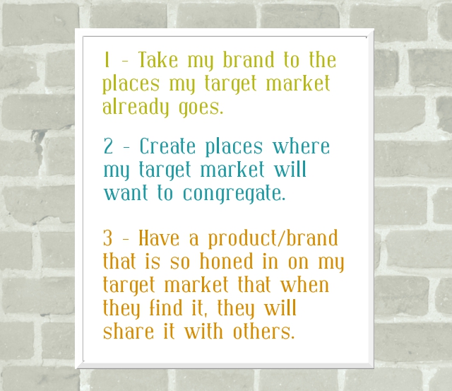
I have three basic strategies when it comes to getting in touch with my target market:

So, firstly, finding the places where my target market already goes. Personally, this why I sell my prints on Etsy rather than on my own site. If you are running a creative business, probably one of the features of your target market is that they like to buy from small/handmade businesses. That target market is shopping on Etsy, and other such similar sites. But, of course, that is still too broad, so even within Etsy you need to be seeking your target market. Think about how your customers actually search. Will they be searching “chunky cobalt knit neckwear” or will they be searching “blue scarf”? If your target market is trendy, and cobalt is a trending color, then you’ll be more likely to include that in your tags/titles. If your target market is less trendy, then blue will be of more value to you than cobalt. In general, make sure you have the more simple terms covered first right at the beginning of your title, then move on to more specific terms that are helpful, but probably not as often searched. Make sure you use ALL 14 tags on your listings, and fill them with words and phrases that have meaning to your target market. And, as we will talk about in later posts, make sure your photos are styled in a way that your target market will be drawn to them.

But even if you are only selling on Etsy, that doesn’t mean Etsy needs to be the only place you are seeking out your target market. Think about other (and non-commerce) sites where your target market is already gathered. Some of these would have some cost – for instance, taking out an ad on a website that your target market likes to visit, or do a giveaway on a blog your target market likes to read, etc. Some of these wouldn’t have to cost any money at all – for instance, you could join a forum that your target market uses and include your website in your profile there if that is allowed, or do a guest post on a blog your target market reads, etc. Yes, it takes time to find these places, and it is different for every target market.

Side note here – One thing you should not do is spam. Each of your reading this may have very different target markets, but I will tell you one thing that I know about your target market: they don’t like to be spammed. Think of it the same way as if your target market was all hanging out in one coffee shop – would you run in, yelling at the top of your voice about your products? Or would you put a flyer about your products on the bulletin board, maybe ask they cafe if they are interested in carrying your items, etc. Behave the same way online.

Ok, moving onto part 2 of my strategy: creating places your target market would like to congregate. I think this is most easily done with a blog. A blog allows for much more interaction than a shop alone. Plus, with a blog, you can offer highly valueable content for your target market for free – and that will draw them in. I think it was Mayi Carles who first enlightened me to this: a good way to come up with blog content is to ask yourself, “What problem does my target market face?”, and then post ideas and solutions on those topics. Is your target market made up of stay at home moms? Post family friendly recipes, home organization tips and activities to do with kids. Is your target market made up of outdoors-y types? Post camping how-to’s, tips on what to pack while backpacking, or give instructions for your favorite trail mix. Posting about topics that your target market will find helpful – and clearly linking to your shop on your blog – can be a great way to get in touch with your target market.

And the third part of my strategy: have a product and brand that appeals to strongly to your target market that they want to tell others about it. Like we talked about last week, having a really strong product is so crucial. But once you have a really sellable product, and a good feel of your target market, and put in some work to start getting in touch with your target market – the good news is that the internet offers soooo many ways for people to share the things they like. Pinterest, Tumblr, Facebook, Twitter, etc., etc. Word of mouth is such a great thing, and when your target market starts spreading the word about you, things can really take off. The thing is – that doesn’t necessarily come easy to get to that point. It takes a lot of work of experimenting with your products, as well as studying and finding your target market.

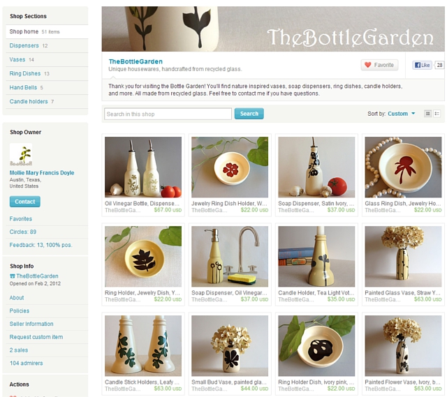
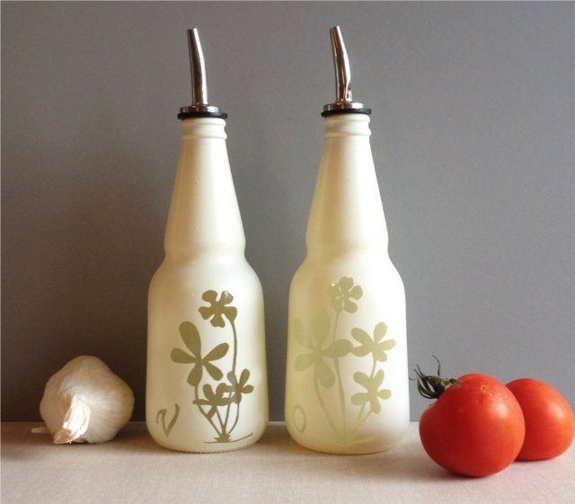
OK! Enough of general discussion, let’s go ahead and take a look at one of the shop owners who asked specifically about target markets. It is Mollie Doyle, owner of the shop The Bottle Garden – take a look:

First of all, let’s point out things she is doing really well on:
-Photography. WOW. These photos are just absolutely gorgeous. The photos have a great ambiance without distracting or competing with the items themselves. The items really stand out, which is great. Also, there is a great cohesiveness to the shop as a whole, with all the items being photographed in a similar way. Gorgeous photos, Mollie!
-Profile. If you browse her shop and visit her profile, she has some great info there on what she does, written in a friendly and interesting way .. this is a great thing to have in a shop!! People who buy handmade love to know something about the person behind the shop.
-Policies. Filled out, clear, concise, and professional, which is exactly what you want. People are less likely to buy from a shop with no policies … or policies that leave them confused or uncomfortable.

And a couple things that are good, but might be tweaked:
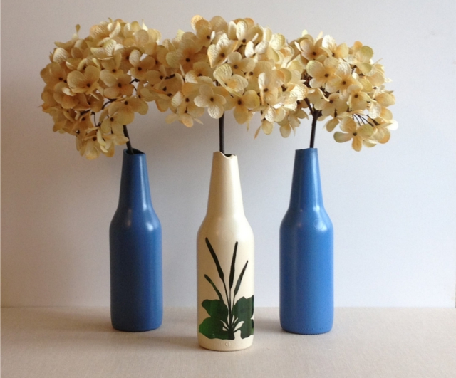
-Descriptions. With a name like “The Bottle Garden”, and with the beautiful products in your shop, people are naturally going to be curious about your work – what you did and how you do it. And I don’t mean giving away trade secrets or anything, but along the lines of what you shared on your profile page … that these are recycled bottles and the neat things you have done to transform them. I really like how you put some of that info right at the top of this listing:

…where you wrote, “I designed this bud vase with a smooth broken edge. The top of the glass was carefully broken to create curves and then polished smooth.” That gives some great insight into the work you put in on these pieces! That kind of info is so valuable to a potential buyer. I know you mentioned price being a question – we’ll be getting into price more in a future post, but the more you make it clear the work that goes into each piece, the more likely people will be to pay a higher price tag. Also, in terms of searching, having really relevant words like “recycled” right near the top of the description would be great. I’d encourage you to start of each description talking a little about what it was you did to the piece, a couple sentences, and sprinkle in good keywords. That will be good in terms of people searching, as well as the top part is what the most people will actually read.

And lastly, a couple things to improve in, especially with regards to today’s topic:
-Target market. Really take some time to think about who you are trying to sell to – look at your beautiful products and think about who it is that would be buying this. A couple things jump to mind as I look at your products – because of the recycled nature of your products, the eco-conscious go-green demographic is one that I think would be a great fit for you. Another angle you could look at is the home decor aspect. Think of women with beautiful houses who enjoy decorating them with unique and quality items, and how much they would enjoy your items. Combine those two, and you’re definitely getting into a niche market! Green home decor is a topic I see around the web quite a bit … in fact after a quick search, I found this list of Top 50 blogs about Green Interior Design … sounds to me like 50 places where your target market already is! I’d suggest looking into pitching your products to relevant blogs – you’ve definitely got the great photos that blogs like that love. Also, if I were you, I’d tweak the tags and titles to involve more terms that pertain directly to your target market. Things like “eco friendly”, “go green”, “eco conscious”, “upcycled home decor” “up cycled” (different spellings are good to cover!) “green interior design”, etc. Monitor your stats to see which terms are bringing people in, and tweak as needed. And, of course, if you find that “eco-conscious women with expendable money for home decor” is too narrow, you can always try marketing to the eco-friendly sector more broadly, or to those interested in home decor and housewares, whether green or not.

A couple other ideas for getting found – have you considered joining an Etsy treasury making group? Having high quality photos is a prerequisite to the groups that give the best results, and since you have that, you might want to go for it. Teams like that do have a time comitment, so you’d have to weigh it. I used to be on several treasury teams and while I was doing that, I made it on the front page of Etsy quite often. Eventually, though, I grew to the point that I was bringing in my own traffic and the time commitment was just too much. But it can definitely be a helpful way to network and grow when you’re starting out. Same thing with social media, or if you would want to consider a blog – you have to weigh which ones are really beneficial and useful to you. We’ll be talking more about social media and such in more detail in a future post.

Overall, Mollie, GORGEOUS shop! I think it’s just an issue of really honing in on your target market and starting out seeking them where they are, in the Etsy search terms, on green design blogs and so forth. Good luck!

I hope this post has been helpful for Mollie and for others as well. Are you trying to figure out your target market too? Have questions or comments about it? Leave them below, I love to hear from you!

The Question No One Asked – Creative Biz Series

It’s time to kick-off the creative biz challenge! WooT! Thank you to all of you who volunteered to have your shop critiqued and posted your questions – it was great to have so many options. And of course while I won’t be able to do everyone’s shop, I hope that the critiques and the information in this series will be valuable across the board. And really, I think that won’t be too hard – everyone asked pretty much the same things! It broke down easily into just a handful of categories. But there was one HUGE topic no one really asked about at all … and that did surprise me. And it is the topic we are going to be taking about today. I’m curious if it jumps out at you…

All great topics, of course! But does anyone else find it interesting what is NOT there? What is the big whole section that no one asked about?

Products.

Our creative business products – the core of running our own small business. Now, of course I didn’t expect anyone to ask “what should I be selling?”. No one knows better than you what you are capable of making. And perhaps it is because of the more personal nature of choosing what products to sell that caused it to not be among the questions, and I understand that. There are a wide variety of product questions that are good to investigate, even just on your own. For instance, “Is this product marketable?” or “Should I consider adding a new line of products?” or “Should I discontinue this type of item?” … I know these are questions I had to consider seriously.

I don’t know if you know this, but I actually had two Etsy shops before my current one – both of which did only so-so. The first, at the end of a year, had only about 40 sales. The second shop, at the end of its first year, had about 75 sales. But once I decided to focus on this third shop, and close down the previous two, I had over 300 sales in about 3 months. What changed? Primarily, product.

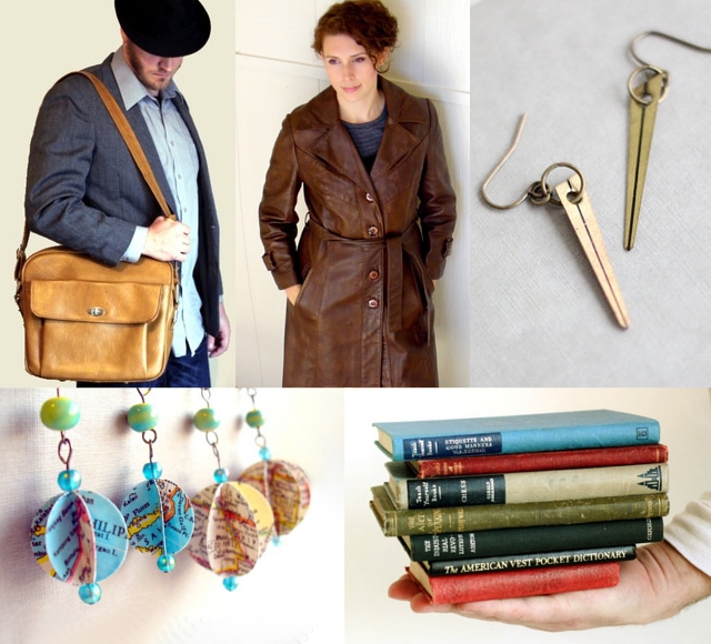
And I’ll say this – I really did like the products I had in my previous shops: jewelry which I made from books pages, maps and clock parts, as well as vintage clothes and various other items. Here is kind of a sampling:

I liked it a lot! But even with promotion, marketing, tweaking descriptions, etc., while the products were selling, it was at a very slow pace. I started to let some products (like my sewing) go fairly early, while others (like handmade jewelry) I kept longer. But it was only because I was experimenting with different types of products that I finally stumbled on what started to really blossom and sell quickly (my art prints)- and that is what I now sell in my shop, FlourishCafe.

At this point you may be thinking, “Well, but I don’t have the time or know how to make a bunch of completely different products!” They don’t necessarily have to be in such a wide variety of categories. My friend Danielle, for instance, owner of the fabulously successful shop The Merriweather Council, has had a HUGE number of sales in her embroidered initial necklaces. Her shop did well, even from early on, with great photography, beautiful workmanship and everything else. But she didn’t start out selling the necklaces. I remember she sold her sewn buntings and there was more emphasis on her wishbone embroidered hoops at that time. And she has stayed within her field of sewing and fiber art and embroidery and added this new product of the embroidered necklaces … and her sales took off even more! Those necklaces even made an appearance on the Today Show. So you can stay within your field, but still come up with new products until you find what really sells well.

I’d say the majority of you who posted question have had somewhere in the range of 10-50 sales so far. We’re going to be talking a lot in future posts about aspects of how to approach marketing, getting traffic, target market, pricing, etc. … but the very first thing I want you to think about is your product. It might be a good product, like I had in my first two shops. The thing is, there are lots of good products out there that don’t sell very well – and that is what happened to me initially. But sometimes you have to let go of something good to move on to something great. You want to have a GREAT product, something unique and that has a direct target market. Because, after all, you will have a much easier time marketing if you have a highly marketable product. And, again, it doesn’t necessarily mean you have to leave the type of category of workmanship you are in – but you might consider launching a related, but new, line of products.

It may take some experimenting to hit on what works, but once you find that niche, the rest of it is much easier. I’d suggest, if you’re considering a new product, start out in small amounts at first. Don’t list hundreds of a new product, only to find out people aren’t really interested in it. Perhaps try a few different types of things (especially if they are related somehow) and list them, at least enough to fill one or two pages – and see what sells. If you find that the handmade dishcloths are selling well – then make and list more. If the crochet key rings aren’t getting many views or any sales, realize it might be time to let that go and try something else. Especially in the early stages of running a shop, I think it is good to do a lot of tweaking and experimenting to find out the market’s reaction to your products.

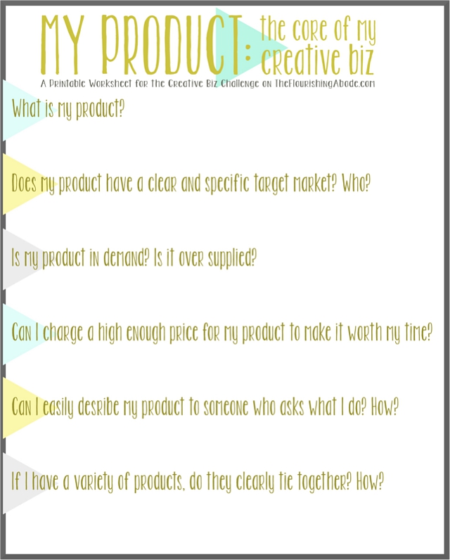
I’ve made a printable to help you think about your product….

And many of these questions tie into the topics you asked about in your questions – but I want you to look at them a little differently, and think of them in terms of examining your product first. These six questions will also serve as a loose guideline of the types of topics we will be looking at in future weeks of this series (for instance, this week was the first question – next week will be about your target market, as mentioned in the second question). I hope this will give you some good opportunities to brainstorm about your products, and consider whether you want to tweak them – or if you are happy with the product you have.

It is my plan, as I mentioned earlier, to offer a critique each week on the particular subject for that week. This time, though, since no one asked any questions about products, I feel it would not be my place to critique that subject in particular. I hope the printable and the points mentioned in this post can help you do a self critique this week — and I’ll plan to make up for the fact that I didn’t do one this week by doing two critiques in at least one of the future weeks. All of the rest of the topics are ones that various people asked about specifically, so there should be no shortage from now on. :)

I hope this has been helpful to you, though! What is your product? Do you ever think about branching out? Or letting a certain product go? Feel free to share some answers from your brainstorm sheet – or just your thoughts in general! I love to hear your reflections on these things. :)

And the winning topic for the next challenge is…

Drumroll, please…

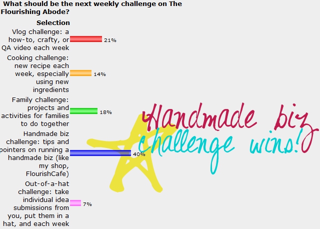
So, the winner of the poll I put up for you to be able to vote for the next challenge is finished – and the Handmade Biz challenge is the winner! I think the timing of this is reeeeally good, because if you have a crafty or creative business, right now is is when you should really be putting work into your shop to be ready for the holidays. I’m planning for it to be a 6 week series, which will take us right into the beginning of November. In the last challenge (the blog redesign challenge) I used Lori’s blog throughout the whole thing to demonstrate how to make some changes. I won’t be making direct changes to anyone’s shop in this series … BUT I think it would be a lot of fun to offer this to any of you who have an online handmade business:

I will be giving individual shop/site critiques each week in the series!

Each Friday, I’ll be addressing one particular aspect of running a your own biz – and also offering a critique of one shop/site, addressing that topic specifically. And I’ll pick a different shop/site each week. The tips, just like in the last series, will be directed at that site in particular, but I’ll also be writing it for others’ benefit as well.

Soooo – if you have your own creative biz (such as an online handmade goods shop, or vintage clothing shop, or website where you offer services, etc.), fill out this simple form and I may pick your shop for the critique one week! And, of course, I’ll give a shout out to your site to send you some traffic, as well. Just copy + paste this into your comment:

My name is:
My business’ name is:
My business is about:
My Website is:
One or two particular areas I would like to learn how to improve in my biz are:

Leave your comments below, I can’t wait to check out your sites! :)
Vote for what the next weekly challenge will be!!

Ok! So it’s time to start a new weekly challenge. I’m excited! This has become a feature here on my blog, that Fridays are the day I post my “weekly challenge” post. Basically, I set a goal of something I have to do every week for about 10 weeks, and then post about it here on Fridays. I’ve done three challenges so far…

The first challenge was the Adventure-a-Week challenge, where each week I had to come up with a new family-friendly out-of-the-house under-$10 activity each week. Next was the “Hack Challenge”, where each week I had to take some random object and upcycle it into something new. And the most recent, which we just finished last week, was the “DIY Blog Redesign” challenge, where I took one reader’s blog and did a complete makeover in 10 weeks, each week offering tips and tricks on how you can do you own redesign as well.

But now it’s time for a new challenge! And I’m going to let you choose which challenge I’ll take. Maybe this one I’ll make into a link-up challenge too, so that if you want to take on the same weekly challenge on your blog, you can post your links here each week. We’ll see – let me know in the comments if that is something you would like. :) But firstly, here are the challenge options on the table:

What should be the next weekly challenge on The Flourishing Abode?
  
pollcode.com free polls 

Alright, start voting! If you like the idea for the last one, you don’t have to leave your individual ideas today, I’ll do a separate post for that if it wins. I can’t wait to see what you decide! I’ll leave this post up for a week, and announce the official new challenge next Friday. So vote for which one you’d like to see!

7 Ways to Promote and Market Your Blog

Well, this is the last week of the blog redesign challenge! Next week I’ll be putting up a poll so you can vote on the next challenge … always fun to start a new project. :)
It was really interesting on Monday’s post how many of you mentioned marketing and promoting as being something you have questions about – because that happened to be related to what I was planning to write about for the last post of this series! Now, this is by no means a comprehensive look at the subject … these are just a few tips, primarily related to promoting your blog. Because, now that we’ve reached the end of this series and you may have a fabulous and newly redesigned blog, you want people to see it! I hope these tips and tools will be helpful in getting in touch with your target audience. The “7 ways” are 7 external websites that you can harness to help promote and/or market your blog, and I’ll be offering tips on how to use each one to benefit your own site.

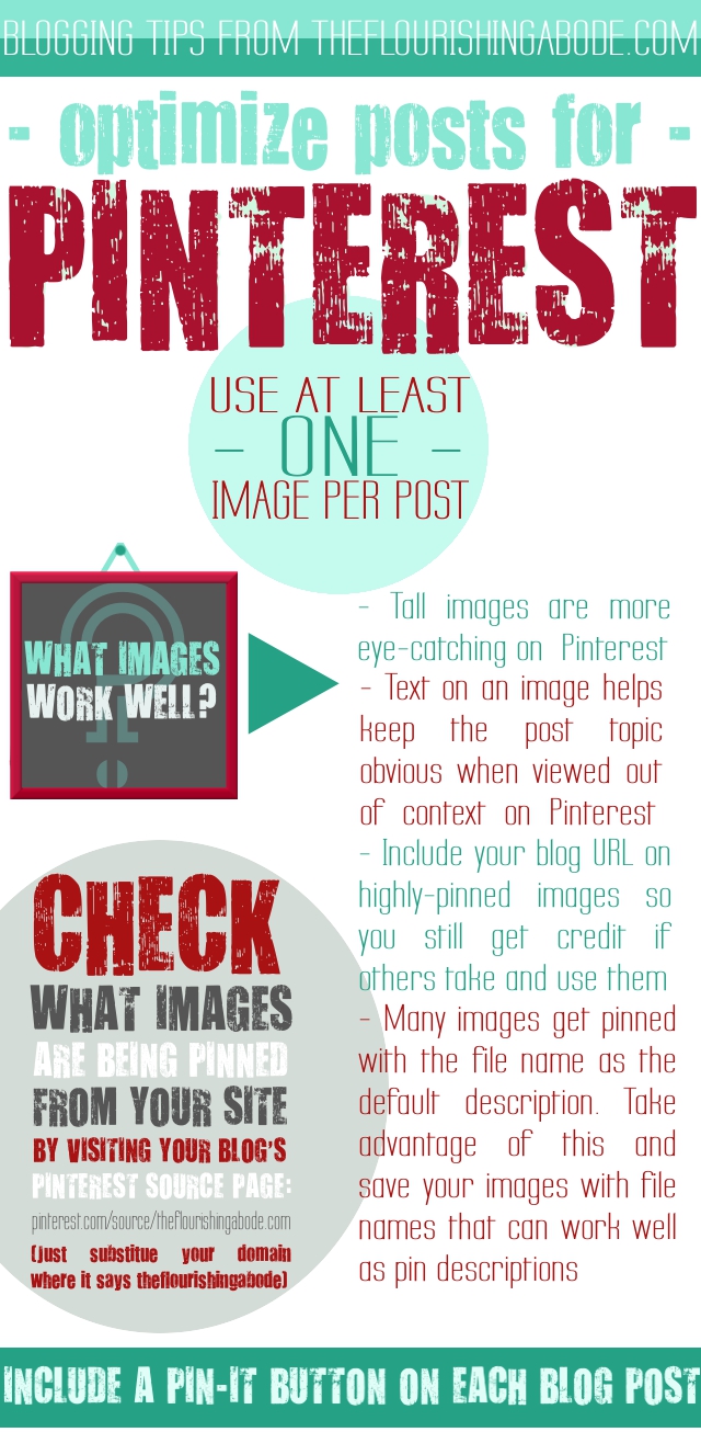
Ok, so #1: Pinterest! On my blog, Pinterest is a HUGE source of traffic for me. And I feel the best way to use Pinterest to help your blog grow is less about getting your own followers on Pinterest than it is about making your posts as share-able for your readers as possible, because Pinterest is like visual word-of-mouth. Here are some tips on how to make your posts very Pinterest-friendly … and, as is only fitting, I included all the Pinterest tips in a very pin-able image. :)
On to tip #2! Blog-following sites. There are sites out there that are specifically made to help people discover and follow new blogs. One such site is HelloCotton. It specifically is for women bloggers, and if you are one, I highly recommend submitting your blog to their site so that people can follow you there. I’m a big fan. And there are other blog-following sites out there as well. Make sure your blog is there to find! And one thing I love about HelloCotton (as well as some of the others), is that followers are notified there of new posts, but are actually directed back to your blog to read the posts. Spiffy! :)

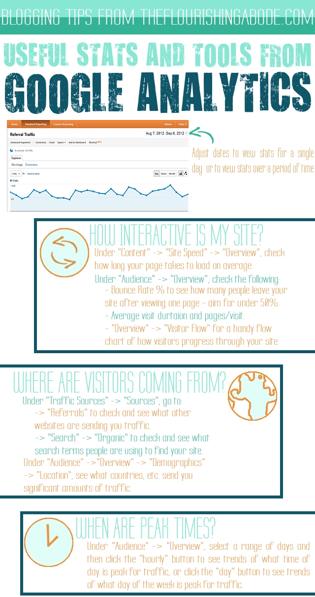
Now for #3: Monitor your site’s stats with Google Analytics. Now, this one is less about how to *directly* promote your site, because Google Analytics is just a tool to use to keep track of statistics for your blog, but it *does* relate to marketing, because it can help you find out information about how to promote and market your blog more effectively.

First of all, you need to install the tracking code on your blog, which Google explains here. Don’t get overwhelmed by the sheer abundance of stats and facts. You don’t necessarily need all that info – I certainly don’t mull over every little bit. Here are some of the tidbits, though, that I find especially helpful to know:

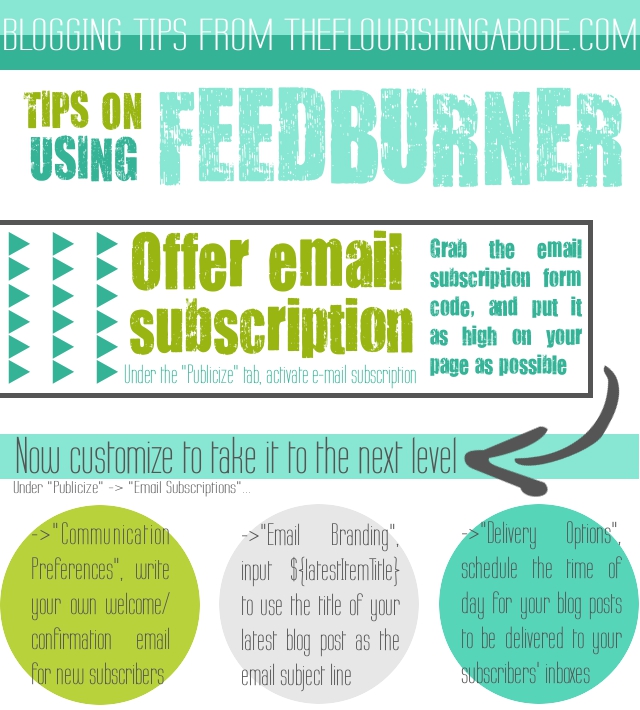
Tool #4 is FeedBurner. If, like Lori, you’re moving from Blogger to WordPress, you will want to make sure you create a new feed for your new site, and update your old feed so that your previous subscribers will still be kept in touch on your new blog. But, regardless of whether you have moved or not here are some tips I have on how to use FeedBurner more effectively – after all, gaining and keeping in touch with your subscribers is a huge part of this whole process! Here are some tips:

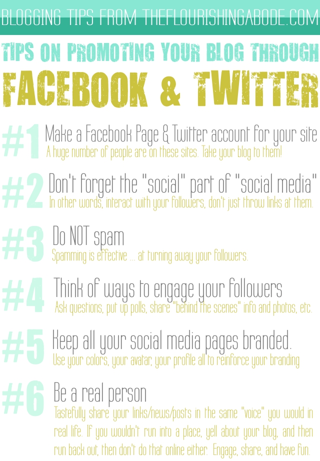
Tools #5 and #6 are very related: Twitter and Facebook. These social networking sites can help SO much in promoting and growing your own website. Probably at some point in the future I’ll do a more in-depth post just on these two sites and how they are different from each other, and how to use the effectively in their own distinct ways, but for today, I’m just going to share some tips the apply to both.

#7 is interesting, because it is the least specific (as far as what I can describe), but is probably the most important. This is the category that sends me the MOST traffic, and then Pinterest is a fairly close #2. But the reason I can’t be completely specific here is because it depends on what your target audience is. The basic premise, though, is that you need to find out where your target audience is hanging out online looking for what you have to offer. For instance, if you have a crafty blog, a good site in this category for you would be CraftGawker. If you have a foodie blog, then TasteSpotting or FoodGawker would be good places to look into getting featured. If you blog about handmade business, then try submitting your posts to Handmadeology. The list goes on and on – but it all depends on your target audience. Find out where they hang out, and promote and market there. Take out an ad on a site that your target audience loves. Offer to do a guest post on a site your target audience visits. This is how you really get in touch with your target audience – by finding them in the places they are looking for you.

Well, that’s it for the blog redesign series! It has been a LOT of fun for me … and also some sleepless nights writing and designing. But I’ve loved it, and I hope it’s been helpful for you. If you missed any of the previous posts from the 10-week series, here they are:

Part 1: Discover your branding with “The Drawing Board” Printable
Part 2: WordPress vs. Blogger
Part 3: Design Tips + Design Worksheet
Part 4: Themes, Coding and Stylesheets
Part 5: Making your own graphics
Part 6: 7 Blog Layout Tips to Engage your Reader
Part 7: Blog Page: The Must-haves and the Panache
Part 8: 25 WordPress Tips
Part 9: The Big Reveal
Part 10: 7 Ways to Promote and Market Your Blog (that’s today’s post!)

Leave your thoughts and comments below … for instance, if you have any ideas or suggestions for the next challenge! (And be sure to come back next Friday to vote!) Or even just to say hi … I love to hear from you!

The Big Reveal!

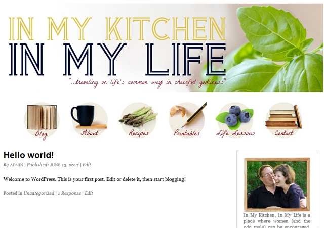
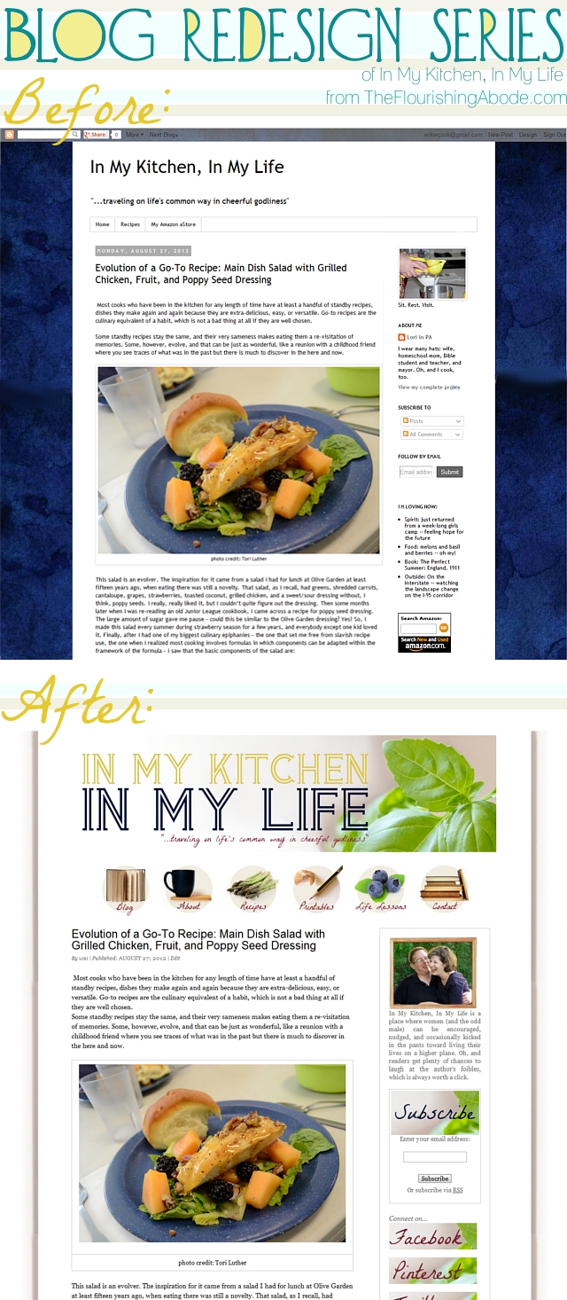
This is it! If you’ve been following this 10 week blog redesign series, this is week 9, and it’s time for the big reveal! (As well as a question I am hoping to get your thoughts on … ) I’ve been redesigning Lori’s blog, In My Kitchen, In My Life throughout the series and giving tips on how you can get set up with a whole new design of your own as well. Lori already had great content, and this redesign was intended to get her set up on WordPress and give her posts the proper garnish and setting that they deserved. So now her blog has officially been moved to WordPress, and here is the before and after:

So what do you think of Lori’s completed site? It’s kind of small in the preview above, but you can check it out more fully here on her new site: www.InMyKitchenInMyLife.com

I considered writing my own tutorial for how to move from Blogger to WordPress – but it’s already been written far better than I could write it! It is on WPBeginner and I encourage you to check out her tutorial, just click here. She takes you through clearly, step by step.

Instead, now that we’ve finished the overall site redesign, I want to offer a few do-and-don’t design tips to bear in mind when writing your actual posts themselves:

o Left align your text. Unless it is poetry, keep your text left aligned. Reading center-justified text just feels weird and does not make it easy to read.

o No crazy fonts in your post. Keep the font of your actual post simple and clean. No handwriting type fonts. When it comes to paragraphs of text, your goal is to make them easily readable, not distract people with individual letters.

o Keep text one color, preferrably black. There are better ways to emphasize and add interest to your writing than to make random words different colors.

o At least one image per post. Obviously, this may not always happen — for instance, my post on Wednesday when I lost my computer charger in the midst of our move and my battery was about to die! (Which, by the way, has been resolved, and thus, today’s post.;) But if it is a post with highly valuable and shareable content, I consider including an image to be a must. For one thing, Pinterest can be a HUGE source of traffic to your blog – and having a picture in the post makes it that much easier to pin.

o ALL images the max width. Figure out what the maximum width of your post is, and only upload images of that width – it keeps your blog’s photos looking beautiful and consistent.

o Take photos in natural light, if possible. Avoid using flash, it makes for much less attractive photos.

o A quick adjust in brightness/contrast can make a big difference. I’d say it’s much better to have a so-so photo in your post than none at all – but if you’ve taken your photo in natural light, often just a little tweak of brightness/contrast can really make it pop even more.

o Break up long paragraphs. Now, this will depend some on your target audience. If they are long readers, you probably don’t have to worry about this. But in general on the internet, people’s reading attention span is fairly short. This doesn’t mean you only have to write short posts (I definitely don’t, haha!), but it helps if you break up long paragraphs into shorter chunks – and injecting photos every few paragraphs can help, too.

Well, next week is the LAST post in this series – now that your blog is set up and finished, I’ll be showing how to use 6 powerful tools that are OUTSIDE of your blog to help promote and publicize your site.

And as we are nearing the end of this series – I’d be very curious for your feedback on something. Several of you have written me expressing interest in having me do one-on-one consultations with you to look at your site, while others have expressed an interest in having me do design work for their blog, while others are interested in how to redesign and optimize an online business, while others talk about the value of writing e-books. I know many of you have commented that you’re surprised I’ve been blogging even while in the process of a cross-country move … but the fact is we are very dependent on my online income right now at this stage of our lives, both from my Etsy shop and from my blog. I’d love to get your feedback on whether the things mentioned above would be helpful if I offered them, or if there is something else you would be interested in. I’ve been astounded by the great responses I have received from you throughout this series, and I’d be very interested to hear your feedback on this. And I can’t believe we are almost at the end of these 10 weeks! Crazy. I hope it’s been beneficial for you.

Please leave your thoughts and comments below, I love hearing from you!

Part 1: Discover your branding with “The Drawing Board” Printable
Part 2: WordPress vs. Blogger
Part 3: Design Tips + Design Worksheet
Part 4: Themes, Coding and Stylesheets
Part 5: Making your own graphics
Part 6: 7 Blog Layout Tips to Engage your Reader
Part 7: Blog Page: The Must-haves and the Panache
Part 8: 25 WordPress Tips
Part 9: The Big Reveal (That’s this week’s post!)
Part 10: 7 Ways to Promote and Market Your Blog

25 WordPress Tips: Printables, Scheduling, Avatars…

Well, we’re preparing for the big move! And I don’t mean our move to Boston, although we are leaving for that TOMORROW! (WOOHOO!) But actually, in the context of blogging, I’m talking about how to move from Blogger to WordPress. This series is now in week 8 and we’ve been making great progress working on Lori’s blog redesign (and hopefully you’ve been making progress on your blog too!) as we’ve been going through this series. The goal was to use Lori’s blog, In My Kitchen, In My Life as a demonstration on how to create a new fully branded look, to move from Blogger to WordPress, and use WordPress tools to best benefit your blog.

So far, we’ve mostly been working on the branding and design aspect. Next week, I’m excited to say, is when we will move her blog from Blogger to WordPress! But one of the things about switching to a new blogging platform is learning how to use it. Lori is, of course, completely new to WordPress, and I’ve heard several of you mention in the comments that you tried WordPress but just were not sure how to use it. So for today’s post, I have 25 WordPress how-to’s, ranging from more simple things such as how to schedule a post to publish later, to things that might be a little more advanced, like how to make printables available on your site, or how to make a custom default avatar for your blog. So hopefully by the end of the post you’ll feel much more at home in WordPress – or even if you’re already on WordPress, that some of the more advanced tips will still be helpful to you! :)

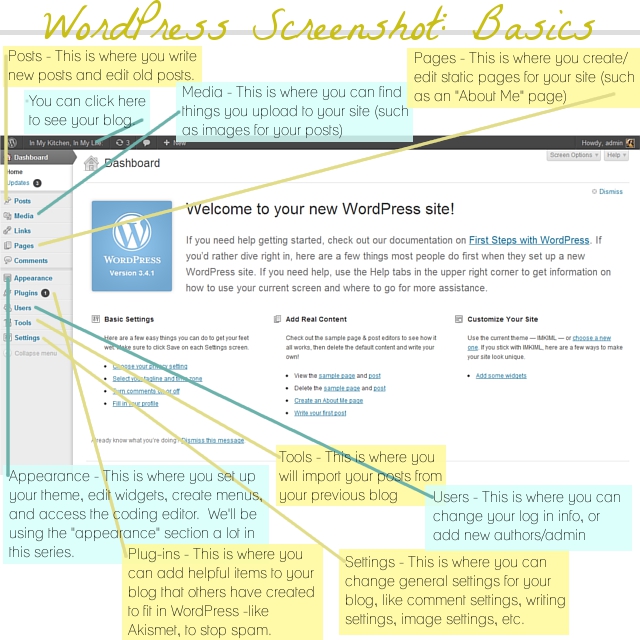
All the tips assume that you are using WordPress.org on your own domain (some may apply to WordPress.com as well, but I’m just not familiar with it), and that you are logged in to your WordPress dashboard. If you’re not sure how to get there, just go to www.YOURSITEADRESSGOESHERE.com/wp-admin and sign in there to get to your dashboard. This is your dashboard – and the menu over on the left side is how you navigate around to different tasks:

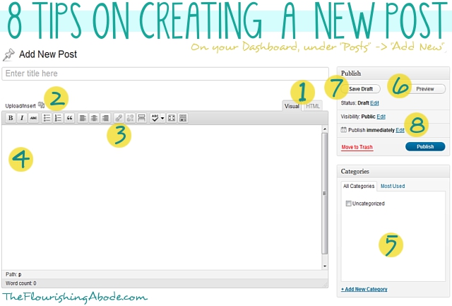
So let’s jump right in! We’ll start off with the simpler tips. The first eight tips all have to do with something that is obviously very important – creating new blog posts:

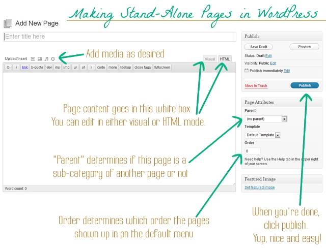
1. Visual vs. HTML.
So the place to put the post title is pretty obvious, as is the large white area where you actually type the post. BUT — there are actually a couple different options on what format you want to use to write you blog post. One is visual and one is HTML. The tabs for these two options are shown at point “1”. Basically, if when you change the appearance of your post (like, if you add an image, make text bold, etc.) and you actually want to see the result of the change in the editing box, then use the “Visual” mode. If when you make a change to the appearance of the post, you don’t want to see the result, but instead you want to see and be able to write the actual HTML, then use the HTML mode. I personally always write in the HTML mode. Depending on which mode you choose, the options along the gray bar at the top of the edit box will look a little different. Heads up, though – while working on one post, don’t keep toggling back and forth between the two, as it can cause some hiccups. Just pick the one you want and stick with it.

2. Inserting images.
So, you’ve titled your post, and you’re writing it, but you want to add an image. This is super simple. Just click the little button by “Upload/Insert” (shown at point 2 in the image above). A box will pop up – click the “Select Files” button, then get the image you’re wanting to use from your computer. Once it has uploaded, scroll down the pop up box … there will be various options in the box you can choose if you want, such as resizing the image, making it centered, or “Link URL” (if you want the image to be a link to somewhere, then put the address as the link URL). Click the “Insert into post” button at the bottom, and now it is in your post!

3. Creating links.
Maybe you want to link to another website in your post. Use your mouse to select/highlight the text you want to turn into a link. Then click the “link” button (shown at point 3) and paste the address you want the text to lead to into the box that open. If you want, check the box that says “open this link in a new window”, so that when people click the link they won’t leave your blog but instead the link will open in a new window. Click “OK”. Now your text is a link like this: this text is a link.

4. Adding video from another website.
This may not be something you use all the time, but it’s handy to know. If you want to upload a video straight from your computer, you would just add it the same way you add an image. But if you want to include a video from another website in your post (for instance, a YouTube video), you might think you should try to use the “embed” code YouTube offers – but you’ll find it doesn’t work on WordPress. Actually, it’s simpler than that, anyway. For this, make sure you’re editing in the “HTML” mode, and just paste the link to the video right into the box. You don’t need any code, just the video address. Make sure the address is on its own line, without any spaces before or after the address, and you should be good to go!

5. Put posts in categories.
Categories are really helpful on a blog. For instance, this post I’m writing is part of a 10 part series, so I put each post for this series in the category “DIY Blog Redesign“. Then if you click on that category, it takes you to a page that has all the posts from that category. It’s pretty helpful for navigating around the site. So when you write a blog post, choose which categories it goes in. You get to make up your own categories, and add them with the link at the bottom of the category box. You can also edit your categories in greater detail by choosing the “Categories” option under “Posts” on your dashboard sidebar.

6. Preview before publishing.
Want to see how your post is looking? Just click the preview button. If you’re using “visual” mode, this may not seem as necessary, but I still encourage you to preview your post before publishing. Then you can check, for instance, that your post’s title fits on one line, that your images aren’t too large, etc.

7. Save drafts.
WordPress automatically saves a draft of the post you are working on writing, but even so, if you’re not ready to publish, be sure to hit “save draft” before closing the post.

8. Scheduling a post to publish in the future.
At point 8 in the image above, you’ll see where it says “Publish immediately”. That means if you hit the “publish” button, the post will go live right away. But what if you want it to wait and not publish until tomorrow? Or next week? Just click the “edit” button next to it, and select the date/time you want. Make sure you hit “ok” once you’ve made your choice. Now the publish button says “schedule” instead, and when you click it, that means the post will be published on your blog at the time you selected. Very helpful. For instance, if I was smart, considering that we are moving tomorrow, I should have written this post two weeks ago and scheduled it for today. Buuuuut I’m not that ahead of the curve, so instead I’m staying up late to write. ;)

And, as we mentioned last week, you edit stand-alone pages and posts in the same way, so those first 8 tips apply to both. The difference is just that to start you would choose either the “Posts” or “Pages” option on the navigation bar on your dashboard. You can click here to see last week’s post all about pages.

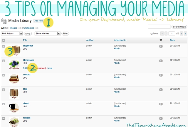
The next three have to do with handling your media:

1. Adding new media.
So, I mentioned before how to insert an image (or other media) directly into a blog post. Sometimes, though, you want to upload a file without just inserting it directly into your post. Just click the “add new” button in your media library, and then you can either browse for the file, or drag and drop into the box.

2. Making printables available on your site.
A good example of a time you might want to upload something on your site without directly inserting it into a post would be if you want to have a PDF printable file available on your site. So, first you would upload it, as stated above. Then, you need to get the URL of the file. To get to the URL of any media you have uploaded, hover your mouse over that item in your media library. A few options will pop up, as you can see by point #2 in the image above. Click “edit”, then scroll down to “File URL”. Copy the address you see there. Now, when you write your post, you can use that URL to create a link, either by using the link button (as described in tip 3 above) or by adding the link to an image (as described in tip 2 above). Now when your readers click that link, it will open the printable!

3. Always upload image at the width of your blog post.
There really isn’t much point to uploading giant sized images to your site. You still want it to display only as wide as your post, and it just makes your site run slower. Also, I highly recommend not using images less wide than your blog post, because then you start having all sorts of different width images in your posts and it just looks messy. I have a few old posts like this and they drive me crazy. It looks so much better to always have your images the same width – no wider and no more narrow than your post. I recommend that before you upload an image you make sure it is that width. For instance, I only upload images to my site that are 640px wide. It keeps it nice and easy, because you don’t have to resize in your blog, keeps your posts attractive, and doesn’t bog down your site.

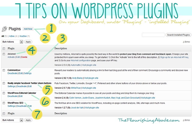
The next 7 tips are about plugins…

1. Adding a new plugin.
Plugins are a great way to add new tools and functions to your blog. If there is something you wish your blog could do, chances are you can find a plugin that can make it happen. To add a new plugin, first click the “add new” button. (yeah, surprise!) Then, search for the name of the plugin you want. Once you’ve found it, click the “install now” link. Once it finishes install *make sure* you click the activate button. Easy! :)

2. Finding new plugins.
Ok, so step one sounds easy enough – but how do I know what the name of the plugin is that I’m looking for? You can always search keywords, but the plugin search is only so good, so personally I like to Google “wordpress plugin (and whatever use I’m looking for)” to find the names of plugins I might be interested in. I’ll share a few types you might find helpful in some of the other tips.

3. Changing the plugin settings.
Some plugins have settings that you might want to change. For instance, if you have a plugin that lets people follow you on Twitter, you will need to set it to know what your Twitter username is. Some plugins will add options/settings to your sidebar, but you can also find if there are settings in the menu of your installed plugins, as shown at point 3.

4. Anti-spam plugins.
As I mentioned, I’ll give a few categories of plugins you might be interested in – one of which is an anti-spam plugin. We’ve talked before about the evils of CAPTCHA, and you definitely want to avoid that, but some sort of anti-spam tool will most likely be needed. Preferably, though, you want one that will be invisible to your readers. Akismet is what I use, and I’m very pleased with it, although it does cost a few dollars a month.

5. Social media sharing buttons.
In one form or another, you certainly want social media sharing buttons so that your readers can easily share your posts with their friends and followers. The three biggest, at least for me personally, are Facebook, Twitter and Pinterest, although there are many more. A plugin that automatically includes sharing buttons at the end of your posts is a must have in my book.

6. Editorial Calendar.
Having an editorial calendar can be SO helpful in scheduling posts ahead of time. I already mentioned earlier how to schedule a post for the future … but looking at your list of posts/drafts/scheduled posts does not make it very easy to visually see what you have coming up on various dates. Installing an editorial calendar (which can then be accessed on your dashboard sidebar under “Posts” -> “Editorial Calendar”) makes it easy to have a visual sweep of upcoming posts, and lets you easily create drafts for future dates that you can then write later. Love. it.

7. SEO tools.
There is a lot to SEO (SEO = Search Engine Optimization) and how it works. Showing up well in search engines can be very important to a blog, or any website. A plugin that helps SEO won’t really be a fix all … but it can definitely help. I personally love Yoast. Once you install it, on the edit page of each post there will be a box at the bottom where you can input keywords, search engine titles and descriptions, and lots of other helpful SEO stuff. It isn’t all you need to have good SEO, but it does help. If you’re serious about SEO, there is a ton of great info out there on the web to help you.

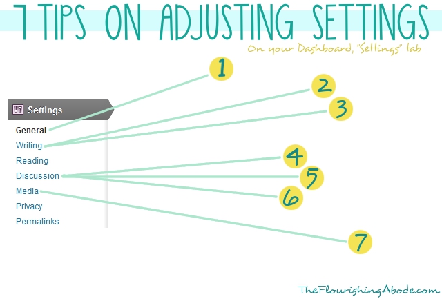
The last 7 tips are on settings options:

The menu shown above is what you would see in your navigation sidebar if you click on “Settings”. There are lots of settings you can explore under each option, but here are a few you might want to check on…

1. Time/date settings.
Under “general” options, you will find the time and date settings. Make sure these are set according to your time zone and such – it can be very frustrating to schedule a post and expect it to publish at a certain time, only to discover that your blog is on an entirely different time zone!

2. Unconvert emoticons.
I don’t know why, but the default setting in WordPress is that if you make a :) face, it automatically turns it into a cartoon smiley face. Personally, I think it looks kind of … odd, especially if it is on a professional blog. You can turn off this option under the “writing” settings.

3. Default post category.
I mentioned categories earlier in this post. If on a particular post you forget to put it in any category, WordPress just goes ahead and puts in the default category, “uncategorized”. However, you can change what the default category is under the “writing” settings. My default category is “blogging”. :)

4. Disable pingbacks and trackbacks.
Under the “discussion” settings you will find lots of options for how people can interact with you blog. One of these options is “pingbacks and trackbacks”. I would strongly recommend disabling these. Unlike comments, which allow for discussion, pingbacks and trackbacks are just a breeding ground for spammers.

5. Comment settings.
There are lots of other comment options you can choose from in the “disussion” settings, as well. Comments are a HUGE part of blogging, so look through here and make sure the settings are set to the way you want – for instance, make sure threaded/nested comments are enabled, that people don’t have to be members of your site to comment, that you will be emailed when there are new comments, etc.

6. Custom default blog avatar.
This is a more advanced tip, but if you really want to take your branding to the next level, you can create a custom avatar just for your site that shows up if people don’t have a Gravatar. For instance, I have my illustrated typewriter than shows up as the avatar – although, of course, Gravatar trumps that, naturally. (If you don’t have a Gravatar, it is a universal avatar associated with your email, and anytime you comment, that avatar automatically shows up – I definitely recommend setting up your own at gravatar.com) But what I’m talking about for blog design is the avatar that shows up as default if people DON’T have a gravatar. There are a few rather blah options that WordPress offers, but you can really brand-up your blog with a personalized one. Using the instruction above about plugins, add the plugin “Add New Default Avatar”. Then, using the instructions from my previous post on making your own graphics, create a branded avatar .. 80×80 is a safe size in Thematic. Then using the instruction in today’s post about media, upload your image to your media library and get the URL. Then go to the “discussion” section of your settings, and scroll down to the avatars. Paste the URL in the custom avatar box, then save changes. Now, along with the other options for avatars, there should be your new custom avatar image. Choose that option, and click “save changes” again. Your blog now has its own custom branded default avatar! WooT!

7. Default image settings.
Under the “media” settings, make sure that the auto embed is enabled, so that you can just paste YouTube addresses in (as mentioned before) … and it can also be a good idea to adjust the auto sizes of your media to fit the width of your blog posts. That way images you upload (if they’re not already the right size) will adjust to the width of your blog, and embedded videos will also fit your blog properly. Keeps things nice and neat!

Well, that makes 25 total! I hope these tips have been helpful for you. Did you learn anything new, or is it all old hat to you? Do you have some tips of your own to share? Leave your thoughts and comments below, I love to hear from you!

If you’ve missed the other posts in this series on DIY blog redesign, here they are:
Part 1: Discover your branding with “The Drawing Board” Printable
Part 2: WordPress vs. Blogger
Part 3: Design Tips + Design Worksheet
Part 4: Themes, Coding and Stylesheets
Part 5: Making your own graphics
Part 6: 7 Blog Layout Tips to Engage your Reader
Part 7: Blog Page: The Must-haves and the Panache
Part 8: 25 WordPress Tips (This is today’s post!)
Part 9: The Big Reveal
Part 10: 7 Ways to Promote and Market Your Blog

Tips on blog pages: The must-haves & the panache

A few posts back I mentioned the importance of white space (especially in your background), but that if you are worried about it making your design too boring, do not fear! There are other ways to add panache to your site – ways that enhance rather than distract from your content. The banner and the sidebar we have already discussed – and today we’ll be talking about something that I consider to be often overlooked design-wise: your menu of stand-alone pages.

When I refer to “stand-alone” pages, I’m talking about pages you create that don’t shift down in order like regular blog posts – these are pages that stand on their own. For instance, the “About Me” page is a very common example of a stand-alone page. You can see my menu of stand alone pages right below my banner – each with my own pen and ink illustration. Personally, I think that menu is one of the main things that helps my blog design to be unique and branded. Plus, it helps with navigation, as several of those pages are designed to highlight particularly useful posts (like in the Tips & Tutorial gallery or on the Printables page).

In today’s post, I’m going to be sharing my thoughts with you on important and helpful ways to use pages, as well as tips ranging from practical to the more panache on how to set them up – and, as always, demonstrating on Lori’s new site for her blog, In My Kitchen, In My Life. And I’m reeeeeeeeeeeeeally excited about Lori’s new menu of buttons which I will be showing later in this post! The possibilities are fairly endless on how you might choose to use your pages. But here are my suggestions as a couple “must-haves” in your pages … as well as a list of ideas for “maybe-haves”, depending on what kind of blog you have.

An “about” page is HUGELY important for a blog. I’ve heard statistics that, in general, the “about me” page is one of the most highly visited pages on a site. Why? Because people want to know who you are and what the site is about! People like to talk and visit with someone they know. Use your “about” page to let people get to know you. Let’s say you run a weight-loss blog. Why do you? Is it because you have a touching story of how you lost a lot of weight yourself, and you want to help others? Or is it because you see the growing trend of overweight children in America and you want to help parents keep their kids healthy? People love to hear your story.

Here are a few fun ideas for ways you might approach your “about” page:

‣ ‣ ‣  Photographs and descriptions of you doing things pertaining to your blog subject
‣ ‣ ‣  A bullet list of interesting facts about you
‣ ‣ ‣  The story of how you got involved in whatever activity it is that you blog about
‣ ‣ ‣  A video for your about page
‣ ‣ ‣  Your own personal mission statement, and the things that matter most to you
‣ ‣ ‣  Humorous interview style
‣ ‣ ‣  Stories/pictures from your childhood that help define you
‣ ‣ ‣  Separate “about” pages for your blog itself, as well as each writer on your blog
‣ ‣ ‣  Etc! Have fun with it!

Some things to probably avoid on your “about” page…

‣ ‣ ‣  Writing in the third person. Unless you have highly unusual circumstances on your blog that make it extremely formal, write in the first person. We all know it’s you writing it. Imagine you are talking to your readers when you write it … and how odd it would sound to talk in the third person.
‣ ‣ ‣  Making it reeeeeeeeeeeeeeally long. It doesn’t have to be your WHOLE life story, just give people a glimpse into your life and a taste of your personality.
‣ ‣ ‣  Résumé style. People want to “meet” you on your about page … not feel like they’re being sold to or that you’re trying to prove something. Highlighting some accomplishments is fine, but try to keep it casual and personable. Awards/features/accomplishments can, in fact, have their own page, like a “Press” page.

But one way or another, have an “About” page on your blog! You visitors are looking for it.

Your contact information should be easy to find from any page a visitor may be viewing. A good way to do this is to have your contact page in your pages menu. There are any number of reasons a visitor to your site may want to get in touch with you – they may want to advertise on your site, they may be interested in guest posting, they may spot an embarrassing typo they want to alert you to, they may want to keep in touch with you on social media sites, they may just want to say hi! Have that contact info easy to find. How much contact info you share is completely up to you. I’ve seen people on large blogs even including their home address so people can send them gifts! Personally, an email address is the most personal info I put on my site … and even that is my “professional” email address, which gets screened through a couple filters before it gets forwarded to my personal email, to weed out the spammers. Also – helpful hint here if you’re concerned about bots scanning your site – you can always include your info in an image rather than in type. That way a real visitor will be able to see it, but it won’t get scanned the same way by bots and crawlers. Or you could always set up a “contact form” where people submit their questions/messages right on your site rather than providing contact info. But at the very least, it is a good place to share your links for how to contact you on other sites – for instance, your Twitter, your blog’s Facebook page, your Pinterest, etc.

Ok, so now you have an About page and a Contact page. What other pages might you want? Really, the possibilities are endless. Here is a list of ideas – and not all of these will be applicable to everyone and you wouldn’t want this many anyway – but hopefully this list of ideas will help get your mind rolling…

‣ ‣ ‣  Home/Blog Page (helpful, because a lot of people won’t be landing on your most recent post, if they’re coming from Pinterest or anywhere else that linked to a previous post)
‣ ‣ ‣  About Blog Page (in addition to an “about me” page)
‣ ‣ ‣  Welcome Page (where you can give first time visitors a tour)
‣ ‣ ‣  Shop Page (where you sell your wares)
‣ ‣ ‣  Press Page (where you highlight places you/your blog have been featured/awarded/etc.)
‣ ‣ ‣  Sponsor Page (info on advertising/sponsoring your blog)
‣ ‣ ‣  FAQ’s Page (your answers to frequently asked questions)
‣ ‣ ‣  Highlight Content Page (pages like my “printables” page or “tips and tutorials” page that highlight especially relevant content from your blog)
‣ ‣ ‣  Outside Pages (including a button in your menu that doesn’t lead to a stand-alone page, but rather links directly to a site outside of your website – for instance my “Cafe” button in my menu takes you to my Etsy shop, FlourishCafe – or another example would be a button that takes you to a subscription form)
‣ ‣ ‣  Links Page (a page that includes links to other pages, like if you want to recommend other blogs/books/resources/etc.)
‣ ‣ ‣  Map Page (a sitemap to help people get around your blog)
‣ ‣ ‣  Etc! The sky is the limit.

First, we’ll go over the basics – and next, how to get that extra panache with images and such. Since in this series we’re moving Lori’s blog from Blogger to WordPress, most of the tech stuff in this series is about how to do things on WordPress. However, in this instance, I actually wrote a blog post a while back when I was on Blogger myself about how to make stand-alone pages in Blogger. You can click here for that post … it’s like a glimpse into the past because it’s from my old blog. :)

Here are the instructions for WordPress. Sign into your WordPress dashboard. On the left-hand menu, you’ll see the option “Pages”. From there, you can select “add new”. This is what you’ll see (minus my notes, of course ;)

Super easy. Now let’s take it to the next level by creating a menu of buttons for our pages!

So, now you’ve made your pages. And we discussed in an earlier post how to make your own graphics that fit your branding and design choices, and these buttons are no different. If you want to make a button for each page in the menu (such as I have under my banner) make sure each image file is exactly the same size – or at the very least, all the same height. You want your menu to look uniform and even. Go to the “Media” section of your WordPress dashboard and upload all the buttons you have made for your menu.

Next, in your WordPress dashboard, go to Appearance -> Menus. Name your new menu (I called mine “top menu”), and save it. Next, look for the “custom links” box:

In the URL box, put the link you want it to go to. If it’s leading to one of your stand-alone pages, like your about page, put the URL for that page in this box. Or, if you’re wanting to link to an outside page, such as your Etsy shop or your subscription form, just put that link here – this is how you include a button to other sites!

Then, in the “Label” box, you will want to use the following code to make it display your button image:
 

<div style=”background-image: url(‘http://www.inmykitcheninmylife.com/wp-content/uploads/2012/08/about.jpg‘);background-repeat: no-repeat;padding: 116px 0 0 120px;”></div>

.. only you will want to edit this code. For one thing, you will need to change the address in green to the URL of the image file you uploaded. (to get the url of an image you uploaded: go to “Media”, hover over the image, click “edit”, then scroll down to “file URL” and copy it.) Also, the numbers after “padding” will need to be adjusted to fit the size of the image you uploaded. For instance, Lori’s buttons were 120×116, your’s will be a different size, most likely. Once you’ve adjusted the code as needed, and have put it in the “Label” box, click “add to menu”. (As I’ve explained before, I’m no coding wizard … I just tweak. For a more full explanation on this particular bit of code, you can check out this blog post where I found it.)

Repeat with each button you want to make! Rearrange order by dragging and dropping. Click “save menu”. Make sure that in the box at the top of the page that your new menu is selected to make it active:

(Or, alternately, if you don’t want to use it as the main menu at the top of the page, and you want to use it else where, you can add it as a widget on your widgets page.)

Let’s say, though, that on one of the buttons, you don’t want the button itself to link to anywhere, but instead you want a drop-down menu of options to come available. Here is how you would do that…

Make the button the same way, only leave the area for a URL blank. But input the image code the same way. Add to menu. So the button is ready, and doesn’t lead anywhere. Now to make the drop down menu, look for this box on the left hand side:

This is a list of all the pages you have made. Find the pages that you want to show up in the drop-down menu, select them, and click “Add to menu”. Then drag and drop those newly added pages under the button you want to be at the top – make sure you drop them so they are indented:

And now a menu will pop up with those options when someone hovers over the top button! Nifty, eh?

So *drum roll* … here is Lori’s site, now with menu buttons! She can always change them around to her own needs and desires, but for starters, here is how I’ve set it up:

She mentioned some types of pages she wanted, so she now has the following buttons:
– Blog
– About
– Recipes
– Printables
– Life Lessons (which goes into a drop down menu where she can feature any special series she chooses)
– Contact

… and, as we’ve discussed over and over again, any graphics you design for your site, like these buttons, should fit with your branding statement and design choices (style, medium, colors, etc.)

So what do you think about how things are coming along? Do you use your menu of pages as a design element? Also, I’d love to hear what pages you have set up on your own site, it would be interesting to see the variety of types of pages different bloggers have! Leave your thoughts and comments below, I love to hear from you!

If you’ve missed the other posts in this series on DIY blog redesign, here they are:
Part 1: Discover your branding with “The Drawing Board” Printable
Part 2: WordPress vs. Blogger
Part 3: Design Tips + Design Worksheet
Part 4: Themes, Coding and Stylesheets
Part 5: Making your own graphics
Part 6: 7 Blog Layout Tips to Engage your Reader
Part 7: Blog Page: The Must-haves and the Panache (This is this one!)
Part 8: 25 Tips for using WordPress
Part 9: The Big Reveal
Part 10: 7 Ways to Promote and Market Your Blog