Skip to content

style

Gift giving guides

As the gift-giving season approaches, sometimes it can be difficult to know what to get for people. When I design a new piece in my shop, I usually have a specific type of person in mind who would like it – for instance, I’ll make something to appeal to gardeners, or a design specifically for a bibliophile, or a print that I think guys who cook would like, and so on. So I thought it would be helpful to break down into categories some things I have designed that could appeal to certain types of people on your gift giving list! (Plus, if you buy it this weekend while I have my buy-one-get-one-free deal going on, you can get something free for yourself in the process!) All while supporting small business this holiday season. Here are some ideas….

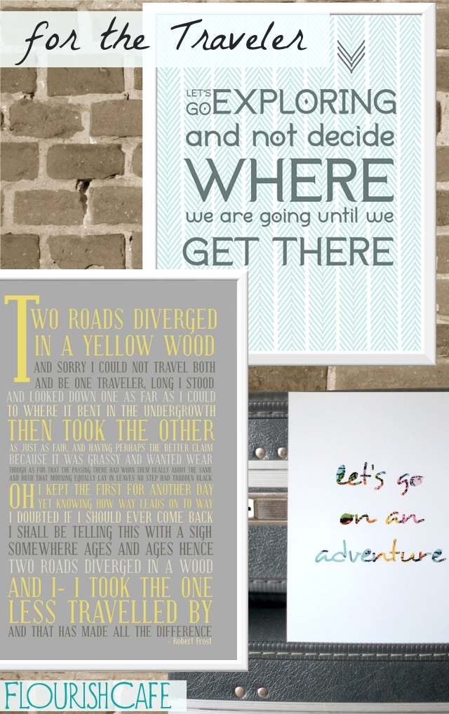
Gifts for the traveler…

Let’s go exploring print
– Road Less Travelled poster
– Adventure print
– More travel related prints

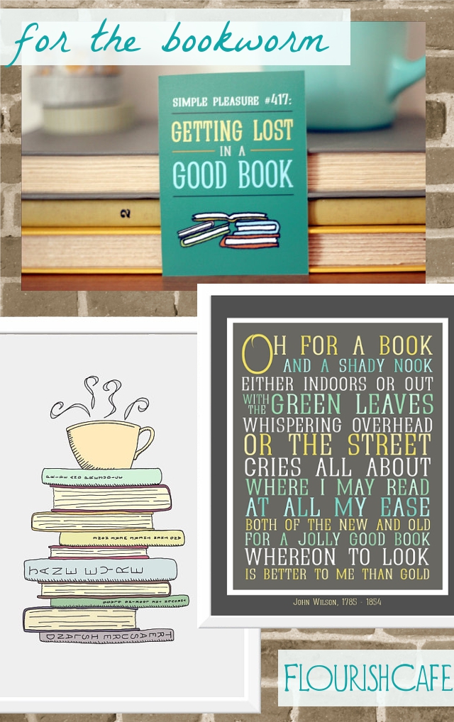
Gifts for the bibliophile …

– Lost in a Good Book mini print
– Oh for a Book print
– I Love Books and Coffee print
– Other reading related prints

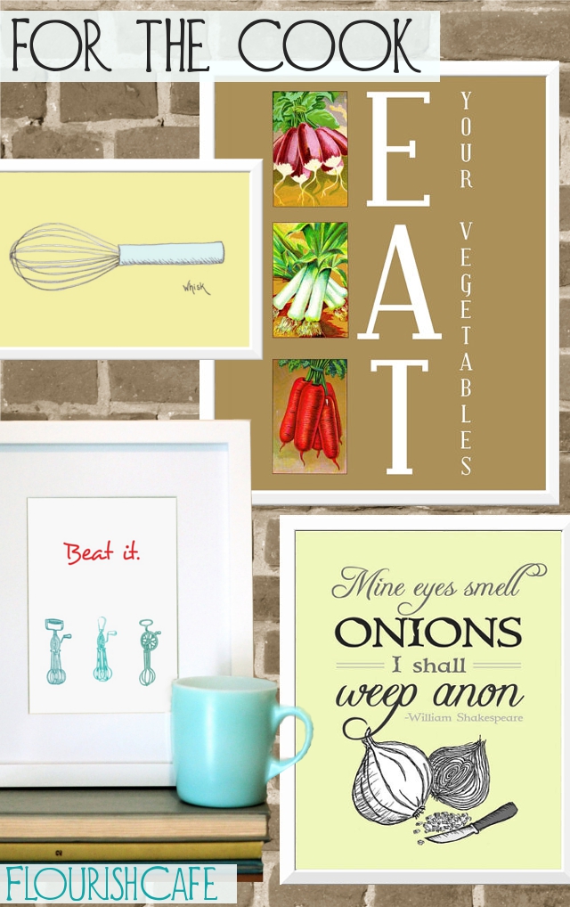
Gifts for the home chef …

– Eat your vegetables poster
– Whisk print
– Beat It print
– Onions quote print
– Other food related finds

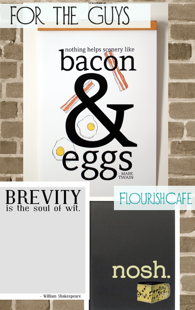
Gifts for guys …

– Bacon and Eggs poster
– Brevity print
– Nosh print
– Other prints for men

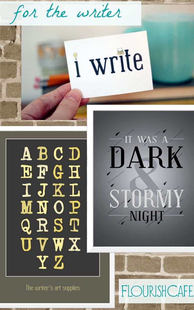
Gifts for the writer…

– I Write mini print
– Dark and Stormy Night print
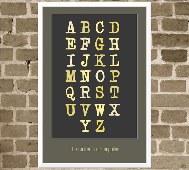
– Writer’s Art Supplies poster
– Other writing related prints

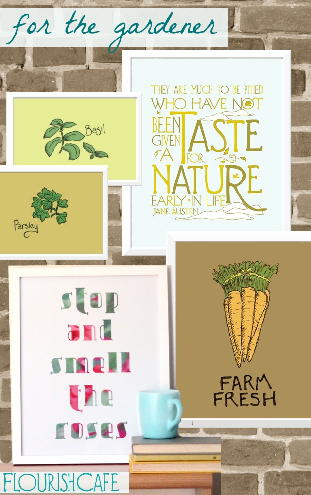
Gifts for the gardener …

– Herb prints
– Taste of Nature print
– Farm Fresh print
– Stop and smell the roses print
– Other outdoors related prints

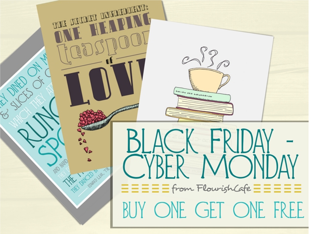
And don’t forget – today through Monday (11/23 – 11/26) for Black Friday and Cyber Monday I am having a buy one get one free special in my shop! Just mention in the “message to seller” at checkout which print of equal or lesser value that you want for free.

Happy shopping and happy holidays!

Curious, too – how many of you do Black Friday/Cyber Monday type shopping?

Black Friday – Cyber Monday Preview for FlourishCafe!

Black Friday is almost here! Closely followed, of course, by Cyber Monday. I’m very excited to announce that for the entire time from Black Friday through Cyber Monday (11/23/12 – 11/26/12) my entire shop, FlourishCafe, will be buy one get one free.

So how does it work? Just purchase the print(s) you are wanting, and then in the “message to seller” section at check out, simply link to the other print(s) you would like to get for free. If you buy one print, you get one free. If you buy five prints, you get five free! The only stipulation is that the free prints much be of equal or lesser value to the purchased print.

I hope this will be useful to you in your holiday shopping! :)

I’ve also been adding some new and exciting things to my shop! (Some of which will also give you some discounts.) Here are some of the changes….

— some new designs:

— some new ways of purchasing prints! For instance, if you’re interested in purchasing more than one print, you can get a discount for getting multiple prints. Or, if you see a print in my shop that you would like in a smaller size, I can do that for no additional cost. Here are a couple examples:


(you can see various options for custom sets and resizing, here)

— and some prints which I am planning to discontinue at the end of the year, and so I want to get rid of any inventory of those prints, and they are available at a very steep discount until then. You can check out all the clearance prints, here.

So happy holidays from FlourishCafe! And if you want to get some buy-one-get-one-free prints, make sure you catch the deal this weekend, Black Friday through Cyber Monday (11/23 – 11/26). Happy shopping!

My Plan & Progress! Look Good Despite the Holidays

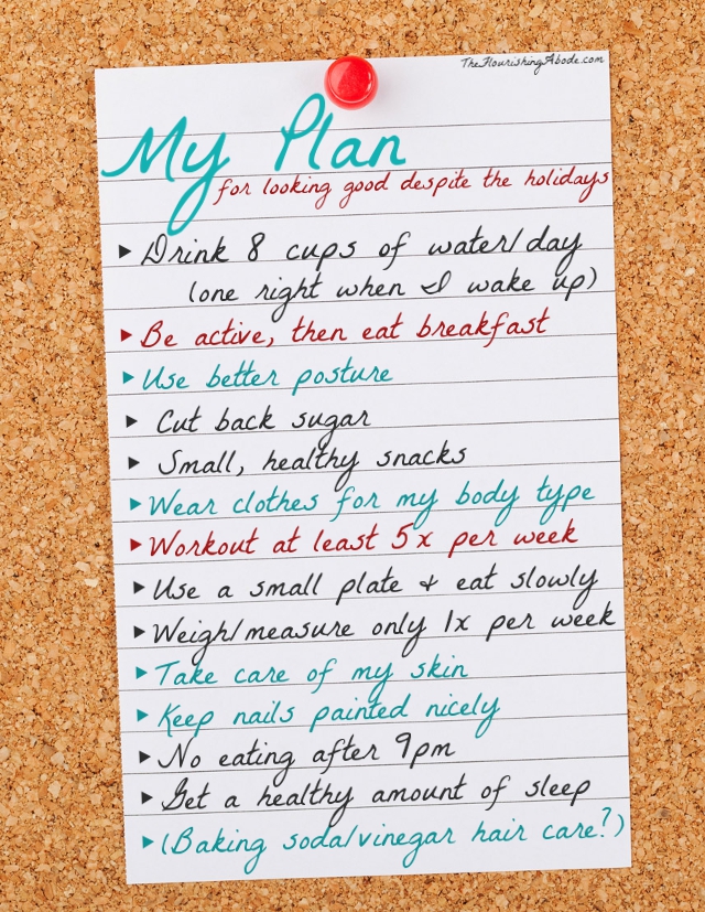
Last week I kicked off a new challenge series: Looking Good .. Despite the Holidays. I’m very excited about it! A little while back I emailed myself a list of smaller goals and habits that I wanted to aim for to help me along the way, and I wanted to share that list with you. As you will see, there are a variety of different types of things on my list. The exercise related goals are in red, the style related goals are in blue, and the food related goals are in gray, so there is definitely a mix.

This is certainly not a one-size-fits-all kind of list, this is just my personal list. And it’s really just a list of things I need to do better about, not everything I need to do. For instance, I thought about including “put on makeup in the morning” – but I already do that, typically, so I didn’t add it to my improvement plan. So each person’s list would look different. However, having some smaller quantifiable goals I think can help achieve a more nebulous goal, like “looking better”.

And I’m feeling especially good about it now that I’m starting to see progress. As I mentioned before, this is not a weight loss advice series … however, I personally have been needing to lose some weight, and over the last few weeks of working on my list, I’ve lost 10 pounds. WooT! I’m starting to be able to fit back into some clothes I couldn’t wear before. I still have more progress I want to make (and not just on losing weight), but I feel like I’m on a much better trajectory now – and one that I can stick to, even after the holidays. Although I definitely haven’t done perfectly on my list … I think now that I’ve shared it with you all, though, I’ll feel much more accountable to it! I’m still really bad about drinking enough water. *sigh* Some of the goals we might end up talking about in more details in other posts.

So, what do you think of the idea of having a list of mini-goals?
What might be some things on your list? Things that are the same or different than mine – I’d be curious to hear either way! Leave your thoughts and comments below. :)

Shabby Apple Giveaway! Vintage Inspired Dresses

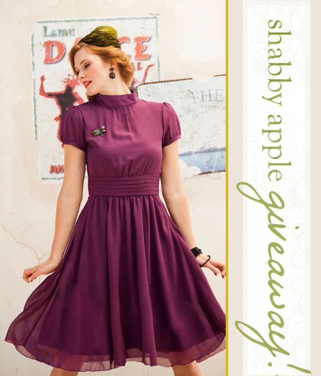
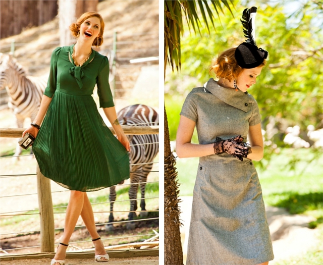
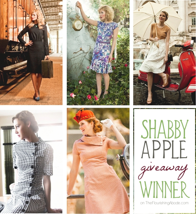
I have long been a fan of Shabby Apple dresses. Their style is exactly what I love … classic vintage dress styles with a whimsical modern twist, all while keeping it modest. *swoon* So I am completely honored to be able to host a Shabby Apple giveaway .. and tickled for you to get the chance to win something from their beautiful brand.

Also, I thought this really ties in nicely with the “Looking good … despite the holidays” series I just started. What a way to kick things off, eh? (People who know me in real life know that when I get excited about something, I tend to talk very fast and enthusiastically … so I’ll probably end up writing kind of like that in this post.) Oh, and not only is this offer good for whoever wins the giveaway – but Shabby Apple is also offering a coupon that all readers of The Flourishing Abode can use this month. Yes? Oh, yes.

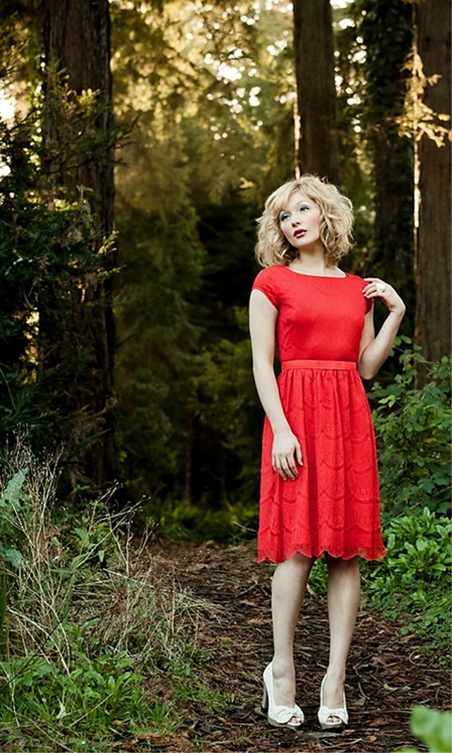
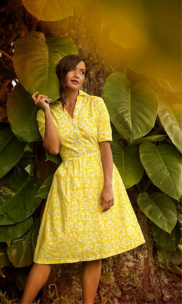
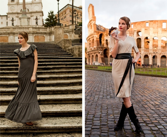
They have quite a range of styles – retro dresses, to lace dresses, to casual dresses – and I love how they organize them by style collections. For instance, I am in love with their Zoology collection, which is where the above dress is from … and the Mad Hatter collection? SO much my *ahem* cup of tea. (I mean, come on, I have a whole series of Wonderland prints in my shop. I love the whimsy!) And their Roamin Holiday collection very much reminds me of when we lived in Europe. *sigh* Here are a few of my favorite dresses…

Eek! I. Love. It. Plus, as I was perusing their website, I saw their handy dandy guides to fit, measurement, and body type … as well as their fast and free return policy – all of which, in my book at least, make buying clothes online SO much easier.

OK! So, on to the giveaway details…
For one winner, Shabby Apple is offering a $50 gift card to their shop.

‣‣‣ 1. To enter, visit www.ShabbyApple.com, pick out your favorite dress, then come back here and leave a comment telling what it is. (This is mandatory to be entered for the giveaway.)

You can also get additional entries in the contest with the following:

‣‣‣ 2. Tweet about this giveaway

‣‣‣ 3. Blog about this giveaway

Leave a separate comment for each entry.
Open to US addresses only, for ages 18 and older.
Giveaway ends at 11:59 pm 11/26/12

And for all my lovely readers, here is the coupon code for 10% off at Shabby Apple:
theflourishingabode10off (Good until 12/12/12)

So have fun browsing around Shabby Apple! What’s your favorite dress?

Looking Good … despite the holidays. New challenge!

Ah, the holidays. I love this time of year. Special memories with family, seasonal good cheer, laughter, delicious food … and the post-holiday surprise of extra pounds when we step on the scale. Um, yeah, not so fond of that last part. No wonder getting in shape is such a common New Years resolution! This year, I’m hoping to keep all the good parts of the holidays, but not feel the regret in the mirror. So for the next weekly Friday challenge, happy holidays can still be healthy holidays!

This challenge is actually very personal to me. It’s not that appearance is the most important thing at all!! But over the last couple years, I’ve put on some weight. And at the same time I’ve been going through a style dilemma. And I’ve not been as active or as healthy as I wish. And I don’t like the results. So this autumn, I’ve started working out again and trying to get into some healthier habits, and finally have been starting to make some headway. WooT! But I don’t want the holidays to stop (or reverse!) my progress.

This series is *not* going to be a weight loss advice series. It is going to be about my attempts to become more healthy, and to improve my appearance in the process. I definitely am not going to be giving any medical advice! I’ll be just sharing what is (or isn’t) working for me. Some of it will have to do with getting in better shape, while some of it will have to do more with style and poise. I feel like I’m muddling through some of that right now, and I intend to share my thoughts, foibles, and even perhaps some occasional successes. But I can pretty much guarantee there will be opportunities for you to laugh at me. :)

And, right as we are getting started, I’ll have an exciting announcement on Monday for a special opportunity that I think you’ll be excited about! So stay tuned for that. :)

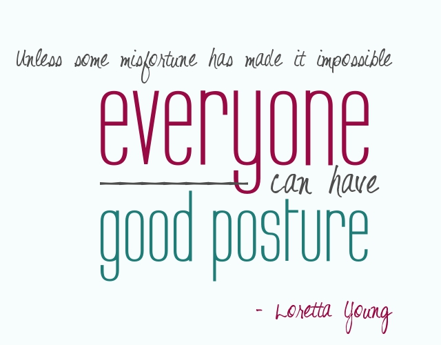
But in the meantime, here is one thing I’m going to try to be working on this week: posture!

Posture can have a huge (and immediate!) impact on your appearance. Even if your outfit is well put together, and your hair looks great, if you are slouching, that can make you look so different. Whereas even if you’re not perfectly put together, good posture can give your appearance a boost (don’t you always stand with great posture when you’re looking at yourself in the mirror?) – plus it is healthier for your body.

I’m fairly tall (around 5’10” or 5’11”, plus I wear high heels), and I do like being tall. But I don’t always have very good posture. My grandmother was also very tall, and I remember her saying to me, “Don’t be ashamed of your height, stand up tall!” I remember being surprised to realize I wasn’t standing up straight – I didn’t feel like I was slouching. But as soon as I stood up straighter, I could feel it.

It wasn’t until I went to the chiropractor when I was older that I realized part of why I didn’t stand up very straight. When I was small, we were hit by a drunk driver, and it did some permanent damage to my neck, making it lean forward. My chiropractor urged me to work on standing up straighter and retraining those muscles, and not holding my head so far forward. He said that one of the biggest differences between how healthy and limber his older patients were was in what kind of posture they carried through their life.

I realized in talking to him, just how little I realized what good posture actually felt like! I found this interesting little info article thing that helps to define exactly what good posture is.

So! I need to work on better posture. Hm. I’m suddenly overwhelmed with how ironic it is that I’m writing this while slouched back on the bed.

Ahem. Excuse me. *adjusts position*

Much better. I think in addition to just trying to remind myself during the day to have good posture and build better habits, I want to work on stretching and doing more yoga/pilates to help practice good posture.

Plus, as a friend recently said to me, “The quickest way to look 10 pounds lighter is to stand with great posture.” So true.

How’s your posture? And what do you think of this overall idea for the new challenge? I’m excited about it – it will definitely give me some accountability during the holidays. Leave your thoughts and comments below! :)

Your target market: Who and where are they?

So let’s say you are selling crochet doilies. Should you be marketing to young urban men? Um, let’s go with NO. A hugely important part of running a successful creative business is understanding your target market.
So, we’re going to talk about who your target market is and how to find them, as well as doing a shop critique of one reader’s shop! But before we get into figuring out all of that … why is it so important to know your target market?

In the questions you asked me in the opening post, a lot of people asked “how can I increase views and sales”? What is the different between those two? Let’s say for a moment I had a guaranteed way that for $10 you could get 5,000 views tomorrow, but that ALL of the views would come from 12 year old girls who love horses, listening to whatever is the current top 40, and glitter. Some of you might find that to be a great opportunity. Others of you might be thinking, “5,000 views in one day would be nice … but I don’t think they would be into what I’m offering”. Or here is another scenario – let’s say you could get a celebrity endorsement of your product, and the options were Paula Deen, LeBron James, or One Direction. Your choices reflect the importance of knowing your target market.

You need to know who you are marketing to in order to be able to market to them effectively.

We can talk about marketing, photography, views, etc., etc. – but if you’re trying to market pearl necklaces to bikers, or photographing baby hats on adults, or getting views on your photography only from fellow photographers who prefer their own work anyway – it’s not going to do much good, because you’re appealing to the wrong crowd. Yes, you want to make your shop more appealing and draw people in … but you want to make your shop appealing to and draw in the people who actually want to BUY your items. Would you rather have 800 views where only 1% of the people buy, or 300 views where 50% of the people buy? Your target market is the people who actually want to BUY from you.

So you want these people to buy from you. How do you make that happen?

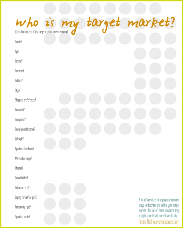
Step 1 – define and describe your target market. And no, just saying “women between the ages of 20-50” isn’t enough. That describes waaaaaaaay too broad of a group. That could cover a new grandmother, and an indie singer/songwriter, and a stay-at-home mother of 5, and a college fashionista. Those four people all will have very different buying habits. When figuring out out target market, you want to narrow down much more than that. Here is a printable list of questions – not all of these may shed light for every seller, but hopefully this will get your thoughts rolling:
Once you have a good feel for who your target market is…

Step 2 – find and appeal to your target market. There are a variety of ways to appeal to your target market: firstly through your product itself (like we talked about last week), as well as how you do your product photography, through your descriptions, through the style of your shop as a whole, and through the price of the product (and this does NOT necessarily mean a low price). Those various topics, though, are all ones which I will be devoting an entire post to in the future, so in this post we’ll be focusing more on FINDING the people in your target market.

I have three basic strategies when it comes to getting in touch with my target market:
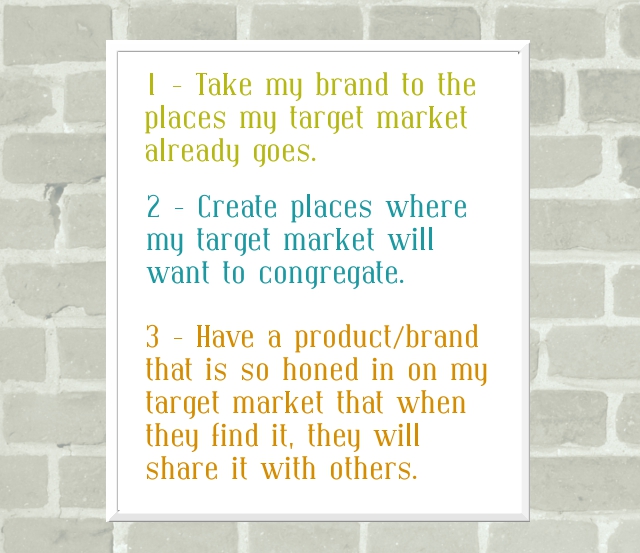
So, firstly, finding the places where my target market already goes. Personally, this why I sell my prints on Etsy rather than on my own site. If you are running a creative business, probably one of the features of your target market is that they like to buy from small/handmade businesses. That target market is shopping on Etsy, and other such similar sites. But, of course, that is still too broad, so even within Etsy you need to be seeking your target market. Think about how your customers actually search. Will they be searching “chunky cobalt knit neckwear” or will they be searching “blue scarf”? If your target market is trendy, and cobalt is a trending color, then you’ll be more likely to include that in your tags/titles. If your target market is less trendy, then blue will be of more value to you than cobalt. In general, make sure you have the more simple terms covered first right at the beginning of your title, then move on to more specific terms that are helpful, but probably not as often searched. Make sure you use ALL 14 tags on your listings, and fill them with words and phrases that have meaning to your target market. And, as we will talk about in later posts, make sure your photos are styled in a way that your target market will be drawn to them.

But even if you are only selling on Etsy, that doesn’t mean Etsy needs to be the only place you are seeking out your target market. Think about other (and non-commerce) sites where your target market is already gathered. Some of these would have some cost – for instance, taking out an ad on a website that your target market likes to visit, or do a giveaway on a blog your target market likes to read, etc. Some of these wouldn’t have to cost any money at all – for instance, you could join a forum that your target market uses and include your website in your profile there if that is allowed, or do a guest post on a blog your target market reads, etc. Yes, it takes time to find these places, and it is different for every target market.

Side note here – One thing you should not do is spam. Each of your reading this may have very different target markets, but I will tell you one thing that I know about your target market: they don’t like to be spammed. Think of it the same way as if your target market was all hanging out in one coffee shop – would you run in, yelling at the top of your voice about your products? Or would you put a flyer about your products on the bulletin board, maybe ask they cafe if they are interested in carrying your items, etc. Behave the same way online.

Ok, moving onto part 2 of my strategy: creating places your target market would like to congregate. I think this is most easily done with a blog. A blog allows for much more interaction than a shop alone. Plus, with a blog, you can offer highly valueable content for your target market for free – and that will draw them in. I think it was Mayi Carles who first enlightened me to this: a good way to come up with blog content is to ask yourself, “What problem does my target market face?”, and then post ideas and solutions on those topics. Is your target market made up of stay at home moms? Post family friendly recipes, home organization tips and activities to do with kids. Is your target market made up of outdoors-y types? Post camping how-to’s, tips on what to pack while backpacking, or give instructions for your favorite trail mix. Posting about topics that your target market will find helpful – and clearly linking to your shop on your blog – can be a great way to get in touch with your target market.

And the third part of my strategy: have a product and brand that appeals to strongly to your target market that they want to tell others about it. Like we talked about last week, having a really strong product is so crucial. But once you have a really sellable product, and a good feel of your target market, and put in some work to start getting in touch with your target market – the good news is that the internet offers soooo many ways for people to share the things they like. Pinterest, Tumblr, Facebook, Twitter, etc., etc. Word of mouth is such a great thing, and when your target market starts spreading the word about you, things can really take off. The thing is – that doesn’t necessarily come easy to get to that point. It takes a lot of work of experimenting with your products, as well as studying and finding your target market.

OK! Enough of general discussion, let’s go ahead and take a look at one of the shop owners who asked specifically about target markets. It is Mollie Doyle, owner of the shop The Bottle Garden – take a look:
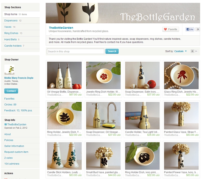
First of all, let’s point out things she is doing really well on:
-Photography. WOW. These photos are just absolutely gorgeous. The photos have a great ambiance without distracting or competing with the items themselves. The items really stand out, which is great. Also, there is a great cohesiveness to the shop as a whole, with all the items being photographed in a similar way. Gorgeous photos, Mollie!
-Profile. If you browse her shop and visit her profile, she has some great info there on what she does, written in a friendly and interesting way .. this is a great thing to have in a shop!! People who buy handmade love to know something about the person behind the shop.
-Policies. Filled out, clear, concise, and professional, which is exactly what you want. People are less likely to buy from a shop with no policies … or policies that leave them confused or uncomfortable.

And a couple things that are good, but might be tweaked:
-Descriptions. With a name like “The Bottle Garden”, and with the beautiful products in your shop, people are naturally going to be curious about your work – what you did and how you do it. And I don’t mean giving away trade secrets or anything, but along the lines of what you shared on your profile page … that these are recycled bottles and the neat things you have done to transform them. I really like how you put some of that info right at the top of this listing:
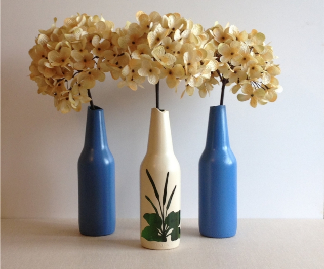
…where you wrote, “I designed this bud vase with a smooth broken edge. The top of the glass was carefully broken to create curves and then polished smooth.” That gives some great insight into the work you put in on these pieces! That kind of info is so valuable to a potential buyer. I know you mentioned price being a question – we’ll be getting into price more in a future post, but the more you make it clear the work that goes into each piece, the more likely people will be to pay a higher price tag. Also, in terms of searching, having really relevant words like “recycled” right near the top of the description would be great. I’d encourage you to start of each description talking a little about what it was you did to the piece, a couple sentences, and sprinkle in good keywords. That will be good in terms of people searching, as well as the top part is what the most people will actually read.

And lastly, a couple things to improve in, especially with regards to today’s topic:
-Target market. Really take some time to think about who you are trying to sell to – look at your beautiful products and think about who it is that would be buying this. A couple things jump to mind as I look at your products – because of the recycled nature of your products, the eco-conscious go-green demographic is one that I think would be a great fit for you. Another angle you could look at is the home decor aspect. Think of women with beautiful houses who enjoy decorating them with unique and quality items, and how much they would enjoy your items. Combine those two, and you’re definitely getting into a niche market! Green home decor is a topic I see around the web quite a bit … in fact after a quick search, I found this list of Top 50 blogs about Green Interior Design … sounds to me like 50 places where your target market already is! I’d suggest looking into pitching your products to relevant blogs – you’ve definitely got the great photos that blogs like that love. Also, if I were you, I’d tweak the tags and titles to involve more terms that pertain directly to your target market. Things like “eco friendly”, “go green”, “eco conscious”, “upcycled home decor” “up cycled” (different spellings are good to cover!) “green interior design”, etc. Monitor your stats to see which terms are bringing people in, and tweak as needed. And, of course, if you find that “eco-conscious women with expendable money for home decor” is too narrow, you can always try marketing to the eco-friendly sector more broadly, or to those interested in home decor and housewares, whether green or not.
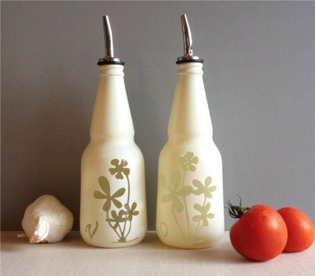
A couple other ideas for getting found – have you considered joining an Etsy treasury making group? Having high quality photos is a prerequisite to the groups that give the best results, and since you have that, you might want to go for it. Teams like that do have a time comitment, so you’d have to weigh it. I used to be on several treasury teams and while I was doing that, I made it on the front page of Etsy quite often. Eventually, though, I grew to the point that I was bringing in my own traffic and the time commitment was just too much. But it can definitely be a helpful way to network and grow when you’re starting out. Same thing with social media, or if you would want to consider a blog – you have to weigh which ones are really beneficial and useful to you. We’ll be talking more about social media and such in more detail in a future post.

Overall, Mollie, GORGEOUS shop! I think it’s just an issue of really honing in on your target market and starting out seeking them where they are, in the Etsy search terms, on green design blogs and so forth. Good luck!

I hope this post has been helpful for Mollie and for others as well. Are you trying to figure out your target market too? Have questions or comments about it? Leave them below, I love to hear from you!

Where is special to you? Custom map art…

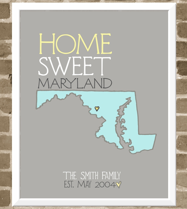
I love maps. And I love when customers give me great ideas for new prints to offer. :) I had someone request a custom map art print to give as a gift to a young couple to commemorate the location where they got engaged! It was such a sweet project, that I thought it would be nice to offer custom map prints for others as well.

I made this as an example if you wanted a print to show your home state, or it could also show the place where you got married, or where your child was born, or a favorite destination from your travels .. any special location you would like turned in to a print! Or, of course, like the project that got me started on this in the first place – you could create a custom print for someone else, which could make a truly unique gift, as the holidays will start approaching before you know it. You get to choose the colors, the text, the location, etc. The details are here.

Where is a place that is special to you? Now that we have moved, I think I might just have to make one of these for our family, with a heart over Boston. :)

Interact! 7 blog layout tips to engage your reader

Why is it that we blog? Why not just write in a journal? The specific answers may vary, but in the end it all comes down to the audience – the readers.

Maybe you want to make people laugh, maybe you want to offer people help, maybe you want to share stories, maybe you want to draw traffic to make money. It’s all variations on a theme: finding readers. Because if we didn’t want readers, we would just write in in a private journal. So when people land on your site, if they are your target readership, you want them to stick around, get to know you and get hooked! What should be at the top of the page? What should be in the sidebar? Today’s post is 7 blog layout tips to keep people on your site, and to encourage them to interact with you – largely by subscribing and commenting. You know it’s what you want! :)

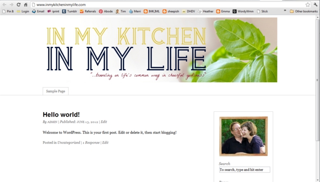
And as in all the previous posts in this blog redesign series, my friend Lori’s blog, “In My Kitchen, In My Life” will serve as the example where I’ll be making these changes. So here we go!

Comments are like candy for a blogger. I LOVE comments. It lets me know people are reading – and it lets me know what they are thinking about what I’m writing. Comments give you great feedback on what people want more of, what people find especially helpful, and plus, they’re just fun! Here are some hints to encourage commenting:

‣‣‣ Make sure your readers know you WANT comments! Don’t be bashful. At the end of your post, put a clear “call to action” asking people to leave their thoughts and letting them know you enjoy hearing from them.
‣‣‣ You can take it a step further and instead of asking for comments in general, pose a particular question that you would like comments on, and include that in the “call to action”.
‣‣‣ Make it EASY for them to comment. Avoid using CAPTCHA like the plague, and if possible, just provide a place for name/email/website rather than making them sign in to comment.
‣‣‣ Have a blog design that allows threaded comments so people can respond to each other.
‣‣‣ Once someone leaves a comment – reply to it! Especially on your most recent posts.
‣‣‣ Realize people comment about your blog elsewhere than your comment section. Provide social sharing buttons at the end of the post to make it easy for people to share and comment on your blog on sites like Facebook, Twitter, Pinterest, etc. (Helpful tip: if you’re curious what people are pinning and saying about your site on Pinterest, just go to pinterest.com/source/YOURDOMAINHERE.com … just put your domain name where it says “your domain here”. For instance, mine would be pinterest.com/source/theflourishingabode.com. See what people are pinning and commenting there, too!)
‣‣‣ Consider some WordPress plug-ins that make commenting even more friendly for your readers! For example, Lori wants “Comment Luv” on her blog. That’s the handy little feature that includes a link to your readers’ most recent blog post along with their comment. You can find this, and other commenting-friendly features, in the plug-ins section of your WordPress dashboard. Just click “add new”, search for the plug in, and when you find it click “install now”. Then once it has installed, click activate! Easy-peasy – now CommentLuv is installed on her site! Some plug-ins have options, and you can edit those under the “Settings” section of your WordPress dashboard.

So there are some ideas on encouraging comments. But before you can get comments, first you need readers to stick around and feel engaged enough to WANT to comment. (By the way, I’m totally hoping to hear from you in the comments of this post!) Plus, you’re hoping they’ll subscribe so they’ll be back for future posts. The rest of the tips address those issues.

If you’re not familiar with the term “above the fold”, it just refers to the amount of a webpage that you can see before you scroll down. If you have to scroll down to see it, it is “below the fold”. First impressions really do make a big difference – if someone lands on your blog and they don’t like what they see above the fold, chances are they’re not going to take the time to scroll down and investigate further.

Bear in mind “liking what they see” isn’t just style, but also whether it looks easy to use and navigate. It might have lots of pretty elements, but if there are a gazillion different things going on, and they can’t tell where to go or what to do – people generally aren’t going to stick around. So usability and navigation is a HUGE part of it. There is also the style side, of course – but bear in mind, like we talked about before, you’re not trying to appeal to everyone, you’re trying to appeal to your target audience. One big part of the style showing above the fold is your banner, like we talked about last week.

Whatever it is you’re going for on you blog, the area above the fold should “hook” your target audience. The style should speak to them, the navigation should be easy, and it should be clear what they can expect. In deciding your layout, remember that above the fold is the most valuable space on your website, and you should make sure it is high impact. But *how* to do that? On to the next tips…


In this online world of computers and information, one of the reasons we are drawn to individuals’ blogs, or small handmade businesses and so forth on the internet is because of the PEOPLE behind them. When we meet someone, we can see their face, and their personality in their appearance. In your content, you should also be conveying who you are and your personality … but in general it’s still a lot easier to “connect” if you can actually see the person. A nice well-lit photo that conveys your personality near the top of the page is a GREAT way engage your visitors – let them see you! Lori has this *fabulous* photo of her and her husband – I just love all the personality and joy in this photo. Plus, it starts cluing you in to the fact that her blog is about home and family right away:
I think it deserves to be above the fold. It’s welcoming, important and creates a connection. So I put it at the top of her sidebar (and check it out – her branding colors are even incorporated in her photo! Just like my colors are in my photo. Ka-pow!):

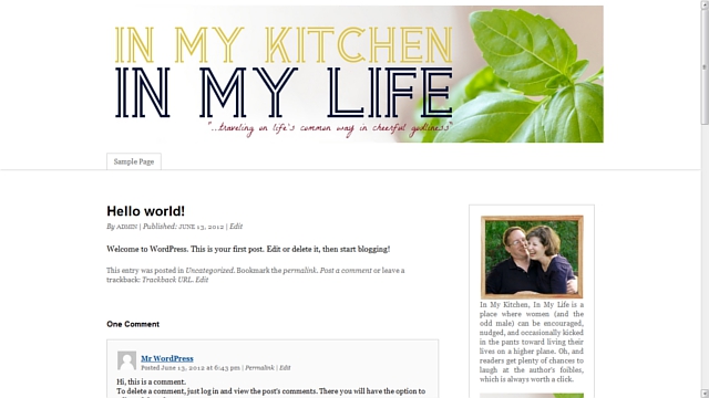
Ok, pull back out your branding printable from week 1. (I told it would come in handy!) One of the questions on that first page was, “Someone has just landed on your blog and wants to know what it is about: Describe your blog in 50 words or less.” If you answered this question (and kept in mind that you’re explaining your blog to someone who just landed on your site), then you now have a great little blurb to use on your site! Here is Lori’s blurb: “In My Kitchen, In My Life is a place where women (and the odd male) can be encouraged, nudged, and occasionally kicked in the pants toward living their lives on a higher plane. Oh, and readers get plenty of chances to laugh at the author’s foibles, which is always worth a click.” Have to say, I love her style. :)

I’d recommend having either a little description of yourself or of your blog right below your photo. On my blog, I have a description of myself there, and I have my blurb a little farther down the page under the heading “so … what’s this place all about?”. Here is Lori’s blog with the blurb put right below her photo:

So, let’s say someone has landed on your site. Your banner speaks to them about what your site is about, they see your photo and feel a connection to you, the writer, and then they read your blurb and think to themselves, “Wow, this is right up my alley!” The content they came to read is helpful, and they’re liking what they see. They are your target reader. Maybe they leave a comment, maybe they browse around some more. They think, “Oh, I like this blog!” And then they leave to go do something else and you never see or hear from them again.

What was missing? Subscribing. But if you really want people to subscribe, you NEED to make it easy and obvious – don’t make them hunt for it. I’ve heard this as good rule of thumb – ask a friend to look at your blog and if it takes them more than 5 seconds to find where to subscribe, you need to change it. Ideally, it should be above the fold or JUST below the fold.

I also think it’s a good idea to have additional places to subscribe at places on your blog where a reader has reached a point of “commitment”. For instance, if they read a blog post and make it to the end, or if the decide to leave a comment, or if they make it to the bottom of your website, there can be an option there to subscribe. If they’ve made it that far in, give them another opportunity to keep in touch.

But what kind of subscription should I offer? RSS? Email subscription? A weekly newsletter? Or what? This will vary somewhat depending on what type of blog/site/business you have and your personal preferences. You have to weigh the pros and cons. For me, email subscription to my blog itself has been by far the most popular way to subscribe, though I do offer RSS as well, and I also tried a newsletter. Just to illustrate – I officially launched this blog in January, and I now have 524 blog subscribers by email, but just 106 subscribers by RSS/readers. I had tried a newsletter in the past, but personally, I found a newsletter to be extra work and less effective because I had more to share than I could reasonably put in a weekly newsletter. I definitely prefer just offering blog subscription, and putting anything I would put in a newsletter into a blog post. *shrugs* But that’s my personal preference.

We’ll be getting more into exactly HOW to set up email subscription, etc. to your blog in a week or two when I move Lori’s blog over to WordPress and get all that stuff set up more fully. But for now, I’ll just set up a place for it high on the sidebar with a button that incorporates her branding and design choices, like we’ve talked about before:

People who land on your blog won’t automatically know everything you have to offer .. and they probably don’t want to scroll back through pages and pages of posts hunting. You want to make navigating around your blog as easy as possible. Here are a few suggestions to help with navigation

‣ ALWAYS make sure you have a search bar for your blog on your page.
‣ Put blog posts in “categories” so the people can click on those categories and see what else you’ve written on the topic
‣ Consider including a category drop-down menu in the sidebar do people can browse and discover more content
‣ Consider having buttons in your sidebar that link to an especially good series/topic
‣ Consider building stand-alone pages/menus that give helpful lists of posts or give maps of your content (we’ll be talking about this more next week)
‣ Consider making a gallery of posts (like I have on my Tips & Tutorials page)
‣ Make sure your contact info is easy to find from every page

The sidebar on a blog is some pretty powerful real estate. For one thing, the sidebar is visible on pretty much every page of your blog. Different people will have different priorities for the sidebar. If you make money by ads on your blog, ad space is going to be important in your sidebar. But firstly, your sidebar IS your own! Make sure you’re using it for the things you need to use it for to make your blog user-friendly and easy to navigate. And if you don’t have ads, don’t feel the need to fill up your sidebar with just a lot of “stuff” – think about what will have the most impact and engage your readers. Your sidebar is valuable real estate, and that is what to remember in deciding what should go there. Here is what I’m recommending on Lori’s sidebar, and which I think are just good to have in general, most of which we’ve already talked about:

‣ at the top: a photo of her, a blurb about her blog and a subscription form (as we’ve already talked about)
‣ Branded buttons linking to series/features (to help with navigation to some of her best content)
‣ Branded buttons linking to her Twitter and Facebook page (to encourage connections on social media)
‣ A search bar (to help with navigation)
‣ A category drop down menu (to help with navigation)
‣ A “grabbable” blog button (handy tutorial for that here)

It’s too much to fit in a screen shot, so instead you can just go check it out and see the work in process on her blog here: In My Kitchen, In My Life. and within just a few weeks it will be time to transfer her blog over from Blogger to WordPress!

I hope these tips have been helpful … and I’ve also laid my secrets out on the table: I want to interact with YOU! I’m always thrilled to get a notification of a new comment. Let me know what you’ve found helpful, or even just say hi – it really does make my day. :) Leave your thoughts and comments below!

If you’ve missed the other posts in this series on DIY blog redesign, here they are:
Part 1: Discover your branding with “The Drawing Board” Printable
Part 2: WordPress vs. Blogger
Part 3: Design Tips + Design Worksheet
Part 4: Themes, Coding and Stylesheets
Part 5: Making your own graphics
Part 6: 7 Blog Layout Tips to Engage your Reader (This is this post!)
Part 7: Blog Page: The Must-haves and the Panache
Part 8: 25 Tips for using WordPress
Part 9: The Big Reveal
Part 10: 7 Ways to Promote and Market Your Blog

August’s Half-Off Print (+ our moving date!)

Time to announce August’s print-of-the-month for half off! And also let you know that since it’s getting to the end of the summer, this is the last month I’ll be doing this. Also – I wanted to let you know we have a moving date! Lord willing, the day we are leaving for Boston will be August 25th!! WooT! I am SO excited!! However, I will probably be closing up my shop sometime around the 19th or 20th. So if you want the print-of-the-month, or anything else from my shop before we move, you probably will want to do that sooner rather then later.

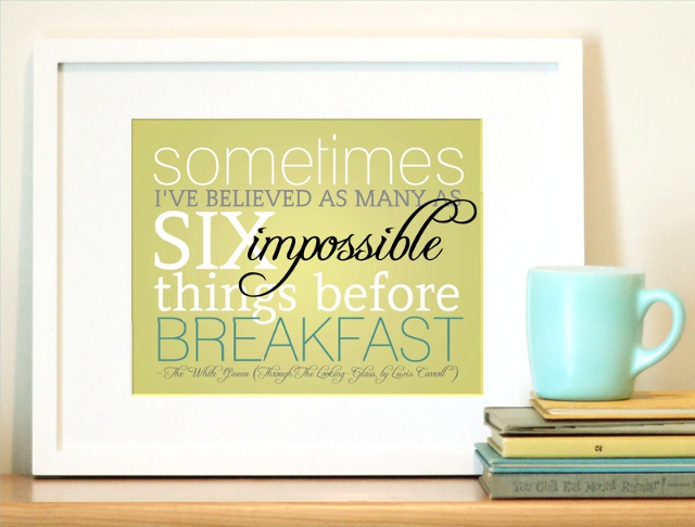
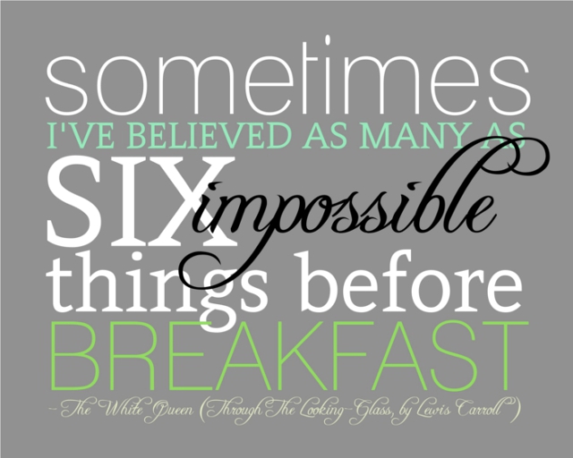
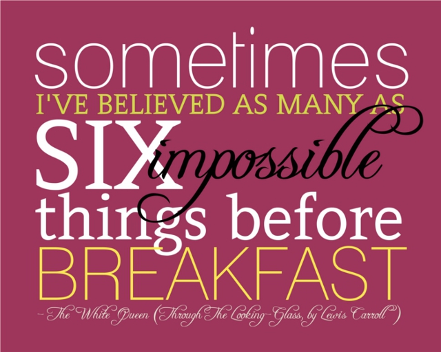
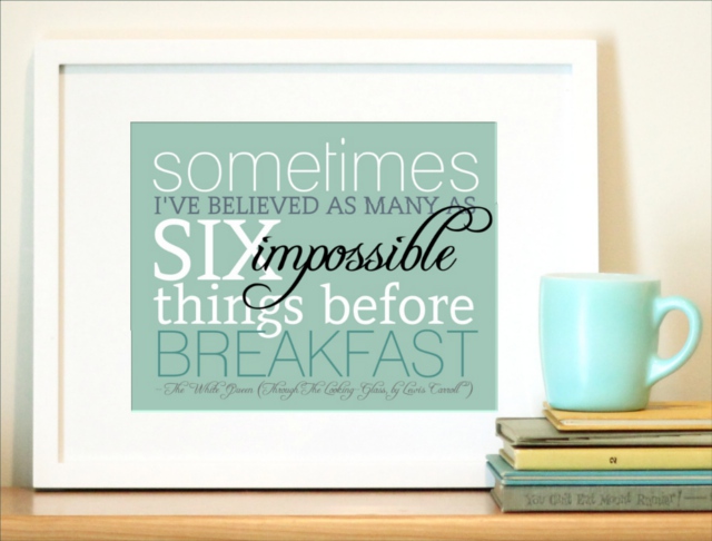
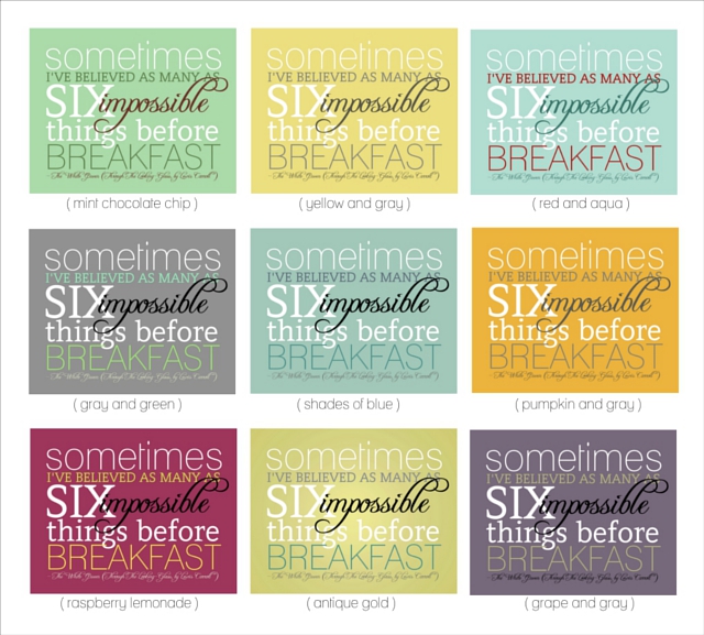
Anyway! Enough chit-chat .. here’s August’s print of the month! It’s my “Six Impossible Things” print, which is a quote from one of my favorite books, Lewis Carroll’s “Through the Looking-Glass”. It’s 8×10, so it’s usually $25, but with the discount it is $12.50. Eek! And any of the colors variations are available for the discount. :) Just use the coupon code FROMTHEABODE

You can click here to see all the options for this print in my shop. The coupon code is valid only on this print, and only while my shop is open during the month of August. I’ll be opening back up shortly after we move, but it might be the beginning of September. Also, the moving sale coupon code LETSMOVE is still good for 30% off any vintage items in my shop (I don’t want to take it all with me!) – but only for a few more days until I remove all the vintage from my shop. I’ll probably keep the vintage section closed for quite some time.

So, naturally things are pretty hectic here as we’re trying to pack some things … and get rid of even more as we continue to downsize for our move. Busy, but happy. How is your summer going?
Leave your thoughts and comments below, I love to hear from you!