Skip to content

blogging

25 WordPress Tips: Printables, Scheduling, Avatars…

Well, we’re preparing for the big move! And I don’t mean our move to Boston, although we are leaving for that TOMORROW! (WOOHOO!) But actually, in the context of blogging, I’m talking about how to move from Blogger to WordPress. This series is now in week 8 and we’ve been making great progress working on Lori’s blog redesign (and hopefully you’ve been making progress on your blog too!) as we’ve been going through this series. The goal was to use Lori’s blog, In My Kitchen, In My Life as a demonstration on how to create a new fully branded look, to move from Blogger to WordPress, and use WordPress tools to best benefit your blog.

So far, we’ve mostly been working on the branding and design aspect. Next week, I’m excited to say, is when we will move her blog from Blogger to WordPress! But one of the things about switching to a new blogging platform is learning how to use it. Lori is, of course, completely new to WordPress, and I’ve heard several of you mention in the comments that you tried WordPress but just were not sure how to use it. So for today’s post, I have 25 WordPress how-to’s, ranging from more simple things such as how to schedule a post to publish later, to things that might be a little more advanced, like how to make printables available on your site, or how to make a custom default avatar for your blog. So hopefully by the end of the post you’ll feel much more at home in WordPress – or even if you’re already on WordPress, that some of the more advanced tips will still be helpful to you! :)

All the tips assume that you are using WordPress.org on your own domain (some may apply to WordPress.com as well, but I’m just not familiar with it), and that you are logged in to your WordPress dashboard. If you’re not sure how to get there, just go to www.YOURSITEADRESSGOESHERE.com/wp-admin and sign in there to get to your dashboard. This is your dashboard – and the menu over on the left side is how you navigate around to different tasks:
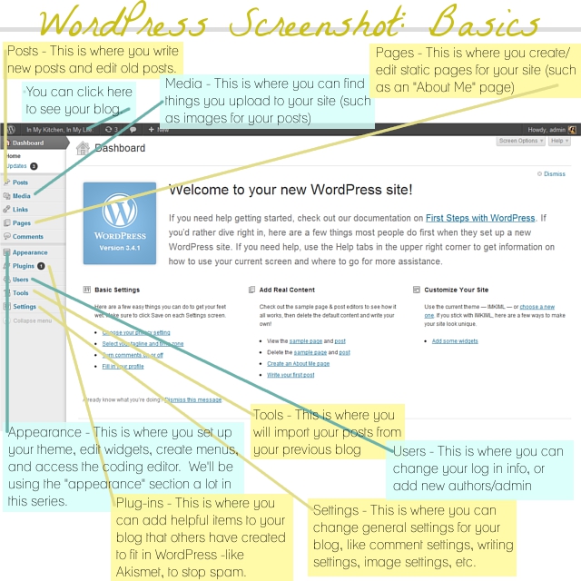
So let’s jump right in! We’ll start off with the simpler tips. The first eight tips all have to do with something that is obviously very important – creating new blog posts:
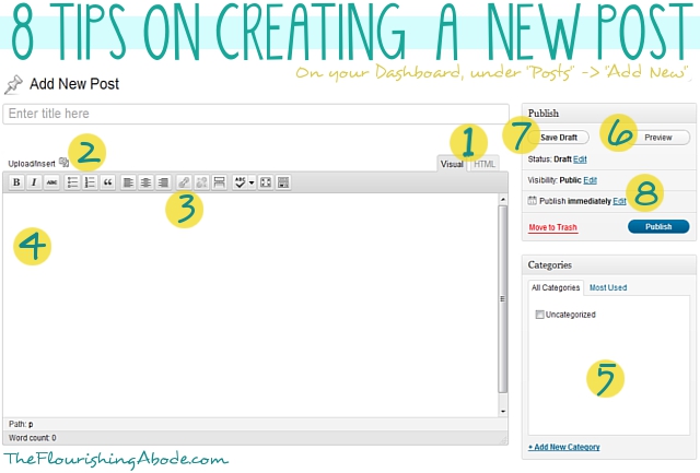
1. Visual vs. HTML.
So the place to put the post title is pretty obvious, as is the large white area where you actually type the post. BUT — there are actually a couple different options on what format you want to use to write you blog post. One is visual and one is HTML. The tabs for these two options are shown at point “1”. Basically, if when you change the appearance of your post (like, if you add an image, make text bold, etc.) and you actually want to see the result of the change in the editing box, then use the “Visual” mode. If when you make a change to the appearance of the post, you don’t want to see the result, but instead you want to see and be able to write the actual HTML, then use the HTML mode. I personally always write in the HTML mode. Depending on which mode you choose, the options along the gray bar at the top of the edit box will look a little different. Heads up, though – while working on one post, don’t keep toggling back and forth between the two, as it can cause some hiccups. Just pick the one you want and stick with it.

2. Inserting images.
So, you’ve titled your post, and you’re writing it, but you want to add an image. This is super simple. Just click the little button by “Upload/Insert” (shown at point 2 in the image above). A box will pop up – click the “Select Files” button, then get the image you’re wanting to use from your computer. Once it has uploaded, scroll down the pop up box … there will be various options in the box you can choose if you want, such as resizing the image, making it centered, or “Link URL” (if you want the image to be a link to somewhere, then put the address as the link URL). Click the “Insert into post” button at the bottom, and now it is in your post!

3. Creating links.
Maybe you want to link to another website in your post. Use your mouse to select/highlight the text you want to turn into a link. Then click the “link” button (shown at point 3) and paste the address you want the text to lead to into the box that open. If you want, check the box that says “open this link in a new window”, so that when people click the link they won’t leave your blog but instead the link will open in a new window. Click “OK”. Now your text is a link like this: this text is a link.

4. Adding video from another website.
This may not be something you use all the time, but it’s handy to know. If you want to upload a video straight from your computer, you would just add it the same way you add an image. But if you want to include a video from another website in your post (for instance, a YouTube video), you might think you should try to use the “embed” code YouTube offers – but you’ll find it doesn’t work on WordPress. Actually, it’s simpler than that, anyway. For this, make sure you’re editing in the “HTML” mode, and just paste the link to the video right into the box. You don’t need any code, just the video address. Make sure the address is on its own line, without any spaces before or after the address, and you should be good to go!

5. Put posts in categories.
Categories are really helpful on a blog. For instance, this post I’m writing is part of a 10 part series, so I put each post for this series in the category “DIY Blog Redesign“. Then if you click on that category, it takes you to a page that has all the posts from that category. It’s pretty helpful for navigating around the site. So when you write a blog post, choose which categories it goes in. You get to make up your own categories, and add them with the link at the bottom of the category box. You can also edit your categories in greater detail by choosing the “Categories” option under “Posts” on your dashboard sidebar.

6. Preview before publishing.
Want to see how your post is looking? Just click the preview button. If you’re using “visual” mode, this may not seem as necessary, but I still encourage you to preview your post before publishing. Then you can check, for instance, that your post’s title fits on one line, that your images aren’t too large, etc.

7. Save drafts.
WordPress automatically saves a draft of the post you are working on writing, but even so, if you’re not ready to publish, be sure to hit “save draft” before closing the post.

8. Scheduling a post to publish in the future.
At point 8 in the image above, you’ll see where it says “Publish immediately”. That means if you hit the “publish” button, the post will go live right away. But what if you want it to wait and not publish until tomorrow? Or next week? Just click the “edit” button next to it, and select the date/time you want. Make sure you hit “ok” once you’ve made your choice. Now the publish button says “schedule” instead, and when you click it, that means the post will be published on your blog at the time you selected. Very helpful. For instance, if I was smart, considering that we are moving tomorrow, I should have written this post two weeks ago and scheduled it for today. Buuuuut I’m not that ahead of the curve, so instead I’m staying up late to write. ;)

And, as we mentioned last week, you edit stand-alone pages and posts in the same way, so those first 8 tips apply to both. The difference is just that to start you would choose either the “Posts” or “Pages” option on the navigation bar on your dashboard. You can click here to see last week’s post all about pages.

The next three have to do with handling your media:
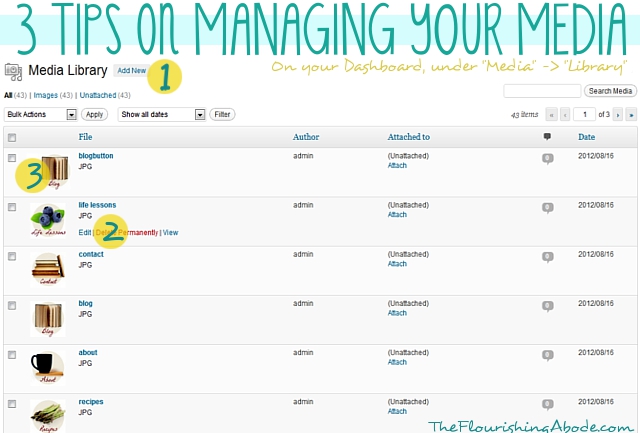
1. Adding new media.
So, I mentioned before how to insert an image (or other media) directly into a blog post. Sometimes, though, you want to upload a file without just inserting it directly into your post. Just click the “add new” button in your media library, and then you can either browse for the file, or drag and drop into the box.

2. Making printables available on your site.
A good example of a time you might want to upload something on your site without directly inserting it into a post would be if you want to have a PDF printable file available on your site. So, first you would upload it, as stated above. Then, you need to get the URL of the file. To get to the URL of any media you have uploaded, hover your mouse over that item in your media library. A few options will pop up, as you can see by point #2 in the image above. Click “edit”, then scroll down to “File URL”. Copy the address you see there. Now, when you write your post, you can use that URL to create a link, either by using the link button (as described in tip 3 above) or by adding the link to an image (as described in tip 2 above). Now when your readers click that link, it will open the printable!

3. Always upload image at the width of your blog post.
There really isn’t much point to uploading giant sized images to your site. You still want it to display only as wide as your post, and it just makes your site run slower. Also, I highly recommend not using images less wide than your blog post, because then you start having all sorts of different width images in your posts and it just looks messy. I have a few old posts like this and they drive me crazy. It looks so much better to always have your images the same width – no wider and no more narrow than your post. I recommend that before you upload an image you make sure it is that width. For instance, I only upload images to my site that are 640px wide. It keeps it nice and easy, because you don’t have to resize in your blog, keeps your posts attractive, and doesn’t bog down your site.

The next 7 tips are about plugins…
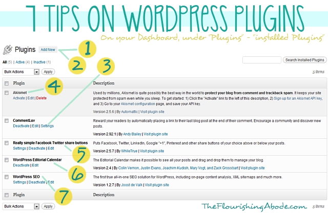
1. Adding a new plugin.
Plugins are a great way to add new tools and functions to your blog. If there is something you wish your blog could do, chances are you can find a plugin that can make it happen. To add a new plugin, first click the “add new” button. (yeah, surprise!) Then, search for the name of the plugin you want. Once you’ve found it, click the “install now” link. Once it finishes install *make sure* you click the activate button. Easy! :)

2. Finding new plugins.
Ok, so step one sounds easy enough – but how do I know what the name of the plugin is that I’m looking for? You can always search keywords, but the plugin search is only so good, so personally I like to Google “wordpress plugin (and whatever use I’m looking for)” to find the names of plugins I might be interested in. I’ll share a few types you might find helpful in some of the other tips.

3. Changing the plugin settings.
Some plugins have settings that you might want to change. For instance, if you have a plugin that lets people follow you on Twitter, you will need to set it to know what your Twitter username is. Some plugins will add options/settings to your sidebar, but you can also find if there are settings in the menu of your installed plugins, as shown at point 3.

4. Anti-spam plugins.
As I mentioned, I’ll give a few categories of plugins you might be interested in – one of which is an anti-spam plugin. We’ve talked before about the evils of CAPTCHA, and you definitely want to avoid that, but some sort of anti-spam tool will most likely be needed. Preferably, though, you want one that will be invisible to your readers. Akismet is what I use, and I’m very pleased with it, although it does cost a few dollars a month.

5. Social media sharing buttons.
In one form or another, you certainly want social media sharing buttons so that your readers can easily share your posts with their friends and followers. The three biggest, at least for me personally, are Facebook, Twitter and Pinterest, although there are many more. A plugin that automatically includes sharing buttons at the end of your posts is a must have in my book.

6. Editorial Calendar.
Having an editorial calendar can be SO helpful in scheduling posts ahead of time. I already mentioned earlier how to schedule a post for the future … but looking at your list of posts/drafts/scheduled posts does not make it very easy to visually see what you have coming up on various dates. Installing an editorial calendar (which can then be accessed on your dashboard sidebar under “Posts” -> “Editorial Calendar”) makes it easy to have a visual sweep of upcoming posts, and lets you easily create drafts for future dates that you can then write later. Love. it.

7. SEO tools.
There is a lot to SEO (SEO = Search Engine Optimization) and how it works. Showing up well in search engines can be very important to a blog, or any website. A plugin that helps SEO won’t really be a fix all … but it can definitely help. I personally love Yoast. Once you install it, on the edit page of each post there will be a box at the bottom where you can input keywords, search engine titles and descriptions, and lots of other helpful SEO stuff. It isn’t all you need to have good SEO, but it does help. If you’re serious about SEO, there is a ton of great info out there on the web to help you.

The last 7 tips are on settings options:
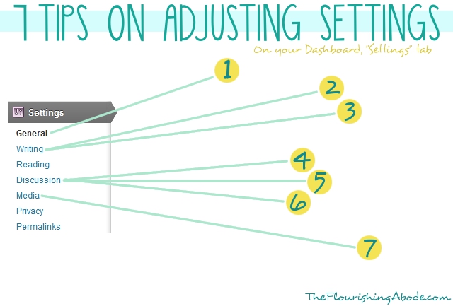
The menu shown above is what you would see in your navigation sidebar if you click on “Settings”. There are lots of settings you can explore under each option, but here are a few you might want to check on…

1. Time/date settings.
Under “general” options, you will find the time and date settings. Make sure these are set according to your time zone and such – it can be very frustrating to schedule a post and expect it to publish at a certain time, only to discover that your blog is on an entirely different time zone!

2. Unconvert emoticons.
I don’t know why, but the default setting in WordPress is that if you make a :) face, it automatically turns it into a cartoon smiley face. Personally, I think it looks kind of … odd, especially if it is on a professional blog. You can turn off this option under the “writing” settings.

3. Default post category.
I mentioned categories earlier in this post. If on a particular post you forget to put it in any category, WordPress just goes ahead and puts in the default category, “uncategorized”. However, you can change what the default category is under the “writing” settings. My default category is “blogging”. :)

4. Disable pingbacks and trackbacks.
Under the “discussion” settings you will find lots of options for how people can interact with you blog. One of these options is “pingbacks and trackbacks”. I would strongly recommend disabling these. Unlike comments, which allow for discussion, pingbacks and trackbacks are just a breeding ground for spammers.

5. Comment settings.
There are lots of other comment options you can choose from in the “disussion” settings, as well. Comments are a HUGE part of blogging, so look through here and make sure the settings are set to the way you want – for instance, make sure threaded/nested comments are enabled, that people don’t have to be members of your site to comment, that you will be emailed when there are new comments, etc.

6. Custom default blog avatar.
This is a more advanced tip, but if you really want to take your branding to the next level, you can create a custom avatar just for your site that shows up if people don’t have a Gravatar. For instance, I have my illustrated typewriter than shows up as the avatar – although, of course, Gravatar trumps that, naturally. (If you don’t have a Gravatar, it is a universal avatar associated with your email, and anytime you comment, that avatar automatically shows up – I definitely recommend setting up your own at gravatar.com) But what I’m talking about for blog design is the avatar that shows up as default if people DON’T have a gravatar. There are a few rather blah options that WordPress offers, but you can really brand-up your blog with a personalized one. Using the instruction above about plugins, add the plugin “Add New Default Avatar”. Then, using the instructions from my previous post on making your own graphics, create a branded avatar .. 80×80 is a safe size in Thematic. Then using the instruction in today’s post about media, upload your image to your media library and get the URL. Then go to the “discussion” section of your settings, and scroll down to the avatars. Paste the URL in the custom avatar box, then save changes. Now, along with the other options for avatars, there should be your new custom avatar image. Choose that option, and click “save changes” again. Your blog now has its own custom branded default avatar! WooT!

7. Default image settings.
Under the “media” settings, make sure that the auto embed is enabled, so that you can just paste YouTube addresses in (as mentioned before) … and it can also be a good idea to adjust the auto sizes of your media to fit the width of your blog posts. That way images you upload (if they’re not already the right size) will adjust to the width of your blog, and embedded videos will also fit your blog properly. Keeps things nice and neat!

Well, that makes 25 total! I hope these tips have been helpful for you. Did you learn anything new, or is it all old hat to you? Do you have some tips of your own to share? Leave your thoughts and comments below, I love to hear from you!

If you’ve missed the other posts in this series on DIY blog redesign, here they are:
Part 1: Discover your branding with “The Drawing Board” Printable
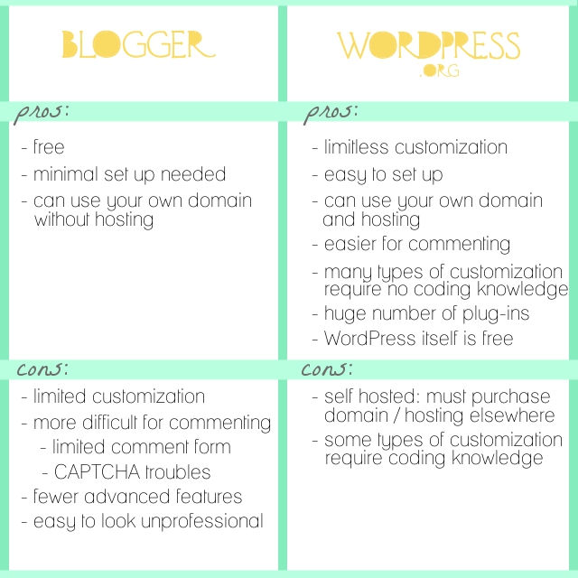
Part 2: WordPress vs. Blogger
Part 3: Design Tips + Design Worksheet
Part 4: Themes, Coding and Stylesheets
Part 5: Making your own graphics
Part 6: 7 Blog Layout Tips to Engage your Reader
Part 7: Blog Page: The Must-haves and the Panache
Part 8: 25 WordPress Tips (This is today’s post!)
Part 9: The Big Reveal
Part 10: 7 Ways to Promote and Market Your Blog
Tips on blog pages: The must-haves & the panache

A few posts back I mentioned the importance of white space (especially in your background), but that if you are worried about it making your design too boring, do not fear! There are other ways to add panache to your site – ways that enhance rather than distract from your content. The banner and the sidebar we have already discussed – and today we’ll be talking about something that I consider to be often overlooked design-wise: your menu of stand-alone pages.

When I refer to “stand-alone” pages, I’m talking about pages you create that don’t shift down in order like regular blog posts – these are pages that stand on their own. For instance, the “About Me” page is a very common example of a stand-alone page. You can see my menu of stand alone pages right below my banner – each with my own pen and ink illustration. Personally, I think that menu is one of the main things that helps my blog design to be unique and branded. Plus, it helps with navigation, as several of those pages are designed to highlight particularly useful posts (like in the Tips & Tutorial gallery or on the Printables page).

In today’s post, I’m going to be sharing my thoughts with you on important and helpful ways to use pages, as well as tips ranging from practical to the more panache on how to set them up – and, as always, demonstrating on Lori’s new site for her blog, In My Kitchen, In My Life. And I’m reeeeeeeeeeeeeally excited about Lori’s new menu of buttons which I will be showing later in this post! The possibilities are fairly endless on how you might choose to use your pages. But here are my suggestions as a couple “must-haves” in your pages … as well as a list of ideas for “maybe-haves”, depending on what kind of blog you have.

An “about” page is HUGELY important for a blog. I’ve heard statistics that, in general, the “about me” page is one of the most highly visited pages on a site. Why? Because people want to know who you are and what the site is about! People like to talk and visit with someone they know. Use your “about” page to let people get to know you. Let’s say you run a weight-loss blog. Why do you? Is it because you have a touching story of how you lost a lot of weight yourself, and you want to help others? Or is it because you see the growing trend of overweight children in America and you want to help parents keep their kids healthy? People love to hear your story.

Here are a few fun ideas for ways you might approach your “about” page:

‣ ‣ ‣  Photographs and descriptions of you doing things pertaining to your blog subject
‣ ‣ ‣  A bullet list of interesting facts about you
‣ ‣ ‣  The story of how you got involved in whatever activity it is that you blog about
‣ ‣ ‣  A video for your about page
‣ ‣ ‣  Your own personal mission statement, and the things that matter most to you
‣ ‣ ‣  Humorous interview style
‣ ‣ ‣  Stories/pictures from your childhood that help define you
‣ ‣ ‣  Separate “about” pages for your blog itself, as well as each writer on your blog
‣ ‣ ‣  Etc! Have fun with it!

Some things to probably avoid on your “about” page…

‣ ‣ ‣  Writing in the third person. Unless you have highly unusual circumstances on your blog that make it extremely formal, write in the first person. We all know it’s you writing it. Imagine you are talking to your readers when you write it … and how odd it would sound to talk in the third person.
‣ ‣ ‣  Making it reeeeeeeeeeeeeeally long. It doesn’t have to be your WHOLE life story, just give people a glimpse into your life and a taste of your personality.
‣ ‣ ‣  Résumé style. People want to “meet” you on your about page … not feel like they’re being sold to or that you’re trying to prove something. Highlighting some accomplishments is fine, but try to keep it casual and personable. Awards/features/accomplishments can, in fact, have their own page, like a “Press” page.

But one way or another, have an “About” page on your blog! You visitors are looking for it.

Your contact information should be easy to find from any page a visitor may be viewing. A good way to do this is to have your contact page in your pages menu. There are any number of reasons a visitor to your site may want to get in touch with you – they may want to advertise on your site, they may be interested in guest posting, they may spot an embarrassing typo they want to alert you to, they may want to keep in touch with you on social media sites, they may just want to say hi! Have that contact info easy to find. How much contact info you share is completely up to you. I’ve seen people on large blogs even including their home address so people can send them gifts! Personally, an email address is the most personal info I put on my site … and even that is my “professional” email address, which gets screened through a couple filters before it gets forwarded to my personal email, to weed out the spammers. Also – helpful hint here if you’re concerned about bots scanning your site – you can always include your info in an image rather than in type. That way a real visitor will be able to see it, but it won’t get scanned the same way by bots and crawlers. Or you could always set up a “contact form” where people submit their questions/messages right on your site rather than providing contact info. But at the very least, it is a good place to share your links for how to contact you on other sites – for instance, your Twitter, your blog’s Facebook page, your Pinterest, etc.

Ok, so now you have an About page and a Contact page. What other pages might you want? Really, the possibilities are endless. Here is a list of ideas – and not all of these will be applicable to everyone and you wouldn’t want this many anyway – but hopefully this list of ideas will help get your mind rolling…

‣ ‣ ‣  Home/Blog Page (helpful, because a lot of people won’t be landing on your most recent post, if they’re coming from Pinterest or anywhere else that linked to a previous post)
‣ ‣ ‣  About Blog Page (in addition to an “about me” page)
‣ ‣ ‣  Welcome Page (where you can give first time visitors a tour)
‣ ‣ ‣  Shop Page (where you sell your wares)
‣ ‣ ‣  Press Page (where you highlight places you/your blog have been featured/awarded/etc.)
‣ ‣ ‣  Sponsor Page (info on advertising/sponsoring your blog)
‣ ‣ ‣  FAQ’s Page (your answers to frequently asked questions)
‣ ‣ ‣  Highlight Content Page (pages like my “printables” page or “tips and tutorials” page that highlight especially relevant content from your blog)
‣ ‣ ‣  Outside Pages (including a button in your menu that doesn’t lead to a stand-alone page, but rather links directly to a site outside of your website – for instance my “Cafe” button in my menu takes you to my Etsy shop, FlourishCafe – or another example would be a button that takes you to a subscription form)
‣ ‣ ‣  Links Page (a page that includes links to other pages, like if you want to recommend other blogs/books/resources/etc.)
‣ ‣ ‣  Map Page (a sitemap to help people get around your blog)
‣ ‣ ‣  Etc! The sky is the limit.

First, we’ll go over the basics – and next, how to get that extra panache with images and such. Since in this series we’re moving Lori’s blog from Blogger to WordPress, most of the tech stuff in this series is about how to do things on WordPress. However, in this instance, I actually wrote a blog post a while back when I was on Blogger myself about how to make stand-alone pages in Blogger. You can click here for that post … it’s like a glimpse into the past because it’s from my old blog. :)

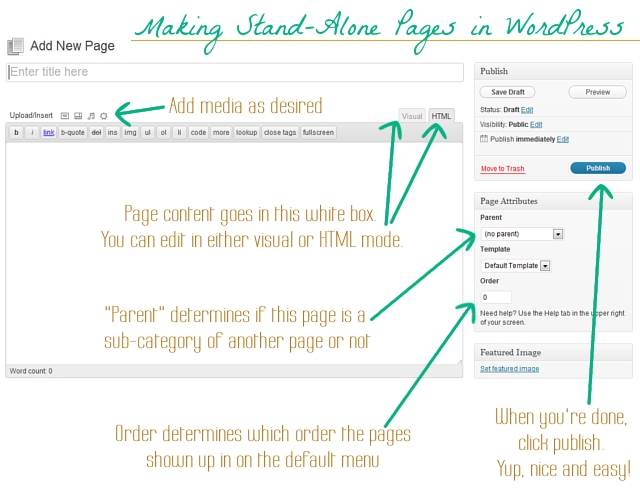
Here are the instructions for WordPress. Sign into your WordPress dashboard. On the left-hand menu, you’ll see the option “Pages”. From there, you can select “add new”. This is what you’ll see (minus my notes, of course ;)

Super easy. Now let’s take it to the next level by creating a menu of buttons for our pages!

So, now you’ve made your pages. And we discussed in an earlier post how to make your own graphics that fit your branding and design choices, and these buttons are no different. If you want to make a button for each page in the menu (such as I have under my banner) make sure each image file is exactly the same size – or at the very least, all the same height. You want your menu to look uniform and even. Go to the “Media” section of your WordPress dashboard and upload all the buttons you have made for your menu.

Next, in your WordPress dashboard, go to Appearance -> Menus. Name your new menu (I called mine “top menu”), and save it. Next, look for the “custom links” box:

In the URL box, put the link you want it to go to. If it’s leading to one of your stand-alone pages, like your about page, put the URL for that page in this box. Or, if you’re wanting to link to an outside page, such as your Etsy shop or your subscription form, just put that link here – this is how you include a button to other sites!

Then, in the “Label” box, you will want to use the following code to make it display your button image:
 

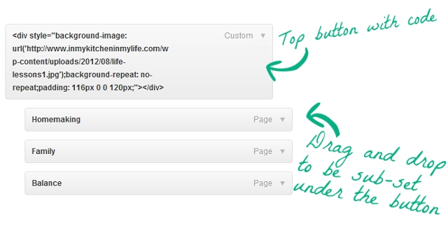
<div style=”background-image: url(‘http://www.inmykitcheninmylife.com/wp-content/uploads/2012/08/about.jpg‘);background-repeat: no-repeat;padding: 116px 0 0 120px;”></div>

.. only you will want to edit this code. For one thing, you will need to change the address in green to the URL of the image file you uploaded. (to get the url of an image you uploaded: go to “Media”, hover over the image, click “edit”, then scroll down to “file URL” and copy it.) Also, the numbers after “padding” will need to be adjusted to fit the size of the image you uploaded. For instance, Lori’s buttons were 120×116, your’s will be a different size, most likely. Once you’ve adjusted the code as needed, and have put it in the “Label” box, click “add to menu”. (As I’ve explained before, I’m no coding wizard … I just tweak. For a more full explanation on this particular bit of code, you can check out this blog post where I found it.)

Repeat with each button you want to make! Rearrange order by dragging and dropping. Click “save menu”. Make sure that in the box at the top of the page that your new menu is selected to make it active:

(Or, alternately, if you don’t want to use it as the main menu at the top of the page, and you want to use it else where, you can add it as a widget on your widgets page.)

Let’s say, though, that on one of the buttons, you don’t want the button itself to link to anywhere, but instead you want a drop-down menu of options to come available. Here is how you would do that…

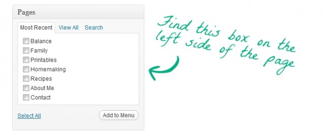
Make the button the same way, only leave the area for a URL blank. But input the image code the same way. Add to menu. So the button is ready, and doesn’t lead anywhere. Now to make the drop down menu, look for this box on the left hand side:

This is a list of all the pages you have made. Find the pages that you want to show up in the drop-down menu, select them, and click “Add to menu”. Then drag and drop those newly added pages under the button you want to be at the top – make sure you drop them so they are indented:

And now a menu will pop up with those options when someone hovers over the top button! Nifty, eh?

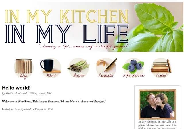
So *drum roll* … here is Lori’s site, now with menu buttons! She can always change them around to her own needs and desires, but for starters, here is how I’ve set it up:

She mentioned some types of pages she wanted, so she now has the following buttons:
– Blog
– About
– Recipes
– Printables
– Life Lessons (which goes into a drop down menu where she can feature any special series she chooses)
– Contact

… and, as we’ve discussed over and over again, any graphics you design for your site, like these buttons, should fit with your branding statement and design choices (style, medium, colors, etc.)

So what do you think about how things are coming along? Do you use your menu of pages as a design element? Also, I’d love to hear what pages you have set up on your own site, it would be interesting to see the variety of types of pages different bloggers have! Leave your thoughts and comments below, I love to hear from you!

If you’ve missed the other posts in this series on DIY blog redesign, here they are:
Part 1: Discover your branding with “The Drawing Board” Printable
Part 2: WordPress vs. Blogger
Part 3: Design Tips + Design Worksheet
Part 4: Themes, Coding and Stylesheets
Part 5: Making your own graphics
Part 6: 7 Blog Layout Tips to Engage your Reader
Part 7: Blog Page: The Must-haves and the Panache (This is this one!)
Part 8: 25 Tips for using WordPress
Part 9: The Big Reveal
Part 10: 7 Ways to Promote and Market Your Blog

10 things you shouldn’t miss

‣ ‣ ‣  1. Several of you commented on Friday’s post asking “how are you still blogging while moving?” I can’t claim I’m keeping up with everything perfectly – but RememberTheMilk.com has been hugely helpful. I can plug in tasks I need to complete for moving, tasks I have to complete for my shop, and anything else – and it sends me handy email reminders so I don’t forget anything! Super helpful.

‣ ‣ ‣  2. I absolutely love rainy days. The sound of the rain against the windows is just so soothing and lovely. I think Tim is the one who showed me RainyMood.com … it’s an on demand rainy day whenever you want it!

‣ ‣ ‣ 3. Fellow readers: do you ever feel like you’re not sure what you should read next? Well, the aptly named WhatShouldIReadNext.com should prove helpful. You input books that you enjoy, and it recommends books that others who enjoy your books also enjoyed. Simple but pretty brilliant! Not all the answers are perfect, of course, but it’s a fun place to start.

‣ ‣ ‣  4 & 5. Fellow writers: if you’re not familiar with NaNoWriMo.org … you’re missing out! It’s for November which is NAtional NOvel WRIting MOnth, and the basic premise is that you write a 50,000 word book IN A MONTH. It is crazy, insane, and a ton of fun. And whether you do NaNoWriMo or not, if you ever have trouble getting motivated to work on your writing, I highly recommend WriteOrDie.com. Let’s just say that it finds ingenious ways to punish you if you stop writing, and it’s great to crank out a high number of words in a short time – you can always go back and edit later. ;)

‣ ‣ ‣  6. Fellow wives: (and especially those who like me who struggle with housecleaning) should check out Lori’s series on Cerebral Homemaking. It’s really helping me completely rethink how I approach homemaking! Although, being in the middle of a move … perhaps not the easiest time to implement! Still, once we’re in our new place, I can’t wait to really start putting more of it into practice. ;)

‣ ‣ ‣  7. I know there are a lot of charities out there, but one you should definitely check out is Heifer.org. You’ve heard the saying “if you give a man a fish, you feed him for a day; if you teach a man to fish, you feed him for his life”. This site lets you contribute to third world families in a way that’s even better than just sending money – you can send a goat, a cow, a flock of geese … something that will continue to help them provide for their family over a longer time period! Check it out, and you could help a family provide for itself in a meaningful way.

‣ ‣ ‣ 8. If you like to make to-do lists (and in particular bucket lists), you might enjoy 43things.com … it’s a fun way to keep track of goals and aims. Checking off the goal “lose 20 pounds” or “move to Boston” or whatever goals you have from your list does feel good!

‣ ‣ ‣ 9. If you’re looking for a laugh on Twitter, you should follow Honest Toddler. Basically you’re following a fictional 3 or 4 year old with complete ability to talk/write/share his thoughts and feeling. He has status updates like, “Daddy’s home!!! Mommy’s telling him all the feelings she’d had since morning.” or “Learning about colors. When am I ever going to use this.” Makes me laugh. :)

‣ ‣ ‣ 10. And of course, a little shameless plug here, there are only a few days left to get August’s print of the month (shown below) for half off from my shop, FlourishCafe. Details are here. :)

What sites and finds have your found online? Share them below! I love to hear from you. :)

Interact! 7 blog layout tips to engage your reader

Why is it that we blog? Why not just write in a journal? The specific answers may vary, but in the end it all comes down to the audience – the readers.

Maybe you want to make people laugh, maybe you want to offer people help, maybe you want to share stories, maybe you want to draw traffic to make money. It’s all variations on a theme: finding readers. Because if we didn’t want readers, we would just write in in a private journal. So when people land on your site, if they are your target readership, you want them to stick around, get to know you and get hooked! What should be at the top of the page? What should be in the sidebar? Today’s post is 7 blog layout tips to keep people on your site, and to encourage them to interact with you – largely by subscribing and commenting. You know it’s what you want! :)

And as in all the previous posts in this blog redesign series, my friend Lori’s blog, “In My Kitchen, In My Life” will serve as the example where I’ll be making these changes. So here we go!

Comments are like candy for a blogger. I LOVE comments. It lets me know people are reading – and it lets me know what they are thinking about what I’m writing. Comments give you great feedback on what people want more of, what people find especially helpful, and plus, they’re just fun! Here are some hints to encourage commenting:

‣‣‣ Make sure your readers know you WANT comments! Don’t be bashful. At the end of your post, put a clear “call to action” asking people to leave their thoughts and letting them know you enjoy hearing from them.
‣‣‣ You can take it a step further and instead of asking for comments in general, pose a particular question that you would like comments on, and include that in the “call to action”.
‣‣‣ Make it EASY for them to comment. Avoid using CAPTCHA like the plague, and if possible, just provide a place for name/email/website rather than making them sign in to comment.
‣‣‣ Have a blog design that allows threaded comments so people can respond to each other.
‣‣‣ Once someone leaves a comment – reply to it! Especially on your most recent posts.
‣‣‣ Realize people comment about your blog elsewhere than your comment section. Provide social sharing buttons at the end of the post to make it easy for people to share and comment on your blog on sites like Facebook, Twitter, Pinterest, etc. (Helpful tip: if you’re curious what people are pinning and saying about your site on Pinterest, just go to pinterest.com/source/YOURDOMAINHERE.com … just put your domain name where it says “your domain here”. For instance, mine would be pinterest.com/source/theflourishingabode.com. See what people are pinning and commenting there, too!)
‣‣‣ Consider some WordPress plug-ins that make commenting even more friendly for your readers! For example, Lori wants “Comment Luv” on her blog. That’s the handy little feature that includes a link to your readers’ most recent blog post along with their comment. You can find this, and other commenting-friendly features, in the plug-ins section of your WordPress dashboard. Just click “add new”, search for the plug in, and when you find it click “install now”. Then once it has installed, click activate! Easy-peasy – now CommentLuv is installed on her site! Some plug-ins have options, and you can edit those under the “Settings” section of your WordPress dashboard.

So there are some ideas on encouraging comments. But before you can get comments, first you need readers to stick around and feel engaged enough to WANT to comment. (By the way, I’m totally hoping to hear from you in the comments of this post!) Plus, you’re hoping they’ll subscribe so they’ll be back for future posts. The rest of the tips address those issues.

If you’re not familiar with the term “above the fold”, it just refers to the amount of a webpage that you can see before you scroll down. If you have to scroll down to see it, it is “below the fold”. First impressions really do make a big difference – if someone lands on your blog and they don’t like what they see above the fold, chances are they’re not going to take the time to scroll down and investigate further.

Bear in mind “liking what they see” isn’t just style, but also whether it looks easy to use and navigate. It might have lots of pretty elements, but if there are a gazillion different things going on, and they can’t tell where to go or what to do – people generally aren’t going to stick around. So usability and navigation is a HUGE part of it. There is also the style side, of course – but bear in mind, like we talked about before, you’re not trying to appeal to everyone, you’re trying to appeal to your target audience. One big part of the style showing above the fold is your banner, like we talked about last week.

Whatever it is you’re going for on you blog, the area above the fold should “hook” your target audience. The style should speak to them, the navigation should be easy, and it should be clear what they can expect. In deciding your layout, remember that above the fold is the most valuable space on your website, and you should make sure it is high impact. But *how* to do that? On to the next tips…


In this online world of computers and information, one of the reasons we are drawn to individuals’ blogs, or small handmade businesses and so forth on the internet is because of the PEOPLE behind them. When we meet someone, we can see their face, and their personality in their appearance. In your content, you should also be conveying who you are and your personality … but in general it’s still a lot easier to “connect” if you can actually see the person. A nice well-lit photo that conveys your personality near the top of the page is a GREAT way engage your visitors – let them see you! Lori has this *fabulous* photo of her and her husband – I just love all the personality and joy in this photo. Plus, it starts cluing you in to the fact that her blog is about home and family right away:

I think it deserves to be above the fold. It’s welcoming, important and creates a connection. So I put it at the top of her sidebar (and check it out – her branding colors are even incorporated in her photo! Just like my colors are in my photo. Ka-pow!):

Ok, pull back out your branding printable from week 1. (I told it would come in handy!) One of the questions on that first page was, “Someone has just landed on your blog and wants to know what it is about: Describe your blog in 50 words or less.” If you answered this question (and kept in mind that you’re explaining your blog to someone who just landed on your site), then you now have a great little blurb to use on your site! Here is Lori’s blurb: “In My Kitchen, In My Life is a place where women (and the odd male) can be encouraged, nudged, and occasionally kicked in the pants toward living their lives on a higher plane. Oh, and readers get plenty of chances to laugh at the author’s foibles, which is always worth a click.” Have to say, I love her style. :)

I’d recommend having either a little description of yourself or of your blog right below your photo. On my blog, I have a description of myself there, and I have my blurb a little farther down the page under the heading “so … what’s this place all about?”. Here is Lori’s blog with the blurb put right below her photo:

So, let’s say someone has landed on your site. Your banner speaks to them about what your site is about, they see your photo and feel a connection to you, the writer, and then they read your blurb and think to themselves, “Wow, this is right up my alley!” The content they came to read is helpful, and they’re liking what they see. They are your target reader. Maybe they leave a comment, maybe they browse around some more. They think, “Oh, I like this blog!” And then they leave to go do something else and you never see or hear from them again.

What was missing? Subscribing. But if you really want people to subscribe, you NEED to make it easy and obvious – don’t make them hunt for it. I’ve heard this as good rule of thumb – ask a friend to look at your blog and if it takes them more than 5 seconds to find where to subscribe, you need to change it. Ideally, it should be above the fold or JUST below the fold.

I also think it’s a good idea to have additional places to subscribe at places on your blog where a reader has reached a point of “commitment”. For instance, if they read a blog post and make it to the end, or if the decide to leave a comment, or if they make it to the bottom of your website, there can be an option there to subscribe. If they’ve made it that far in, give them another opportunity to keep in touch.

But what kind of subscription should I offer? RSS? Email subscription? A weekly newsletter? Or what? This will vary somewhat depending on what type of blog/site/business you have and your personal preferences. You have to weigh the pros and cons. For me, email subscription to my blog itself has been by far the most popular way to subscribe, though I do offer RSS as well, and I also tried a newsletter. Just to illustrate – I officially launched this blog in January, and I now have 524 blog subscribers by email, but just 106 subscribers by RSS/readers. I had tried a newsletter in the past, but personally, I found a newsletter to be extra work and less effective because I had more to share than I could reasonably put in a weekly newsletter. I definitely prefer just offering blog subscription, and putting anything I would put in a newsletter into a blog post. *shrugs* But that’s my personal preference.

We’ll be getting more into exactly HOW to set up email subscription, etc. to your blog in a week or two when I move Lori’s blog over to WordPress and get all that stuff set up more fully. But for now, I’ll just set up a place for it high on the sidebar with a button that incorporates her branding and design choices, like we’ve talked about before:

People who land on your blog won’t automatically know everything you have to offer .. and they probably don’t want to scroll back through pages and pages of posts hunting. You want to make navigating around your blog as easy as possible. Here are a few suggestions to help with navigation

‣ ALWAYS make sure you have a search bar for your blog on your page.
‣ Put blog posts in “categories” so the people can click on those categories and see what else you’ve written on the topic
‣ Consider including a category drop-down menu in the sidebar do people can browse and discover more content
‣ Consider having buttons in your sidebar that link to an especially good series/topic
‣ Consider building stand-alone pages/menus that give helpful lists of posts or give maps of your content (we’ll be talking about this more next week)
‣ Consider making a gallery of posts (like I have on my Tips & Tutorials page)
‣ Make sure your contact info is easy to find from every page

The sidebar on a blog is some pretty powerful real estate. For one thing, the sidebar is visible on pretty much every page of your blog. Different people will have different priorities for the sidebar. If you make money by ads on your blog, ad space is going to be important in your sidebar. But firstly, your sidebar IS your own! Make sure you’re using it for the things you need to use it for to make your blog user-friendly and easy to navigate. And if you don’t have ads, don’t feel the need to fill up your sidebar with just a lot of “stuff” – think about what will have the most impact and engage your readers. Your sidebar is valuable real estate, and that is what to remember in deciding what should go there. Here is what I’m recommending on Lori’s sidebar, and which I think are just good to have in general, most of which we’ve already talked about:

‣ at the top: a photo of her, a blurb about her blog and a subscription form (as we’ve already talked about)
‣ Branded buttons linking to series/features (to help with navigation to some of her best content)
‣ Branded buttons linking to her Twitter and Facebook page (to encourage connections on social media)
‣ A search bar (to help with navigation)
‣ A category drop down menu (to help with navigation)
‣ A “grabbable” blog button (handy tutorial for that here)

It’s too much to fit in a screen shot, so instead you can just go check it out and see the work in process on her blog here: In My Kitchen, In My Life. and within just a few weeks it will be time to transfer her blog over from Blogger to WordPress!

I hope these tips have been helpful … and I’ve also laid my secrets out on the table: I want to interact with YOU! I’m always thrilled to get a notification of a new comment. Let me know what you’ve found helpful, or even just say hi – it really does make my day. :) Leave your thoughts and comments below!

If you’ve missed the other posts in this series on DIY blog redesign, here they are:
Part 1: Discover your branding with “The Drawing Board” Printable
Part 2: WordPress vs. Blogger
Part 3: Design Tips + Design Worksheet
Part 4: Themes, Coding and Stylesheets
Part 5: Making your own graphics
Part 6: 7 Blog Layout Tips to Engage your Reader (This is this post!)
Part 7: Blog Page: The Must-haves and the Panache
Part 8: 25 Tips for using WordPress
Part 9: The Big Reveal
Part 10: 7 Ways to Promote and Market Your Blog
DIY Blog Design: Making your own graphics!

Ok, so we had a lot of groundwork to set before we got to this point – but at last we’re able to start designing our graphics! WooT! :D

If you’re new to this series, it’s a 10 part event that happens each Friday – so if you haven’t seen the previous posts, I’d recommend you go back and check them out to be able to get the most out of this post.
Part 1: Discover your branding with “The Drawing Board” Printable
Part 2: WordPress vs. Blogger
Part 3: Design Tips + Design Worksheet
Part 4: Themes, Coding and Stylesheets

And now, today, part 5 – we actually get to start making graphics! Several people expressed an interest in learning how I turned my hand drawn illustrations into graphics for my site – so I’ll be explaining that, plus talking about using photography for graphics (which is the medium I am using for the graphics I’m making for Lori’s site) as well as tips that I hope you’ll find helpful for whatever medium you are using. Let’s jump in! :)

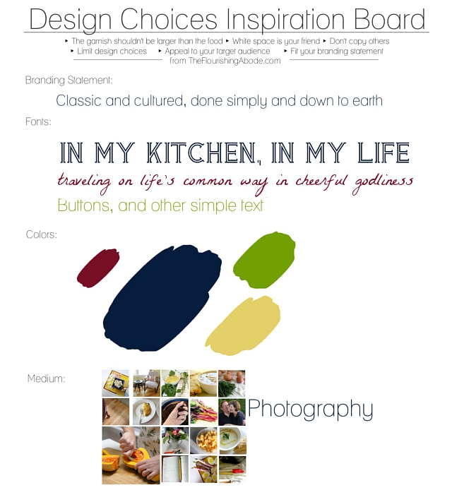
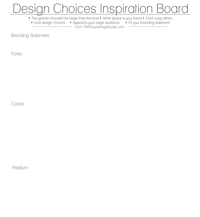
Alright – first step, pull out your branding printable from part 1 and review your target readership and branding statement; keep it in mind in every step of designing your graphics. And look back at your design worksheet from part 3 – remind yourself of your design choice limits (like your medium, colors, etc.) as well as the design tips I included on that sheet. Make sure you stay true to your design choices as you start making your graphics.

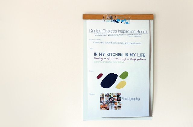
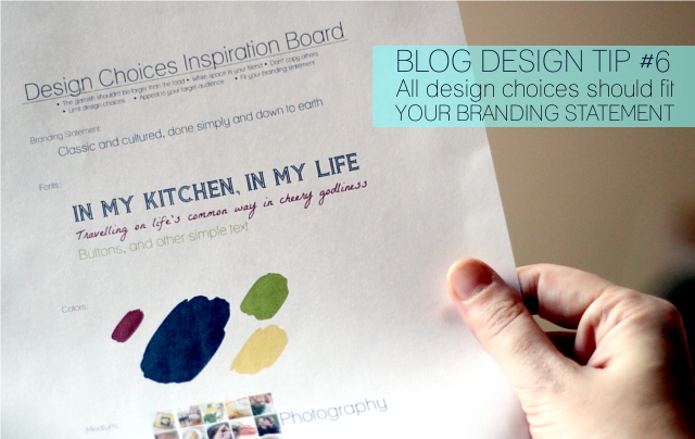
So, as I’ve mentioned before, my friend Lori from In My Kitchen, In My Life has kindly let me use her blog as the demonstration for doing this redesign and move to WordPress. The branding statement we came up with from her branding printable was “Classic and cultured, done simply and down to earth”. On her design sheet I chose colors, fonts and the medium of photography. I consider these choices to be the “paints” I have filled my design palette with – whenever I need to design something for her site, these will be the “paints” I will use.

Today we’re going to work on designing a header. After the importance of not having a background that overwhelms your content, I would say what you put in the header is probably the single most important graphic on your site. First impressions really do make a big difference – and the header is right at the top. The header is actually the whole area right there at the top of your page … and often people have a banner there, which is what I’m going to be putting on Lori’s site. As I mentioned above, I’m using photography as the medium for her design.

A few pointers to bear in mind while making your banner:
– make sure your blog name is large enough and easy to read
– consider including your tagline on your banner to help people know what your site it about right away, but if it doesn’t work on your banner, it is not a requirement
– don’t forget the previous pointers on the effectual use of white space – sometimes less is more
– make sure the main colors in your banner are colors from your design choices
– ask yourself “does this banner fit my branding statement?”
– look back at your branding printable and look at what you wrote that you wanted to be people’s first reaction to your site — and realize that the banner is probably the first thing they will see and react to on your site

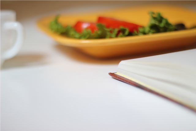
So, the next step is to just start playing around. Admission: I am a graphic designer … but that doesn’t mean the very first draft of a design comes out fabulous. Don’t expect the first try to be perfect. Don’t worry about messing up. Just have fun and play around with your ideas! If your medium is painting, try some different techniques, maybe some that are messier, and some that are neater. If your medium is pen and ink, cover your papers with assorted drawings – you can always just crop out the ones you don’t want! If your medium is photography, like I am doing for Lori’s blog, try a variety of shots – different angles, different distances, different photography subjects. And just to show you kind of how it goes, here are an assortment of photos I took just to try out some different ideas for Lori’s banner.

Some rough draft photos:

I wanted to take a photo of some basil and try that out, but I didn’t have any basil. Here is a tip if photography is your medium – try checking out some public domain photo sites. PLEASE bear in mind that just because a photo is on the internet, that does NOT mean it is public domain – even photos on the internet are protected by copyright and you can be sued for taking copyrighted photos. However, there are some sites where photographers choose to make their photos available in the public domain, which means they are no longer under copyright, and you can use them for both commercial and personal use. Just *make sure* the site states they are in the public domain – assume they are copyrighted unless the site specifically says otherwise. A good example is publicdomainpictures.net where they state that you can use their photos for person and commercial use for free – and I found a photo of some herbs there:

And, as I mentioned, I’ll also be showing how turn your hand-drawn illustrations into graphics … here is a sheet where I was sketching some images for graphics for my site:

So now we have a whole bunch of rough drafts – the sampling above is just a few of the many photos I took for Lori’s site and illustrations I drew for my site.The next step is to take those and enhance them into actual graphics in your image editing software. If you have Photoshop – great! If not … well, neither do I. It’s simply not affordable on my budget. However, there is a program called GIMP that is a completely free download from GIMP.org which I highly recommend. I’ll say up-front, it’s not the easiest program to learn. BUT, really, you don’t need to know how to do everything. I’ll give you a few pointers on some of the features … and even if you never learned anything beyond this, I think you would still find the program tremendously helpful. But chances are once you started using it, you’d learn more as you go.

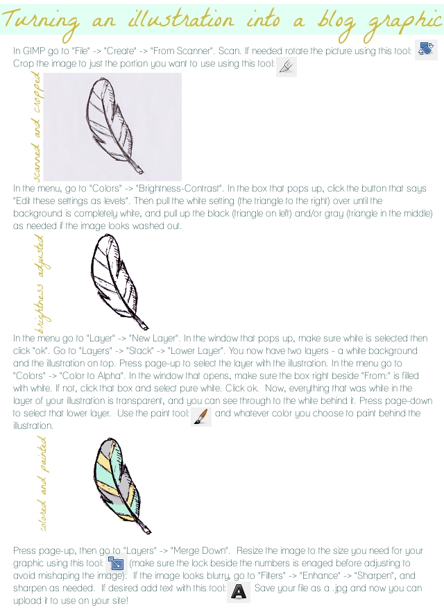
First off, here is the explanation of how I take my hand-drawn illustrations and turn them into graphics. This assumes you’ve already drawn your art (like my feather you saw I drew, above) and have it in the scanner and the instructions are meant for that – but many of the steps and tools are useful for any type of image editing:

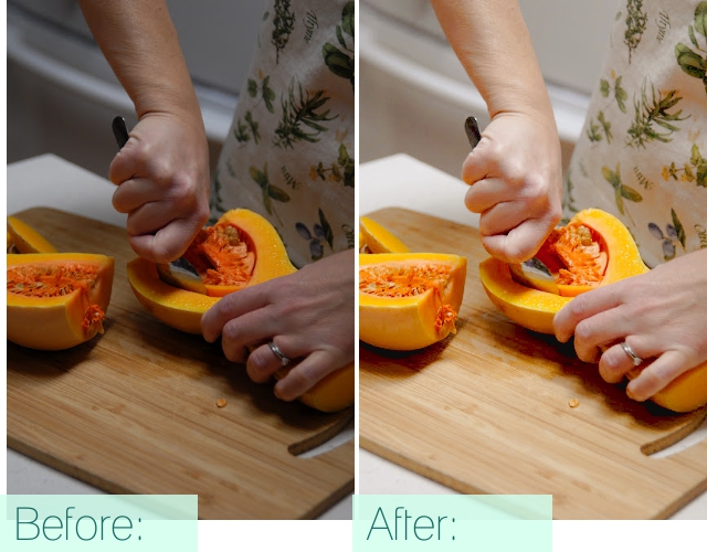
For photography, which is the medium I’m using for Lori’s blog, many of these tools are what I’m using as well. Be sure that in editing brightness/contrast that you click the “edit these settings as levels” button before adjusting anything, especially in photography. You probably won’t want to alter the levels quite as harshly in a photo as you would in a black and white line drawing, either. A couple other helpful tools for editing photography are on the “Color” menu: Color Balance and Hue/Saturation. As long as I’ve taken the photos in shaded natural lighting (for instance, taking a photo inside right by a window), these three (brightness/contrast, color balance, and hue/saturation) are usually all I need. See the difference these few can make? This is a lovely photo Lori had on her blog that I may be incorporating into her design that I touched up with these tools:

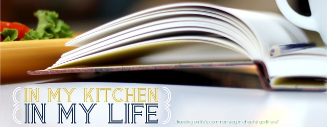
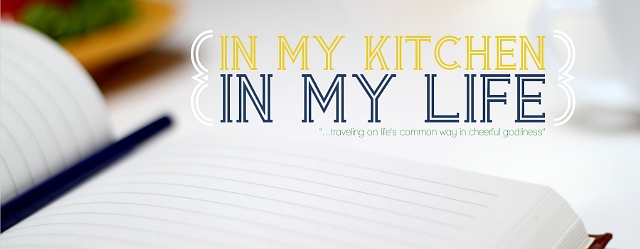
Plus, of course in a banner, you’ll use text overlay. Like I mentioned before – play around and have fun with it! Here are a couple banners I made to try out on Lori’s blog:

But in the end, I decided they weren’t quite working. So I started using the herb photo from the public domain site. This is a good example of where cropping can be effective. I really only used a small portion of that photo – and even then, I blurred out a significant portion of it to white so that the words would really pop. In the end, I felt this one best spoke to her blog and branding, and also represented her colors best. Here’s the final result:

Though, of course, that is just a smaller version there – you can see how it looks full size on Lori’s site by clicking here: In My Kitchen, In My Life.

Also, if you’re using WordPress and the theme which I recommended last week, you can click here for simple instructions on the code you need to put in to give your site a banner.

I hope you’ve found these tips and pointers helpful – and that you’ll have fun working on your new graphics!
What medium are you using for your blog graphics? Share your thoughts below, I love to hear from you!

To check out the next posts in this series, you can see them here:
Part 6: 7 Blog Layout Tips to Engage your Reader
Part 7: Blog Page: The Must-haves and the Panache
Part 8: 25 Tips for using WordPress

DIY Blog Design: Stylesheet? Coding? Fear not!

If coding and customizing your WordPress theme sounds too scary – then this post is for you!
(This is part 4 of my DIY Blog Redesign series… a little more techy for this post, and next week we’ll be back on the artistic.)

Admission: I designed my blog look – and starting out, I knew next to nothing of how to do CSS. Now, granted, I did know a fair amount of HTML, but I still had to start from scratch on CSS – and it wasn’t too bad. My point is this … don’t be intimidated by coding and the “back stage” parts of blog design. It doesn’t have to be scary. Especially if you’re using a child-theme. But I don’t claim to be a coding expert by any means.

Today’s post is going to be all about:
-choosing a “theme” for your blog (this is something you install from WordPress, related to templates)
-creating a child-theme (this doesn’t mean it’ll look like a kid blog, it just means you’re creating your own sub-theme based on the original)
-the CSS (style sheet)
-simple approach to coding

Ok, so the first step is finding a theme. If you remember the blog design tips from last week, we’re looking for a theme that allows those to be put into use. Plenty of white space, nothing too distracting, nothing that will detract from your content. I remember when I first signed up with WordPress, I was initially distraught because there wasn’t a theme that had exactly everything I was looking for … but that was before I realized just how much you could really customize a theme once you had set it up.

The theme I recommend going with is “Thematic”. It’s free, which is obviously really nice. It’s a simple and well-thought-out design, specifically made to be customized to however you want to design it. The really nice thing about Thematic is that even if you just leave it without customization, it is a nice simple theme … but that by putting in some work on it, the possibilities are endless. For instance, my blog is based on Thematic, as will Lori’s blog which I am redesigning as we go through this series … but our blogs will look entirely different in the end. Also (and this is a huge bonus) there is a whole community of Thematic support – Q&A forums, a free guide, etc. If you want more info on Thematic, as well as links to the support options, you can find that here.

To use the original Thematic, just go to your WordPress admin panel, then go to Appearance –> Themes, then click the “Install Themes” tab and search new themes for “Thematic”. Click “install”. After it’s installed, make sure you click “activate” to, well, activate it. ;) Simple, eh?
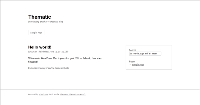
This is what Thematic looks like in just the base form:

Pretty simple, pretty basic. But as we’ve talked about before, often less is more. Content “pops” well on a simple design. However, we’d obviously like to add interest, branding and a more developed aesthetic. So first you’ve installed the original Thematic, and now we’re going to make “child theme”. This is basically a second-generation version of a theme. Pretty much all you’re doing is copying the basic elements of the theme, but setting it up as it’s own theme where you can customize it. You can click here for an easy run through on setting up your Thematic child theme.

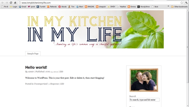
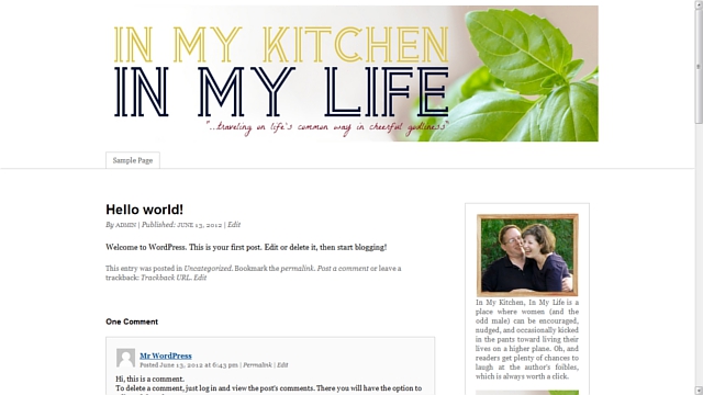
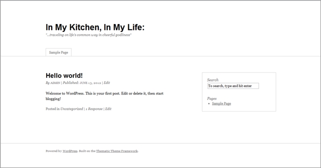
So, I’ve now set up a child theme based on Thematic for Lori’s blog. Here’s what her site looks like, and as you’ll see, the child theme automatically looks just like Thematic:

But now that it’s a child theme was can go in and start tinkering around.
*taps finger tips together menacingly*
(Ok, well, not menacingly. This isn’t supposed to be scary.)
*taps finger tips together expectantly*

This is where we get into … the stylesheet! Ta da! It’s a CSS file that has all the rules for what your site looks like as a whole. I’m trying to think of a good analogy for the stylesheet … maybe think of it as your design’s DNA. It has all the guidelines for how your site displays. Some of the changes we’ll be making will be more like dying your hair or getting a tattoo – things that affect just one particular area – but appearances we want to change overall on your blog, we’ll have to rewrite the “DNA”, the stylesheet.

As I mentioned, I knew next to nothing about CSS when I started out. However, there are a ton of great resources online … CSS Basics being a good place to start. You don’t have to know how to do everything, but at least familiarizing yourself with the basics is a good idea.

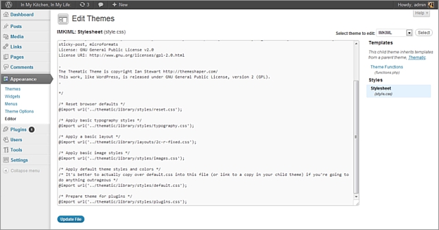
You can get to your style sheet by going to your WordPress dashboard, then click “Appearances”, then click “editor”. There might be a few files available over on the right, and you want the one called “style.css”. Since you have a child theme, all the rules come from Thematic by default, but you’re not editing Thematic itself. (Again, make sure you’ve installed AND activated your child theme, you don’t want to start tinkering in the innards of the original Thematic, just your child theme.)
Here is kind of what your stylesheet will look like, starting out:

You may not be able to read it in my tiny preview above, but the friendly Thematic author has written handy and helpful notes here touching on what you need to do to change things from the Thematic defaults. It mentions different files … like
“/* Apply default theme styles and colors */
/* It’s better to actually copy over default.css into this file (or link to a copy in your child theme) if you’re going to do anything outrageous */
@import url(‘../thematic/library/styles/default.css’);”.

Basically, its just relying on the original Thematic rules unless you change it … so if you want to change something, but you don’t really want to start coding from scratch, you can copy/paste those files and just edit the lines you want to. Since you previously have installed the original Thematic before installing and activating your child theme, you can find all these files by logging into your hosting service (like we talked about how I use BlueHost), going to your cPanel, then to your File Manager. In your file manager, in the file for your WordPress (for instance, Lori’s file is called “InMyKitchenInMyLife”), open the folder “wp-content”, then the folder “themes”, then the folder “thematic”, then “library”. That contains all the folders that have the various CSS files. Don’t change the content of these files here, just copy the contents of, for instance, the default.css file, and then paste it into your stylesheet. Then you can edit lines. Today’s post is mostly an introduction to the whole topic, and in future posts I’ll share with you specific line edits you may want to do. But just for example today, let’s say we want to change the width of the site. I’ve already copied over the necessary CSS file, and I just go to the line that determines the width of the site, and change the pixel number:

I find it very helpful to know I don’t have to start from scratch and code it all myself – I can tweak! This is my simple approach. And lest panic seize you, let me tell you this – you don’t have to edit anything blindly. If there is something you want to know how to do specifically, you can probably find it online. For instance, next week, I’ll be sharing the code snippet you can insert in there so you can add a banner. But there are lots of tutorials out there if there is something you want to do and you don’t know how. Plus, there are also the Thematic forums where you can search because your question may already be answered there, and if not you can ask for help on a specific question. (But do try to figure it out first, before asking on the forums … they’re super helpful, but they do have guidelines and expectations that you’re trying to figure it out.)

So that’s how/where we’ll be changing DNA stuff. :) There are somethings that can be changed without altering the DNA. For instance, if you go to your WordPress dashboard, then to “Appearances” and then to “Widgets”, you’ll see lots of places to change things up there as well … these are more changes to a specific area. Over on the right, you can see what these different areas are. For instance, if you want to add a search box to your sidebar, you simply drag “search box” over from the widget options and drop it in the sidebar area. And there are lots of other areas you can drop widgets, such as at the end of a post, at the top of a page, etc. You don’t need to (and probably shouldn’t) use them ALL – or you’re going to start overwhelming your blog with extra “stuff”. But it is nice to have the capability to be able to easily drag and drop into any of these areas. We’ll be getting more into the sidebar, and what should go there, in a couple weeks. Next week, though, we’re going to be working on actually creating graphics, and starting to put them on the site. I can’t wait to share Lori’s new banner with you then!!

I hope that this has helped to show that getting in and tinkering doesn’t have to be scary or overwhelming. You just take it one edit at a time. :)

Do you do this kind of thing on your blog? If not, does this help to make it less scary? I hope so!
Leave your thoughts and comments below, I love to hear from you. :)

If you’ve missed the other posts in this series on DIY blog redesign, here they are:
Part 1: Discover your branding with “The Drawing Board” Printable
Part 2: WordPress vs. Blogger
Part 3: Design Tips + Design Worksheet
Part 4: Themes, Coding and Stylesheets (That’s today’s post!)
Part 5: Making your own graphics
Part 6: 7 Blog Layout Tips to Engage your Reader
Part 7: Blog Page: The Must-haves and the Panache
Part 8: 25 WordPress Tips
Part 9: The Big Reveal
Part 10: 7 Ways to Promote and Market Your Blog

A change of pace

Hi all! So, you know all this hype I’ve been talking about moving to Boston? Well, things seem to finally be moving along! I hope to be able to share a moving date with you *very* soon, Lord willing.

In the meantime, as I crazily pack boxes, get rid of stuff, prepare for our hopefully eminent move and still try to get dinner on the table, I’m going to need to change up the pace of my blog a little bit, and I wanted to let you know kind of what to expect.

Fridays will continue to be the DIY Blog Redesign challenge. That is really the main thing on my blog right now that definitely has a end-date deadline. It’s a 10 week series (this week will be week 4), so we’ll continue on pace with that.

Mondays will probably start featuring some guest posters and/or highlight some great tips and finds from others … like some occasional link round-ups or interesting Etsy finds.

Wednesdays (like today) are currently the “Truth and Evidences” series, where we’re looking at evidences in religion. These posts are quite time consuming, and so for the rest of the summer, I will plan to post a new one of these every-other Wednesday instead of every Wednesday. So there was a Wednesday post for that series last week, and there will be another next week … but not this week.

Tuesday has been the day for Tim’s RTW cartoon. Considering the fact that that cartoon is based on the things he draws on a form at his current job, I’m not sure how much longer that will run, since he will not still be in that job soon, Lord willing. We’ll probably play that one by ear.

Anyway, that’s kind of my current plan. I’d be very curious to hear (and not just in light of blogging-while-moving, but also just in general), what types of posts here do you enjoy most? Anything you would like to see in particular?

Leave your thoughts and comments below, I love to hear from you! :)
(And I can’t wait to blog from Boston!! Wooohooooooo!)

DIY Blog Redesign: Design Tips

I guess there are basically two sides to this blog redesign series … the artistic side, and the more tech related side. We’ll be kind of jumping back and forth week to week from one to another – this week it’s the artistic. You know, the fun stuff! ;) I have six blog tips to share plus a worksheet to start making some design choices.

So far in this series, we’ve talked about getting a vision for your branding so you can know what you’re aiming for, and then the next week we covered where to blog and how to get set up, and this week we’re going to be getting into design tips. Then over the next couple weeks we’ll start combining your branding and these tips to start really building your site.

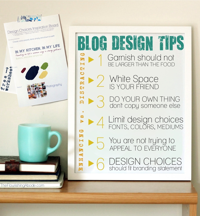
All of the tips today are going to be with one aim in mind: Distracting vs Enhancing. We want all the aspects of our design to enhance our content, not detract or distract. Also, bear in mind that these are tips, not rules. I hope you’ll enjoy them and find them useful – I definitely had fun writing it!

DESIGN TIPS

1 ‣‣‣ The garnish shouldn’t be larger than the food

So, if you’ve been following this weekly series all along, then you’ll remember that your blog is like a dish: the content (your posts) is the food, and the design of your blog is the plating/garnish. Garnish can’t make up for lack of actual food … but it makes a huge difference in how the food is presented – and received by the eater/reader.

I don’t know if any of you are FoodNetwork fans, but I simply loooove watching “The Next Food Network Star”. It combines a couple of things I love – cooking and branding. Each contestant is their own brand, trying to win a spot for their own new show on FoodNetwork. Anyway, on a recent episode Alton Brown cautioned one of the contestants, “Watch out, you’re about to put a garnish on that plate that is bigger than the food.” And, as we continue to think of your blog as a meal, that is the exact same caution I want to give you.

Your blog’s design shouldn’t distract or overwhelm your content. If your design is so busy/cluttered/overwhelming/eye-catching (and I don’t mean that last one in a good way) that it is difficult to focus on the actual content of your posts, then your design is doing the exact OPPOSITE of what it should be doing. A few examples of some easy ways to overwhelm your blog with “garnish”:
– music that starts playing as soon as you load the page (trust me, a huge % of people will leave right away)
– busy/jarring/dark/overwhelming backgrounds
– lots of random font color/size changes throughout your writing
– so many sidebars, each full of ads and widgets, than your content is slimmed down to a tiny sliver
– etc.

“Garnishes” should be tasteful, and should be the supporting actors – not upstaging the lead role.

On to tip 2!

2 ‣‣‣ White space is your friend

White space can make a huuuuuge difference on your blog. Imagine the difference in looking at a busy/cluttered blog, where your eyes narrow as you try to find your way through all the busy-ness to find the content … vs. a blog where your face relaxes when you look at it, the content itself catches your eye, and you are drawn into reading. The amount of white space is often directly related to making the difference between these two. And, as was mentioned earlier, it comes back to the difference between distracting and enhancing. Which blog are you going to linger on longer?

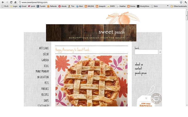
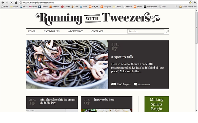
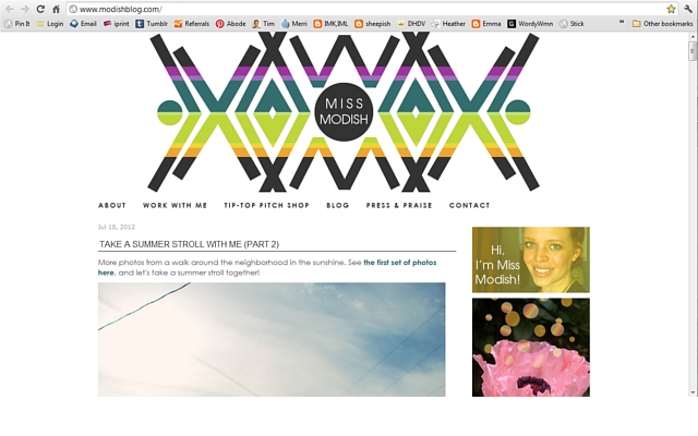
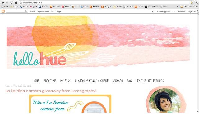
Always remember that the part of your blog that you want people to really take note of and remember is your content. It’s the heart and soul of your blog. Give the eye space to relax. Don’t crowd your blog. White space in the background, white space around text, around pictures, around design elements – it helps to let these things really stand out on the page. Now, there is definitely a spectrum of how much white space you may choose to have on your blog. I’m going to put a few screenshots below of blogs that use white space well to make sure they don’t detract from their content. (You can click any image to be taken to their blog). Each has it’s own unique style and branding, but note the common thread of white space:

Bearing in mind the importance of white space, think carefully about backgrounds. I would encourage you to do one of the following to help highlight your posts:
1 – Have no background (white space only)
2 – Have a background that includes a lot of white + one neutral (like mine)
3 – Have a background that uses color only very subtly (probably best for blogs with a muted palette)

Now, my fellow bright color lovers, don’t despair. This does not mean you are doomed to a boring blog. It just means there are probably better ways to show those bright colors than in your background. In fact, those colors will jump off the page best if you stick with no background. Obviously there are blogs that have designs that don’t follow any of these guidelines. But the thing is … it’s a lot easier to come up with a good design that highlights your content following these. And it’s a lot easier to create a design that competes and overshadows your content if you don’t follow these.

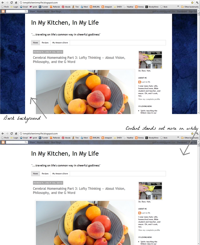
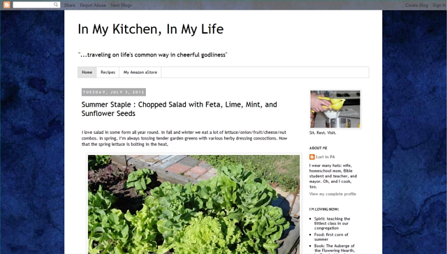
For instance, on Lori’s blog, In My Kitchen, In My Life, which is the “guinea pig” example for this series as we go through and redesign her blog, she has a dark blue kind of marbled background. Observe, below, the difference it makes simply by removing the background, and how much more the gorgeous photo in her post jumps off the page:

See how much more the content of the post catches your eye in the on with the white background? Now, you may be saying, “But a white background looks boring!” Fear not! There are many, many ways to put interest in your design — ways that won’t compete with your content the way a busy background easily can. We’ll be getting into those in future posts. :)

On to tip 3!

3 ‣‣‣ Do your own thing – don’t copy someone else’s style.

I want to mention this one specifically here since I just showed some screenshots of others’ blogs. The key to a good blog design is not in finding a blog you like by someone else and trying to mimic their style. Remember that the goal of your design is to highlight YOUR content. Their blog is designed to highlight their content. You wouldn’t want to copy someone else’s posts and claim them as your own – so don’t copy someone else’s design either. And anyway, knock-offs just aren’t as good. Your final product will be so much better if you discover your own style rather than trying to mimic someone else’s. Ok, ’nuff said on that.

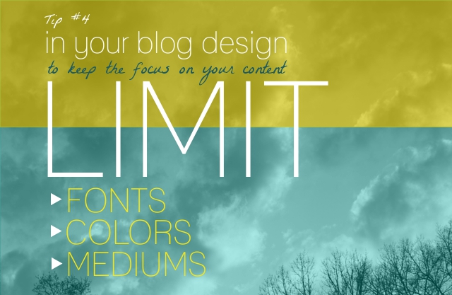
4 ‣‣‣ Limit your choices: colors, fonts, mediums

It’s a really good idea to limit your design choices. Now, keep in mind, this is limiting your design, not limiting your posts! If you want to have photos in one post, and your paintings in the next, that is fine. But your design itself should have choice limits. I recommend the following limits in your design choices:

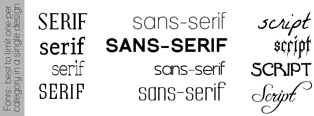
‣ Fonts: Up to three: one serif, one sans-serif, and one script. (Serif means a font with those little extra lines that poke out on the end of the letters. Sans-serif means the letters don’t have those extra details. Script means it’s more like handwriting/novelty fonts… examples are below.)

One more note on fonts. Just because a font is free, does not necessarily mean it is free for commercial use. Make sure you have the proper licence for the fonts you use. For example, Kimberley Gershwein has a lot of fun fonts available here on dafont – they are free downloads for personal use, but for commercial use you must purchase the license. Happily, it is just $5! One of the fonts that is going to be a part of Lori’s branding is by Kimberley. So make sure you have the proper license on your fonts.

‣ Colors: Up to three. (You can get away with a little more if you’re counting black/white, or if you have multiple shades of the same color.)

‣ Mediums: Choose one main medium for your design. (Again, this is for design, not for post content. If you’re going to have a photography banner, don’t have buttons that are pen and ink illustrations. Or if you want watercolor paint sidebar images, use that in your banner as well. Have one major medium you’re using in your design, rather than mixing and matching. By the way, mixed media counts as one medium. For instance, collage of vintage images and graphic design. Just make sure you make the mixture consistent throughout your graphics.)

These limits will help to keep your look branded, recognizable and unique – as well as giving a clean look to allow your content to stand out.

On to tip 5!

5 ‣‣‣ You’re not trying to appeal to everyone

I’ll be honest. My FlourishCafe creative biz & blog are never going to catch on with a huge following in the teen goth skater guy community. Yeah, surprise, surprise, huh? I remember when I first launched … I was also designing some jewelry and accessories at that time. I went to a downtown park with some friends to do a photo shoot of a scarf-wrap that I had made. While we were taking the photos some goth/skater guys walked by and called out something about my “ghetto scarf”. And while it never feels great to have something you’ve made ridiculed by others – it really didn’t both me. Why? They weren’t my target audience. Frankly, I would have been disturbed if those teen guys had wanted to wear my ruffled and be-ribonned scarf. I wasn’t trying to appeal to them. So the fact that my product didn’t appeal to them was no big cause for concern.

The same is true for your blog. You’re trying to reach out to your target audience. If that target audience is middle aged women who are interested in yoga, then don’t worry whether 20-something men who play hockey will love your site. This applies to your content, to your design, to everything. Now, I’m not talking about being rude or bashing other audiences on your blog – I’m just saying that you should write and design your blog for YOUR target audience … and if it’s not someone else’s cup of tea, don’t worry about it, they are the target audience somewhere else. If your readership isn’t particularly trendy, don’t worry about having to change your blog’s color scheme to fit Pantone’s color guidelines each season. If your readership isn’t into cats, then maybe don’t put LOLCats all over your blog. If your readership is on a tight budget, don’t worry whether millionaires will find your money saving tips useful.

Now, some things apply to practically all target audiences – like the ability to read/see your content, which is why tips like having plenty of white space and not overwhelming with garnish are fairly universal. But many options, like which colors to choose, what style to go for, etc. will depend on your taste, and your target audience. If you just try to broadly appeal to everyone you won’t be as successful at getting in touch with that niche target audience that you want. Look back at your branding printable and read your description of your target audience. Think about them in your blog’s design, and in your posts. In fact, a good way to come up with valuable content is to think about the problems your target audience faces – and offer solutions in your posts. Is your target audience knitters? Offer tips on keeping yarn organized. Is you target audience gamers? Review your favorite little-known games and tell people where they can find them. Is your target audience creative women? Offer them tips on how to re-design their blogs. (Wait, that’s what I’m doing!;) Because in the end, a blog is about the reader, not about the writer. Yes, be authentic and be yourself. But it’s the difference between blogging about how hungry you felt at work today vs. blogging a recipe you made that really hit the spot after a long day at work. Both are “about” you, but one is for you, and one is for your readership. Think about your readers, both in your content and in your design, and don’t worry about whether it appeals to everyone else.

Ok, are you ready to finally start making some design decisions??? Here we go!

6 ‣‣‣ Make decisions that fit your branding statement

I’ve designed a little worksheet to help you keep track of your design choices – in particular, your fonts, your colors and your medium. I tried to keep the worksheet simple and plain to not interfere with your own design process. Unlike printables, which I have offered before, this one is a jpeg to be used in your image editting software, so you can type with different fonts, and get your exact colors and such, rather than hand writing it. I tell you what, it is SO handy to have a file with your specific hues saved so that you don’t have to try to find “that blue” on the color wheel each time.

I put a place to write out your branding statement, which you crafted from the first part of this series (if you haven’t seen that yet, it’s an important step! You can click here to go back to that post) because all of your choices should reflect your branding statement. Look back at your branding printable, at the colors that resonated with you, the answers you gave, and start there to make your design choices. For instance, looking at Lori’s answers from her branding printable, here is the sheet I filled out for her blog, In My Kitchen, In My Life, which I am redesigning in this series:

Do you start to get a flavor for her site, looking at that? Her serif font is more classical looking, it almost reminds me of columns. Her script font looks like what you might see in a neatly hand-written letter. I think this fits her branding statement “classic and cultured done simply and down to earth” well. As for her medium – I decided not to illustrate her blog, like I illustrated mine, because that sketchy almost-cartoonish feel of my illustrations definitely doesn’t fit her branding statement. As I looked back through her posts, I saw that she had lots of great photos. Some of them I believe she took herself, and some of them her son, who is a budding photographer, took. I started compiling these photos, and fixing up the lighting in my photo editting software – and the colors for her blog that she had mentioned just jumped right out at me! You can see the images, though small, at the bottom of the worksheet. Since she has so many nice photos that reflect her style so well, I thought it would be good continue that and use photography as the medium for her blog. And on the colors … yeah, you can see I cheated a little and used four instead of three. This is because the navy blue is so close to black, and as I mentioned black and white can be “givens”. In general, though, I recommend sticking with 3 colors.

So, here is your own design board to fill out. Make sure you put your branding statement at the top – and have fun playing around to decide on your new design choices! Just right-click the image below and save it to your computer so you can edit it.

I hope that these tips and worksheet have been helpful for you!
I’d be very curious to hear about some of your design choices.
Leave any questions, comments or thoughts below, I love to hear from you!

You can also check out the rest of the posts from this series, here:
Part 1: Discover your branding with “The Drawing Board” Printable
Part 2: WordPress vs. Blogger
Part 3: Design Tips + Design Worksheet (That’s today’s post!)
Part 4: Themes, Coding and Stylesheets
Part 5: Making your own graphics
Part 6: 7 Blog Layout Tips to Engage your Reader
Part 7: Blog Page: The Must-haves and the Panache
Part 8: 25 WordPress Tips
Part 9: The Big Reveal
Part 10: 7 Ways to Promote and Market Your Blog

DIY Blog Design: Where to blog? And how to begin?

Hey everyone! First of all, thanks soooooooo much to all of you who commented on last week’s post about blog branding! It is hugely helpful to me as we move forward in this weekly series to know what is working and what people find useful, and how the process is going for you! (Plus, it’s just a lot of fun to hear from you. Comments = candy for a blogger.)

Also, before we get into the meat of today’s post, I want to tap into the collective blogging minds that are reading this and ask you a question — do you have any ideas for fun blogging quotes?? I’ve been working on making some new typography prints for my shop .. usually I use reeeeally old quotes that are in the public domain (like Jane Austen’s, etc.), but obviously there are no old quotes about blogging! So I’ve been making up my own quotes (like the one above), but I thought it would be so great to find out if any of you have quote ideas about blogs/blogging – to be turned into prints! If I use your idea, I will credit you for the quote in description, and give you a discount for my shop. :)

So while you mull that over, let’s jump into today’s post. We started off last week by starting to get a feel for branding, to get a bit of a roadmap so we know what we’re going for in each of our own sites. This week we’re going to start jumping into some of the getting-it-done basics of the beginning – where should I be blogging?

These are common questions for bloggers –
Which blogging platform should I choose – Blogger, WordPress…?
Do I need my own domain – and is having a domain the same as having hosting?
And how would I get set up if I DO want that??
And what is the air-speed velocity of an unladen swallow?????
Ok, maybe not that last one, but we’ll be getting to the other questions in today’s post. And the nice thing is … whichever route you take on these questions, it doesn’t have to be too difficult. And bonus points if you got the reference of that last question.

So first question, Blogger vs WordPress:

So, where should you have your blog? Blogger or WordPress? Now, I’ll say upfront – these are not the only two options. There are also options like TypePad or Tumblr, etc. … but TypePad costs more money then either Blogger or WordPress, and Tumblr tends to be more about photos/sharing others’ posts, than writing/commenting, which is the essence of most blogs we’re dealing with in this series. Also, I’d say that Blogger (aka BlogSpot) and WordPress are probably the two most popular blogging platforms, so I think it makes sense to just look at these. But by all means, if you have another platform that you are absolute sold on that you think others should know about, please tell us about it in the comments for your fellow bloggers to see! :)

So which one? It’s a head-to-head BATTLE! Ok .. well … not really. There is no one right answer on this for everyone, it largely depends on your goals and desires in blogging. Personally, I have blogged on both Blogger and WordPress and definitely prefer WordPress – and if you’re going through this series because you’re serious about growing and branding your blog, then I would highly encourage you to consider WordPress. But if you’re more wanting to blog very casually and only want a free version, then Blogger might be better for you.

But one thing I want to point out – in talking about WordPress, I am referring to WordPress.org NOT WordPress.com. WordPress is always free, but on WordPress.org you use WordPress on your own domain/hosting which would look like yourblogname.com, and which you purchase elsewhere — whereas on WordPress.com, they host your blog and it would look like yourblogname.wordpress.com. Also the WordPress.com version does not offer limitless customization, does not have unlimited storage, and has rules against having ads on your blog. Some of those can be added on if you pay for them – but in that case, you might as well be using WordPress.org because your hosting would probably cost less. I think if you’re going to use a free version, I think you might as well be at Blogger. So in the comparison here, it is between Blogger and WordPress.org.

Here’s my visual chart of the pros and cons, and while certainly not an exhaustive list, it hits what I see as the major points:

I think the two biggest factors are the ability to customize, and the ease with which people can comment on a blog.

On commenting …. comments are a HUGE part of blogging. You want your readers to be able to interact with you as easily as possible. Most people who visit your blog won’t leave a comment – but of those who DO choose to leave a comment, you don’t want to make it difficult for them. It is very common for people starting to comment to end up not leaving their comments because of CAPTCHA. (CAPTCHA is that spam catcher thing that makes you type in the hard to read squiggly letters to be able to leave a comment.) For one thing, it is another step, and not always an easy step, that can easily cause people to choose to skip commenting — I hear people talking about this often on Twitter, it’s a pretty common reaction to CAPTCHA. Or sometimes it is accidental. I’m less likely to leave a comment on a CAPTCHA blog, but even when I do, I can’t tell you how many times later I’m closing my tabs and find a comment that failed to go through due to CAPTCHA mishap. Also, besides CAPTCHA issues, to leave a comment on a Blogger blog you have to choose an account type to comment with – and not everyone fits those account types (including myself), which again makes commenting more difficult for people reading your blog, even if they want to comment. To comment on WordPress, however, you simply comment with your name, email and site, if desired, and don’t need to jump through CAPTCHA hoops. If your blog is fairly small you may not need any spam guards – but if you do need a spam filter, you can use Akismet on WordPress. It’s a few dollars a month, and it does an excellent job – this is what a I use, but that small amount is worth it to me to make commenting as easy as possible for my readers.

Besides commenting, there is also the difference in customization. On Blogger you are limited to templates and certain amounts of personalizing, which can lead to many sites looking much the same. There are ways to get in there and personalize to some extent, and there are even way to use a custom domain, which you would need to purchase elsewhere. But in the end, you are limited on Blogger in ways that you are not limited on WordPress. The sky is the limit to design and brand your blog exactly as you choose.

Lori, who has the blog In My Kitchen, In My Life, which I am redesigning as a demonstration in this series, has been on Blogger, but decided she wanted to move to WordPress and that is what sparked this entire series. A move from Blogger to WordPress can be the perfect opportunity to redesign your blog. And one thing that is indicative of the value of WordPress – there tend to be a LOT more people who move from Blogger to WordPress than vice versa.

Ok, so let’s say you do want to move to WordPress. What’s all this hosting/domain stuff?

The domain of Lori’s new blog is InMyKitchenInMyLife.com. The domain of my blog is TheFlourishingAbode.com. It’s what becomes the address of your site. Hosting, on the other hand, is the background storage and capability to make your website available on the web. You can have a domain – but without hosting you can’t set up and run your blog on it. Domains cost about $10 per year. Hosting costs from about $5 to $15 per month. I personally use BlueHost.com, where I can host an unlimited number of domains per month for about $5 per month, and I’ve been very impressed with their customer service. And there are lots of other sites where you can purchase hosting as well — but one way or another, if you’re going to use self-hosted WordPress, you’ll need to get both domain and hosting. Having your own domain and hosting both helps your site look more professional (as opposed to a .blogspot.com or whatever being added on the end) and gives you greater control over the workings of your site.

So let’s say you want to get hosting and a domain for your blog, and set up WordPress. How do you DO that??

This will vary some, depending on which hosting company you use. But it is not difficult to set up. If you go with BlueHost, which I recommend, they have excellent customer support to help you through the process, including live chat assistance if you need it. You just click on the “sign up” button, enter the domain you wish to buy, and they walk you through the process of purchasing the domain and the hosting you need. Once you’ve purchased and verified your account, this means you have hosting, but not that you have WordPress on your site yet – it has to be installed. As we mentioned before though, WordPress itself is free, so there’s no extra cost.

One reason I like BlueHost is that they make it very easy for you to install WordPress. In the “help” section of BlueHost, you can search for how to install WordPress, and they actually have a video showing click-by-click how to do it. And I’m sure any hosting company offers helps/how-to’s. But just to give you an idea of how easy it is … on BlueHost, you go to your Control Panel (or cPanel, the “hub” page where you manage your hosted sites), and click Simple Scripts, then select WordPress, then click “install”, then select the domain you want to put it on – and it installs it and gives you your log-on info. Easy-peasy. Then you can use the log-in information to get into your WordPress dashboard. Once you sign in, you’ll be at your dashboard, which you can think of as “back stage” for your blog. Here’s a screenshot of the dashboard and just a little roadmap of the basics of what-to-find-where in WordPress:

So now you are on WordPress! If you’ve been blogging somewhere else, that blog is not interrupted at this point. For instance, I’m working on Lori’s new WordPress blog at her new domain – but her blogger blog, at InMyKitchenInMyLife.blogspot.com, is still completely operational, uninterrupted, and not connected to this new blog yet. The actual transfer from Blogger to WordPress will be one of the last steps in the series – not until the new site is ready. Only then will we transfer over her Blogger blog, and set it up so that any one visiting her Blogger blog automatically gets redirected to her new WordPress blog. And that is a good thing to have this in-between time – because that gives you the chance to fix up, design, and get your new blog ready before making the transfer.

I hope this post has been helpful for you to get your bearings on where you want to blog, the perks to WordPress, and that getting set up is not too difficult at all! Next Friday, I’ll be sharing some design tips, Lord willing.

Don’t forget to let me know in the comments if you have any blog quote ideas! I think it is so fun to have inspiring images and such around you in your creative work area, even if it is just a corner of your apartment (like me!). Here’s another one I’ve come up with so far:

So, where do you blog? Leave your thoughts and comments below, I love to hear from you!

You can check out the rest of the posts this series, here:
Part 1: Discover your branding with “The Drawing Board” Printable
Part 2: WordPress vs. Blogger (That is today’s post!)
Part 3: Design Tips + Design Worksheet
Part 4: Themes, Coding and Stylesheets
Part 5: Making your own graphics
Part 6: 7 Blog Layout Tips to Engage your Reader
Part 7: Blog Page: The Must-haves and the Panache
Part 8: 25 WordPress Tips
Part 9: The Big Reveal
Part 10: 7 Ways to Promote and Market Your Blog

DIY Blog Design: The Drawing Board Printable!

I’m soooo excited! This is the beginning of the DIY blog design makeover series (which I’ve really been looking forward to!) where I’ll be taking one person’s blog and doing a 10-part complete redesign, makeover and transfer to WordPress — and giving tutorials and tips, as a graphic designer, on how to do your own blog makeover as well. I hope that any of you who are bloggers as well will find it helpful- at the end of this post there is a free printable worksheet, as pictured above, which I have made to help you start down this road. And I have to say I am very excited about the project myself – this type of thing is my cup of tea!

So that you know what to expect, in today’s post here is what we’ll cover:
– introducing the blog I will be redesigning
– meat and potatoes vs. garnish and plating
– what branding is
– my free Branding 101 printable and tips on how to use it to establish your own branding.

‣ ‣ ‣ Meet Lori

The lovely blog I’ll be reworking is by a reader and dear friend of mine, Lori, and it is called “In My Kitchen, In My Life“. I’ve known Lori for years- she taught me Bible classes as a child, cooking classes in high school, and has been a great source for advice now that I am a married woman – and I’m tickled to get to work on her design. Her blog is perfect for this type of makeover, because she has a distinct voice in her posts, and writes highly valuable content for her audience (I definitely recommend checking it out!) – but her blog’s design, while not bad, could be doing a lot more to highlight her content and give her better features, which is why she volunteered for me to use her blog. Here is a screen shot of her blog as it is currently:

‣ ‣ ‣ Meat and potatoes vs. plating and garnish

Lori’s blog is an excellent example of having what’s really important in a blog: great content. The content of your posts is the core and essence of your blog. It’s the meat and potatoes, the entree. The design, on the other hand, is the plating and the garnish. You can have the most beautiful plating and garnish – but if the real substance of the food is missing, the plating and garnish won’t make up for that. However, once you do have the meat and potatoes, the plating and garnish can make a big difference in the presentation and how your content is received. A delicious meal can be a delicious meal even on a paper plate – but it can also be taken up to the next level by being served on beautiful plating with tasteful garnishing. As they say, “content is king” and we will be addressing content somewhat in this series, but largely it will be about taking the great content you have, like Lori does on her blog, and presenting it in the best possible light – adding that next level of plating and garnish.

‣ ‣ ‣ What is branding?

(And do I need it, even if my blog is not a business?)

So we’re going to be starting at the “drawing board”: establishing your blog’s branding, which personally I find can be a really fun project. Now, you may think of branding as just being connected to businesses and shops and so forth, and your blog may or may not be a business blog. Or, like I used to think, you might think that branding just means a logo. But the concept of branding can certainly apply to blogs whether they are businesses or not, and is much broader than a logo. Blog branding is the unique style and experience that your readers will have and see in all aspects of what you are offering. Here is one way to see branding in general … imagine you are at the mall and are planning to buy a white t-shirt there. You could buy a white t-shirt at any number of places in the mall – but it’s going to be a different person who chooses to buy the shirt from Coldwater Creek as opposed to American Eagle, or from Hot Topic – and this is because even though the white t-shirts might not vary that greatly, the branding extends beyond just the simple items themselves, but covers the entire experience from going there, to buying the item, to how you feel about the item – and those different types of branding appeal to different people. The same is true for your blog. Your blog branding covers the entire experience of someone coming on your site, not just the content itself, and applies whether you have a business blog or not, because even if you’re not selling anything, you’re still trying to win the eye of your target readership. The branding you want to have on your blog will impact all of your design choices in a makeover, and branding will vary widely from blog to blog depending on why you are blogging, your target audience, and your own style and personality. So to start out this series I’ve made a branding questionnaire printable to help walk you through how to narrow down to what you want that branding on your blog to be.
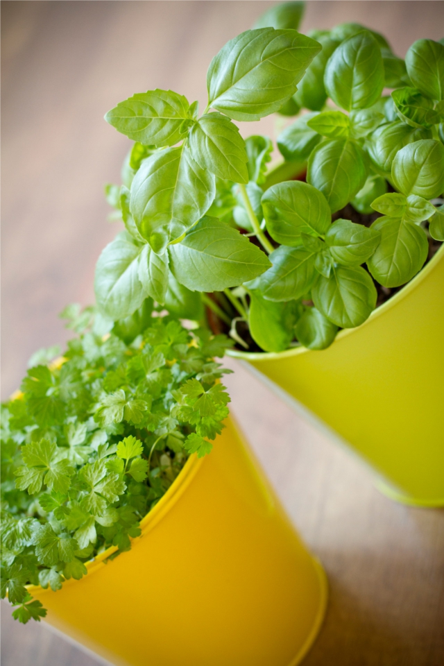
‣ ‣ ‣ Branding 101 Printable & How-To Tips

As we move forward in this series (which will continue here on Fridays) a lot of the things we will be doing in future posts will be based on the answers you give to questions on this printable. I sent these questions to Lori ahead of time so that I could base her blog’s design on her answers. These questions don’t really require very long answers, and for the most part are pretty straightforward, but there are a few that I wanted to give some additional explanation for here.

The first section is just the basics, and things that you probably already have established: your blog name, tagline, etc. One question on there, though, that I want to point out is “Why do you blog?” You don’t really need to get very deep on this answer unless you want to – this is largely to establish the purpose for your blog. Is it to promote your business? Is it to offer advice or support on a certain topic? Is it to get feedback on your writing skills? The one answer I would avoid putting here is anything along the lines of “for fun” or “for a creative outlet”, because that doesn’t shed any light on why you are writing on a publicly viewable website as opposed to a personal journal at home. This question has to do with why you a seeking an audience for your writing – you want to be upfront with your audience with what they can expect. If it’s a business related blog, you want to make that clear in your design so your readers aren’t taken aback or surprised when you start talking about selling to them. Or if you are wanting build a online support community with your blog, you want make sure your design offers easy ways to join and participate. And so forth, depending on why you are blogging.

The rest of the questions of the 2-page printable are what I call “The Brass Tacks”. They are questions to help you think through and define what kind of style and look you want to go for on your blog, and help lead up to the last question: to come up with a branding and design statement. What is a branding and design statement, you ask? It is not a tagline or something that describes your blog to other people, it is simply a succinct phrase that describes the feel you want in your branding and design, for your own use as a guideline while you design your blog. It doesn’t have to make a lot of sense to other people, as long as it is crystal clear in your own mind – but it should be short. As an example, my own branding statement that encompasses all of my sites (my blog, my shop, my website, etc.) is “cozy urban cafe”. That may or may not make perfect sense to you as you look at my sites – for instance, urban style can mean a more hip-hop and grafitti type style, but I mean it more in a downtown kind of way – but in my own mind it is clear, and as a result, all of my sites have a similar feel that reflects my original design goals.

If you’re easily able to answer the questions asking for just a couple specific style terms and such, you’ll probably have a fairly easy time coming up with your branding statement. But if, as you’re trying to answer the style and adjective questions, you can’t think of how to describe it, try imagining your blog was an actual physical location, like a shop or a house, and see if that helps you describe the look you want. Even then, though, it may feel a little nebulous or scattered. In helping people with blog design in the past, I think this is one of the things that people have a lot of trouble with – defining exactly what they want on their blog. When Lori gave me her answers, they were a little more general than the questions asked for, which I was actually glad to see, because I think this is common issue and gave me the opportunity to demonstrate (since I’m the one doing the designing in this case) on how to take these general types of ideas and narrow down to a branding and design statement.

Here were Lori’s answers to the two questions that asked for a few style terms and adjectives:
“This is where I just get overwhelmed. Is there such a thing as the modern side of Lands’ End clothing meets Italian Renaissance art meets old books meets straw garden hat and good hand tools meets artful cheese plate? That’s my style. Good luck.”
“Ai, yai, yai… Pick for me, please! Ok, one of those great looking rooms where the furniture is very comfy, very functional, with few useless objects except a very few of sentimental value which are also lovely to look at — like my pottery bowl of river rocks picked up from a Swiss alpine stream and my basket of postcards from our travels and field trips.”

Her answers really made me smile – I think this feeling of “this-meets-this-meets-this … what is that?” is very common. So, if you’re in this boat, know you’re not alone! I can understand why it seems overwhelming – it would be very difficult to design anything trying to juggle all these different aspects. But here is what I did to filter Lori’s description down to a single style description, and I hope you’ll find the process can be fun, not daunting.

The first step is that you want to think about what the different aspects have in common – what ties them together. Personally, I went and found pictures of the things she mentioned in her description … a piece of Italian Renaissance art, some old books, hand tools, artisinal cheese plate, etc., and lined them all up to be able to make some visual comparisons. Another way to look at this came up as I was explaining to Tim the process of narrowing down to the similarities; a light bulb turned on in his head and he said, “Yeah, it’s like finding the common denominator of the different styles!”, and he started kind of mind-mapping attributes of the different items to find common ground. I thought that was a interesting way to think of it – especially if you’re more of an abstract/math brained person like Tim. Or the visual comparison might work better for you if you are more artsy-brained, like me. But in whatever method works best for you, try to think of what the common cord is that ties the different elements together.

Secondly, you might think I’m going to say find what is different between the elements- but that’s not quite the case. It would be a pretty endless list! Instead, ask yourself, “How do these things comment on each other?” In other words, why didn’t Lori answer with JUST the Italian Renaissance for her look? What is it about garden tools that fills something that was missing in the Italian Renaissance? What is it about Lands’ End that fills a style need missing in having old books alone? Contrast to try to find how and why these different pieces comment on each other. You may find that some aspects are actually very overlapping, where as some introduce a whole missing, but vital, piece of the puzzle.

After going through this process, here is the design statement I came up with from Lori’s description:
“Classic and cultured, done simply and down to earth.”

I feel that encompasses what she was trying to portray in her descriptions. Now the last (but very important)
step in crafting your design statement is this: once you have your design statement, forget about all those nebulous descriptions. Now, I don’t mean forget about the other questions you answered on the printable, we’ll still be using a lot of those answers in the future. But those fuzzy nebulous thoughts of Renaissance-meets-cheese-plate-meets-gardening-tools — let those go. You want to design and plan you blog look based on your branding statement. If you try to design with all of those other things in mind, you’re going to end up with some parts of your blog looking like the Renaissance, and some parts looking like garden tools, but it’s not going to all tie together. Your branding statement should encompass everything you need from those nebulous thoughts, anyway. If you feel you can’t let go of those because it feels like something will be missing, then that is probably a sign that your branding statement is not complete. Once you have a branding statement finished, it will make your job of designing SO much easier in the rest of the process.

I hope this has been helpful! You can get the free printable by clicking the photo, below.
Let me know how it goes answering these questions – and if you are having trouble narrowing down to a design statement, talk about it in the comments below, and let’s see if we can help each other out! :)

Please leave your thoughts and comments below – I love to hear from you!

You can check out the rest of the posts in the series here:
Part 1: Discover your branding with “The Drawing Board” Printable (That is today’s post!)
Part 2: WordPress vs. Blogger
Part 3: Design Tips + Design Worksheet
Part 4: Themes, Coding and Stylesheets
Part 5: Making your own graphics
Part 6: 7 Blog Layout Tips to Engage your Reader
Part 7: Blog Page: The Must-haves and the Panache
Part 8: 25 WordPress Tips
Part 9: The Big Reveal
Part 10: 7 Ways to Promote and Market Your Blog