Well, after an unintentional week off, I’m back up and running for the Creative Business Challenge. :) Last week we talked about product photos and descriptions. I wanted to talk about the two of them together, because in a sense they are doing something similar – providing information about your product in a way that appeals to your target market. However, it is just a lot to cover in one post, so we’re still on that topic for this week, looking more at practical ways to put it into action by doing two shop critiques.
If you missed last week’s post, you might want to go back and check it out, here. It covers a lot of the general concepts of product photography and descriptions that we’ll be talking about putting into practice in this post. And while the tips today are directed at two shops in particular, my hope is that it will be helpful and applicable for others as well. One is a handmade shop, and one is a vintage shop, so it should cover a variety of topics.
Well, let’s jump in!

The first shop we’re going to look at is Julia’s Fit, run by mother/daughter duo Julietta and Mariya. Here is the question they asked:
One or two particular areas I would like to learn how to improve in my biz are: Photos and stories. Photos are our number one weakness. Since we both have full-time jobs, we try to experiment on weekends, but that’s not barely enough time. Goal #1 is to improve our photography by far.
Stories are another things that we need to work on. Every item has a story that needs to be told. We are looking to find an approach that works for us and doesn’t make us feel like we’re “bragging” when we describe our items. We think that by improving these two sides of the business, advertising won’t be that much of a problem than it is now.
Great questions! Let’s take a look at their shop…
First, some things they are doing well…
– Photography lighting: I know you said you only have the weekends to work on photos, but it looks to me like you’ve got the lighting part of it figured out really well! Your photos are bright, clear and well-lit without getting any glare or reflection. This is an interesting photography critique, because as far as the technical side of getting a nice photo (things like lighting, crispness, focus, white balance, etc.), it looks like you already have a good handle on that. It will be more in the side of styling and such that improvements can be made. But as far as the technical side of taking the photos, you’re doing a great job.
– Profile: It is always good to have your profile page filled out so people can learn more about the artist(s) behind the shop, and they’ve done a nice job of giving info about themselves in a friendly way, yet keeping it succinct.
Things that are good, but could be better…
-Tags and titles: They’re doing a great job of using all 14 tags (all Etsy shop owners should do this! The tags are one of the ways that people find you in the searches, so make sure you’re using all 14 slots for tags). However, both the tags and the titles could be used even more effectively. Etsy now allows phrases in your tags, so use that to your benefit. Instead of just “blue” you can put “navy blue” or “blue pillow” or, even better, “navy blue pillow”. Just make sure the words actually do flow in an accurate phrase (like “navy blue pillow”) as opposed to just a list of words that don’t make a related phrase (like “pillow cushion soft”). Right now though, most of your tags look like they are just one word. If someone searches “blue pillow”, listings with “blue pillow” with respond better than if they are only tagged separately with “blue” and “pillow”. So think of phrases that people might search for your items, and be sure to include them in your tags and titles.
Things that can be improved….
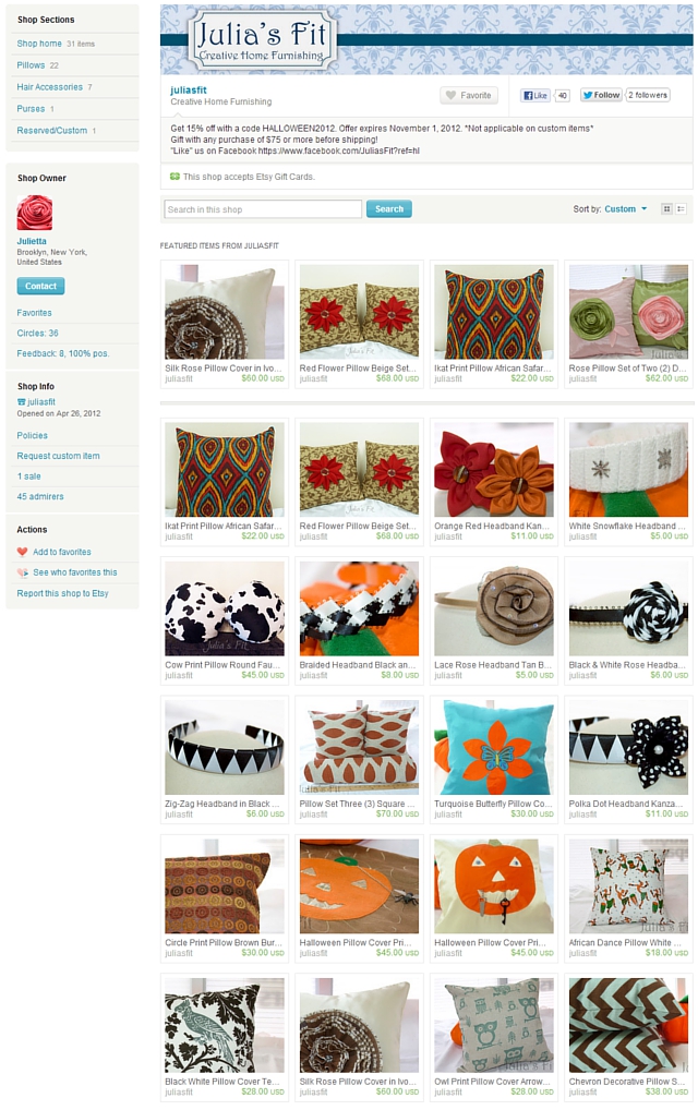
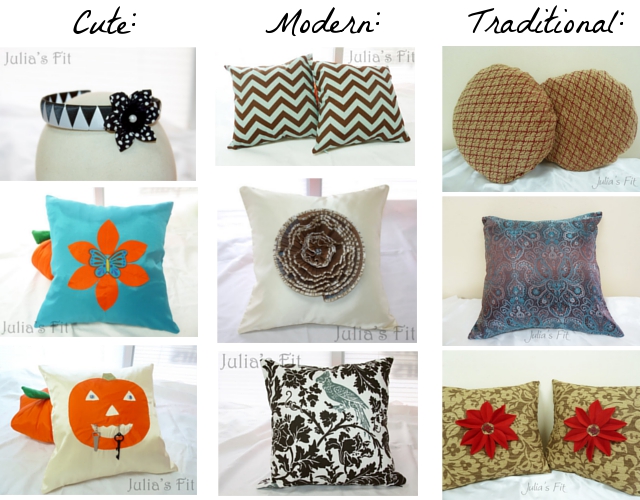
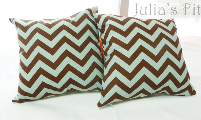
-Shop cohesion: I think it would be good for you to do some brainstorming about your target market. What is your shop about, and what type of person shops there? I see you have home decor pillows, and that you mentioned in your profile that also do duvet covers and such, but then there are also head bands and bows. And among the pillows there are some pillows that would be at home in a trendy urban apartment, where as some would be more at home in a cute setting with kids, while others look more traditional (as shown in the photo below). Now, I am by no means saying that variety is a bad thing! I’d just recommend deciding what direction to go, and choosing variety within that direction. If you want to keep the hair bows and more fun kid type pillows, you could find a way to tie that together. Or, if you want to be a home decor shop, you could find a way to tie together different styles of pillows. But at the moment I think it is hard for a visitor to know whether your shop is the place for them – whether they are shopping in a upscale home decor shop, or a cute and fun family shop, etc. Neither is necessarily better than the other (although the price you need to get for your items may affect the decision), it’s more just an issue of cohesion so that when your target market comes into your shop, they say “Oh, yes, this is the place I would want to buy ____.”
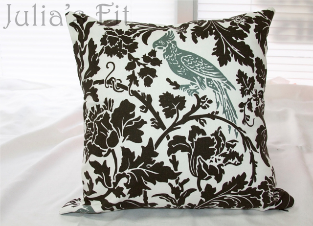
– Photography styling: Once you have a sense for which direction you want to go, choose one or maybe two ways that look good with that style, and use that same setting to photograph all your products to keep cohesion. Personally, I think you have a GREAT thing going with this setting:
I think this setting is excellent because the white sheets and white window in the background are just enough to give the pillow a current and homey atmosphere – but without distracting from the pillow itself. I would reshoot all your pillows in this setting, but I would personally recommend the following changes:
– remove the watermark. It distracts, and with this type of item, the chances of someone stealing your photo and passing it off as their own is fairly slim. Or, if you’re just not comfortable without a watermark, I’d move it somewhere much less obvious. Besides distracting a customer in the photos, having a watermark can make it harder to get on the front page, on blogs, etc., etc.
– the way you are currently cropping the photo in thumbnail view to where it is just a corner of the pillow can make it hard to tell what the photo is of … I would recommend showing at least 3 if not all 4 sides of the pillow instead of just 2 so that it is clear what it is when people see the photo in their search results.
– maybe play around with photographing the pillows at an angle in addition to straight on?
– Descriptions: I know you mentioned that this is a troublesome spot for you. Let’s look at the description for these pillows:
Here’s a pair of pillow covers in a very popular chevron print. Designer is Premier Prints. This is lovely color scheme of brown and light blue aqua. Very versatile print, would go great with any type of home decor or space. Invisible Zipper is located on the bottom, and blends in with the aqua stripes perfectly. The fabric is a 100% thick cotton. Size about 17” by 17”. Inserts not included.
Thanks and Happy shopping!
********************************
P.S.: International buyers, please be advised that all customs fees are completely out of my control. Check with your local post office for details on customs fees in your area.
I think the first paragraph of the description would be alright if this was a catalog or mass produced item. You cover a lot of the basics – size, color, whether the insert is included, etc. However, this is a handmade item by you. Think about the question, “Why should someone buy a handmade pillow cover from me instead of a pillow cover from a big store?” The description needs to reflect the answer to that. And I think that you might have an easier time explaining that once you’ve figured out the direction for your shop. Those of us who sell on Etsy basically have specialty shops. If you have a good field of your specialty and who it is that would be interested in it, I think it becomes easier to tell your “story”. Just to illustrate, I’m going to imagine I’m you, that I made these pillows, and that I’m going to have the shop specialize in the modern styles of pillow…
After a busy day in the city, it is so nice to curl up on the couch with a hot cup of coffee and a cozy pillow. I made this set of modern brown and aqua chevron pillow covers to keep your apartment both cozy and stylish. Slip them onto pillow inserts and toss on the couch for an instant lift to the room. Lovingly handmade of thick 100% cotton with a hidden zipper, it will hold up well to the tumultuous life of a throw pillow (squeezes, cuddles, pillow fights, and being cried on during chick flicks).
Not that this is necessarily what you would have in your description, but I just wanted to demonstrate that having a particular feeling to your shop and a certain demographic in mind can make description writing a lot easier.
After an opening paragraph to give some personality, I would recommend bullet point lists of details so that people can easily find more info. I gave an outline last week for a user friendly way to write descriptions that you might find helpful. Also think about what details should be included. I see you have that section about international customs at the end, and I think it comes across as a little intimidating. It is certainly all true, but I’d recommend making it a little friendlier. Instead of saying it is out of your control, just state that it is their responsibility. Some other questions that customers will be wondering that should be answered in the description – how long after purchasing the item will it be shipped? it is machine washable? how will it be packaged? etc.
So here is an imaginary example of what the whole thing might look like, based on the outline from last week…
After a busy day in the city, it is so nice to curl up on the couch with a hot cup of coffee and a cozy pillow. I made this set of modern brown and aqua chevron pillow covers to keep your apartment both cozy and stylish. Slip them onto pillow inserts and toss on the couch for an instant lift to the room. Lovingly handmade of thick 100% cotton with a hidden zipper, it will hold up well to the tumultuous life of a throw pillow (squeezes, cuddles, pillow fights, and being cried on during chick flicks).
— Details —
These handmade pillow covers:
∙ measure 17 x 17 inches.
∙ are made with Premier Prints fabric.
∙ are 100% cotton.
∙ are machine washable.
∙ do not come with pillow inserts.
∙ open with an invisible zipper.— Shipping —
This item ships within 3 business days of payment, and is carefully packaged in a poly sleeve.
International buyers are responsible for any customs fees that may apply in their own countries.— Want more? —
Interested in something a little different?
Browse my shop for additional modern styles of home decor: http://www.etsy.com/shop/juliasfit
Or click the contact link below if you are interested in a custom order!
I love your pillows (especially that bird one – SO cute!) and I think once you hone in on your target market and if you approach descriptions more from the point of view of getting the reader to imagine using and recognizing the quality of the pillow, rather than feeling like you have to say “this is amazing!”, that might help about feeling like “bragging”.
Well, I hope that these tips have been helpful! Let’s go on to shop number two …

Shop number two for a critique is The Little Red Owl, which is a vintage shop run by Amy. Here were her questions…
one or two particular areas i would like to learn how to improve in my biz are: i have just opened my shop recently and i would love to learn how to better reach my target audience and how to properly price my items. i am also new to facebook (i have a page for my business only) and i would love to get a better handle on that as well. thx! love the blog!
Alright! Let’s take a look at her shop…
First let’s take a look at some things she is doing well…
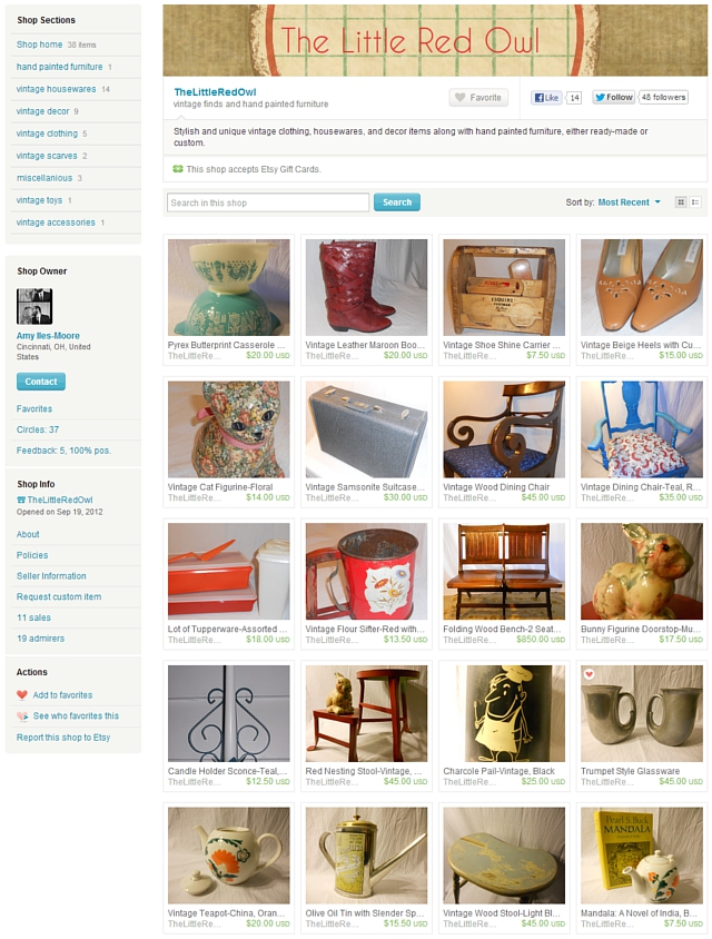
– Number of listings: Having about 2 pages of items is a great number to start out a shop with – its enough listings to have an established looking shop, and have a fair amount of variety for shoppers to look through. As you find what types of items sell well and such, then, you can continue to build. But you’re at a great number of listings for such a new shop!
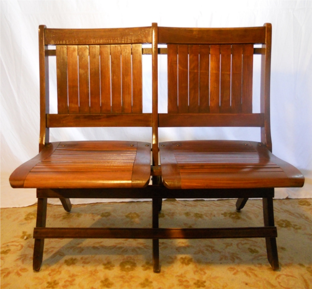
– Variety of price points: It is tremendously helpful to have items at a variety of price points in your shop. Big ticket items, like the chairs below, don’t move too fast but the whole time they are in your shop they tend to bring in more traffic. But then you also have smaller ticket items that can have a quicker turnover with that traffic. Personally, your prices look very appropriate to me, too, as someone who used to sell vintage.
– Banner and avatar: I absolutely love the feeling evoked by your banner and avatar. It gives a great vibe for the style you’re going for right away when people see your shop, and having a picture of yourself in your avatar is a big plus, because people love to see the owner behind the shop, so nice job on those!
Things that are good but could be improved:
-Profile: I see you have your profile filled out, which is good, but it seems to be outdated. You mention wanting to open an Etsy shop, and it is now open. You also mention that you want to blog, and give a link – I would recommend perhaps removing that, and then adding in the link and info for your blog once you start doing it. I do see you have your About page filled out nicely, though, which is great!
– Facebook: We’ll be looking more at marketing and such next week – but I did look up your page on Facebook. It’s great that you have a Facebook page, that can be very helpful in marketing! However a few things I noticed that could be improved:
– your cover photo is stretched. I’d recommend creating a new photo that would fit better in the space.
– post on your business page about once a day. More than that, and people will start to “hide” your posts. I’d recommend un-linking it from Twitter and such to keep from overwhelming your followers.
– Keep your posts relevant to your business. Try sitting down and really brainstorming who your target market is, and think about what things are helpful to them. For instance, if you find a blog post that talks about caring for vintage items, that would be a perfect kind of thing to share. Or post pictures of behind the scenes work at your place getting items ready for your shop, etc. But try to keep it relevant – people “like” your page to follow The Little Red Owl, so give them updates that are related to their interest in that.
Things to be worked on:
-Photography Logistics: It looks like you are using indoor lighting and/or flash in your photos. I would highly recommend using diffused natural lighting instead. You could shoot outside in the shade, or inside near a well-lit window. Indoor lights creates unflattering lighting, sometimes distorted colors, and a flash creates glare on the items. Also, make sure your photos are fully in focus and non-blurry, that you can see the whole item in the first photo (especially for unique vintage items where people might not be able to guess what it is from a close-up), that it is not washed out, and that the white balance is properly adjusted.
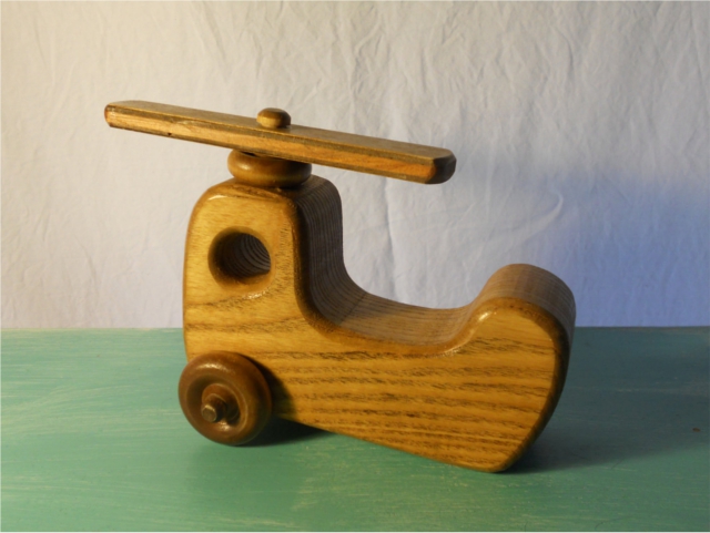
-Photography setting: When you have a shop with a lot of variety, as vintage shop tend to do, it can be difficult to keep a cohesive shop. A cohesive shop is very valuable in appealing to a certain target market. I get the impression that your target market has an appreciation for quirky meets classic. I think that having one fairly simple background that has just a little bit of quirk without being distracting, and shooting every item in that same place, and at the same angle would be helpful to make your shop recognizable, branded, and cohesive. I kind of like the photo with the white background, but kind of teal colored base for the item to sit on … especially if you were to shoot the photo head on rather than at a downward angle so that the color was more below than behind the item. You could maybe even get away with using some of the red pattern you are currently using in some of your photos, but use it as a base instead of a background, so that the color or pattern is just below rather than behind the item. Enough to make it quirky and unique, but not enough to distract. Here is the photo I am talking about:
Play around with different backgrounds, and find something that you can use pretty much across the board (at least on all the small items, and then maybe one different but similar setting for all the larger items/clothing), and shoot all the items in that same setting. White is good, but if you use a sheet, make sure it is not wrinkled, as that can be distracting and also looks unprofessional.
I definitely love your vintage finds! I think I am someone in your target market. :)
I hope these tips have been helpful both for the shop owners above, as well as other Etsy shop owners!
If you have any thoughts or comments, please leave them below!


Omg, April, you are so right on with all your critiques and advice. I have never poured over a blog like I do yours and I hang on to every word. I am really hoping to rediscover who I am as a shop owner and give my shop the makeover it needs using your series.
Thank you so much for taking the time to do this. It is more valuable than you can imagine.
Aw, thanks, Yvette! I really appreciate your encouragement! Life has been so crazy lately that blogging has gotten a LOT harder – so I’m really glad to know it has been helpful for others! :)
Thank you sooo so much for such a thorough critique, and for putting it in such accessible words. You’re very right on all these points. We have to take a step back and put ourselves in our buyers’ shoes. It’s difficult to identify our target market. “Women 25-50” seems about right, but it’s a big range and not very specific.
I continue coming back here to re-read your previous posts, and I’m taking mental notes. Eventually it will start making sense, and coming together.
Thanks again!
I’m so glad you found it helpful. Yes, women 25-50 is just far too broad, as that covers a significant portion of the population! I know it can be hard to narrow down, but it definitely helps a lot. :) You do lovely work and I wish you the best of luck. :)
Thank you so much for choosing my shop. I am so pumped to take the critiques you have done and use those to improve my shop. Having an outside opinion is such a benefit!
I so enjoy your blog. It is full or warmth and help-us less experienced peps REALLY enjoy all your help and your giving spirit.
Thanks again.
Wow! What a big help those critiques were. I’m going to take that advise before I have my shop critiqued then see if its necessary! Thank you so much!